Responsive Web Typography

Variable Fonts

Light and dark modes compared on the site

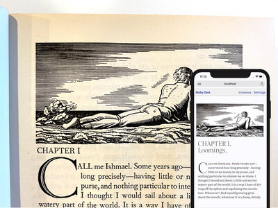
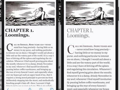
The reader’s right: preferences and light modes

Tuesday, 7 July, 2020

There are a couple of things I’d like to show you this week. One is a relatively small but important step forward for the book project: supporting light modes (with user preference setting). The other is more important to me...

Chapter one in print and on the phone

Part 6: On the nature of ‘book’-ishness

Friday, 29 May, 2020

This week is one I’ve been awaiting for quite some time. Really since before I even started this process. It’s also the first time I’m posting something that I know is broken in a lot of browsers. But where it...

Text scaled for small screen and large

Part 5: Dynamic Typography Redux: clamp() on it

Monday, 18 May, 2020

This week has a big update to the typographic scaling that features some very new CSS about which I’m pretty excited. It’s featuring a new way of defining low, scaling, and high values for things like font-size that removes a...

Side-by-side comparison of screens showing Georgia and Literata versions of the book

Part 3: Adding web fonts—giving voice to our words

Monday, 4 May, 2020

This is a big week for the project. While it was an important step last week to establish some basic responsiveness, we couldn’t really nail down the typography until we added the typeface. Too many aspects of the feel, proportions...

Using Variable Fonts on the Web (online workshop)

This online workshop will introduce you to variable fonts, what they’re good for, where to get them, how to use them, and why you should care. Set up in two 2-hour sessions to help fit into your pandemic-upended schedule and...
Workshop
Image of the titles and acts in the poster

Skewed, rotated, and styled

Friday, 27 March, 2020

Once again this week there were a few different threads coming together to inspire this issue. I’m continuing to explore amazing examples of graphic design in the form of publication covers and posters, and focusing on how we can achieve...

Text set with overlaid color and outlines

Outlines and overprints

Monday, 16 March, 2020

A few things coalesced to inspire the issue this week, and they bring us back to exploring some beautiful cover designs dating from the early 1960’s. I recently picked up Impact 1.0 and Impact 2.0 from Unit Editions, each filled...

Text overlay and knockout demo

Figure/ground composition with text, image, and color

Saturday, 29 February, 2020

This week we’re going to dig in to more text effects. In keeping with the idea of exploring more editorial design without requiring lots of custom code, this issue’s experiment could certainly be set up in a content management system...

Getting graphic: reinventing design with type on the web

Graphic designers have customized layouts and title pages in magazines for decades. But, between the limited technology of the early web, and our race to systematize design once we had sufficiently capable technologies, we’ve missed out on much of what...
Talk

Two Jasons talking about Variable Fonts

Tuesday, 19 November, 2019

My friend Jason likes to learn stuff. And what better way to do it than invite people on to a web show and make stuff? We got to chatting at a conference a month or two back and sat down...

Subscribe to Variable Fonts