Figure/ground composition with text, image, and color
This week we’re going to dig in to more text effects. In keeping with the idea of exploring more editorial design without requiring lots of custom code, this issue’s experiment could certainly be set up in a content management system to allow for changing images and text content.
A few issues back we explored some text overlay effects combined with images, and I’ve seen another really interesting experiment from Mandy Michael that got my attention. That, combined with a recent trip to the Museum of Modern Art in New York City, reminded me of an assignment from a design class in college. We were asked to create a composition with one line on a page. I tended to gravitate to a more elliptical shape, mostly off the page top-right. This created some relationships with the corners, and a tension where the line came closer to the bottom edge of the image like a weight suspended over the ground. I don’t think I got a very good grade, but 25 years later I still think about the challenge.

I wanted to see if there was a way to combine some of these ideas: text, image, shape, and their relationship to the visible canvas of the screen. To create a mask for text, with an interesting interplay between message and image, or even just color. Since we now have things like viewport units for height, we can play with how these elements use the screen size, and can maintain relationships with different edges of the screen.
Web design has had a tendency to flow top-down, and this usually makes sense: you have no idea what the content will be over time, or upon what size device it will be viewed. So for a long time, much of our efforts have gone toward optimizing around that dynamic content/any device scenario. But our layout capabilities have evolved, as have the capabilities of our content management systems. So perhaps it’s time to revisit some of these limitations and see what we can do.
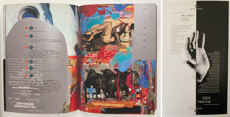
The premise is to see if we could create a flexible design component based on an image or color and some text, combine that with a masking shape, and design it in such a way that it utilizes the whole screen in a way that engages the viewer and draws them in, no matter the size or shape of device. That interplay—between positive/negative, foreground/background, text/image—has long been part of our graphic design lexicon. You can see it in action in these images of Vaughan Oliver’s and Jennifer Morla’s work.
Our challenge is to bring it into our web vocabulary in a practical, sustainable way.

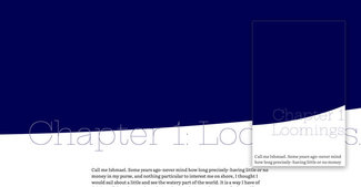
The first example is mixing image, shape, and text. We’ve got a big background image that’s masked off with an oversized offset oval. We’ll place text over that image overlapping the bottom edge of that mask, and then position a copy of that text on top in a contrasting color, and apply the same clipping mask as on the image. Thanks to using viewport-related font-sizing and height management we can have a big bold element that (mostly) fills the screen regardless of device size or aspect ratio. By allowing the elements to move and scale we can be sure to have the effect we want without forcing every aspect of the relationship.
We start with the image and mask. The image is placed as a background with ‘background-size: cover’ to be sure it always fills the visible area. The container controls the height, and the clip-path mask is an oversized oval, offset enough to create the somewhat asymmetrical effect we’re looking for. This gives us the slight visual tension and gets away from the usual boxiness of the web. Notice that we’ve set up a custom property to hold the mask shape, so we can apply the same thing to the text. This helps make the whole component more flexible: no matter what image or text, the layout will always match up.
<div class="masked-element">
<div class="masked-element--background image"></div>
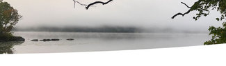
<h1 class="masked-element--clipped-text" data-heading="Morning, mist, and magic">Morning, mist, and magic</h1>
</div>And here’s the CSS for the wrapping element and masked image. Note we have to add the ‘-webkit’-prefixed version as well if we want it to work in the most browsers (more on that support can be found on caniuse.com):
:root {
  --mask-shape: ellipse(200% 90% at -20% 0%);
}

.masked-element {
  height: 80vh;
  margin-bottom: 4rem;
  max-height: 95vh;
  position: relative;
}

.masked-element--background {
  -webkit-clip-path: var(--mask-shape);
  clip-path: var(--mask-shape);
  position: relative;
  height: 100%;
  width: 100%;
  z-index: 1;
}

.masked-element--background.image {
  background: url(path/to/image/mist_crop.jpg);
  background-size: cover;
}
Next we’ll add a text element, and position it on top of the image. We can use flexbox to make sure the text area fills the same space as the image. This way we can apply the same clip-path mask and they’ll always line up. Before we do, let’s look at how the text and image overlap.

First we finish setting up the styles for the overlaid text:
.masked-element--clipped-text {
  color: var(--text-color);
  line-height: 1.1;
  margin: 0;
  padding: 0 1rem 0 0;
  height: 100%;
  width: 100%;
  position: absolute;
  bottom: 0;
  right: 0;
  display: flex;
  flex-direction: row-reverse;
  align-items: flex-end;
  text-align: right;
  z-index: 2;
}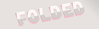
Taking a tip from Mandy Michael’s ‘Folded’ demo, I’ve supplied the same text that’s visible in a ‘data-heading’ attribute on the main text element. If you were outputting this from a CMS that would be something you could set in the template file. I’ve played on Mandy’s example and added a ‘contenteditable=true’ attribute and some JS to allow you to edit the overlaid text in the demo.
<div class="masked-element">
  ...
  <h1 class="masked-element--clipped-text" data-heading="Morning, mist, and magic" contenteditable="true">Morning, mist, and magic</h1>
</div>
Finally we create the pseudo-element with matching text and position it right on top of the original text with a contrasting color. Note that since it’s a child of the main text, we can use ‘inherit’ on most of the attributes to make sure it stays true to the positioning of the main text element.
.masked-element--clipped-text:after {
  content: attr(data-heading);
  color: var(--text-overlay-color);
  -webkit-clip-path: var(--mask-shape);
  clip-path: var(--mask-shape);
  margin: inherit;
  padding: inherit;
  height: inherit;
  width: inherit;
  position: inherit;
  bottom: inherit;
  right: inherit;
  display: inherit;
  flex-direction: inherit;
  align-items: inherit;
  text-align: inherit;
  z-index: 3;
}
By setting the overlaid text in white (or any other contrasting color), we can get the effect of the text being ‘knocked out’ of the image or color wherever it overlaps:
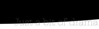
I’ve also included an example of just text and color. You’ll notice that I’m featuring another font from the Google Fonts catalog called Hepta Slab. It’s a really fun one, and has a weight range from 1-900, so you can really push the boundaries of scale with it. Check out the CodePen example to see how to use the variable version via the Google Fonts API.
And finally an example of using this technique as an ‘intentionally not quite full-screen graphic effect’ to give a strong title element that still shows the viewer there’s more to the story, no matter what size or shape the screen.