Monday, 16 March, 2020
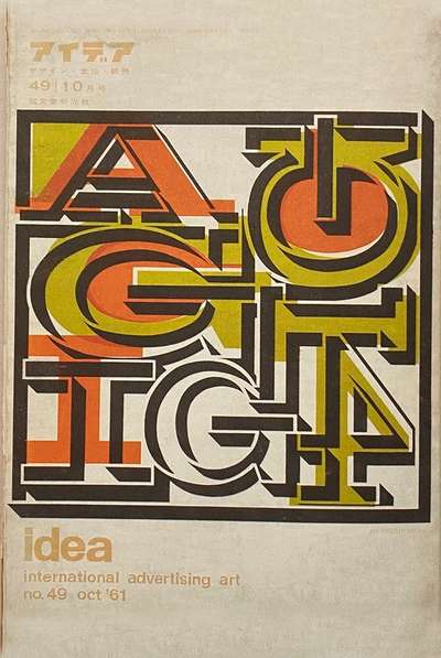
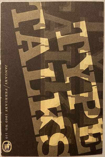
A few things coalesced to inspire the issue this week, and they bring us back to exploring some beautiful cover designs dating from the early 1960’s. I recently picked up Impact 1.0 and Impact 2.0 from Unit Editions, each filled with publication cover designs from 1922–1973 and 1974–2016 respectively. There’s inspiration for days in each but a couple from 1.0 caught my eye. One is a cover of Type Talks in the US, and the other Idea from Japan (pictured below). Both feature big, bold type and lots of layers—though the former is monochromatic and the latter very much not. They both reminded me of wood type experiments and prints I’ve seen over the years, so I wanted to see if I could create a way to achieve that effect on the web.
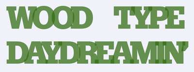
Another piece of the inspiration puzzle came in the form of the latest release from the Font of the Month Club: Datillo DJR (variable). The heavy end of the weight spectrum seemed a perfect pairing, so I decided to see how these could come together. As always, the goal is to create something that could easily integrate into a blog or other sort of content management system and not require any special effort on the part of the publisher.
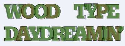
Thinking back to the technique I used in Issue 34 it seemed like there were some good elements from which to draw. I wanted to make sure that there was no special HTML markup required, and that the text would remain readable by assistive technologies. Using a little Javascript to wrap the letters and add a data attribute lets us achieve the effect without complicating the publishing process. Here’s a snippet of where we’re headed:

Wrap it up, we’ll take it
Just like in #34, we’ll use a take on Michelle Barker’s ‘Accessibly-split text’ technique in order to have a plain ‘ol H1 element split and wrapped in individual spans. This also allows us to add some ARIA magic to make sure the text stays readable for assistive technology while still giving us the chance to play a bit with the letterforms.
I won’t go through all of the JS again (you can read all about it here), but the one thing we do in addition to creating a series of spans with the individual letters in them is add a data-attribute (we’re calling it ‘data-content’) with the value of the letter contained in the span itself. This lets us target the content of the data-attribute with CSS and apply positioning and styling to it as well.
c.setAttribute('data-content', c.innerHTML);This gives us a span for each letter that looks something like this:
<span data-content="T" aria-hidden="true">T</span>Now we can have a little fun with pseudo-elements in our CSS. Using the pseudo-elements of :before and :after, we can create additional content which we can grab from the data-content attribute. This effectively creates another copy of the letter which we can style and layer.
First things first
We’re borrowing a bit of the overlap in the letters from the previous experiment, but not quite as much. We’re also just using one color, but giving it a little transparency.
Here’s the CSS to get us started:
.overlap span {
  color: rgba(55,110,25,.75);
  letter-spacing: -0.135em;
  line-height: 0.7;
  position: relative;
  word-spacing: 0.75em;
}
By positioning the span relatively, we can position the :before and :after copies absolutely (relative to the original letter. With that we can use a series of nth-child selectors to move them around, change characteristics, and opacities—all combining to give a bit more random feel.
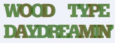
First we add a second layer with a slightly lighter weight and different color and opacity. Notice how we can use the ‘data-content’ attribute to supply the content for the pseudo-element. Add to that another series of nth-child selectors and it feels pretty random.
.overlap span::before {
  content: attr(data-content);
  color: rgba(125,20,0,.75);
  font-weight: 750;
  line-height: 1;
  opacity: 0.35;
  position: absolute;
  top: 0.1em;
  left: -0.05em;
}

/* Play with the second solid fill color and opacity */
.overlap span:nth-child(odd)::before {
  color: rgba(0,0,75,.14);
}

.overlap span:nth-child(5n+1)::before {
  color: rgba(35,50,00,.15);
}

.overlap span:nth-child(7n+0)::before {
  color: rgba(0,80,95,.25);
}
Finally we add the :after element, make it an outline, and nudge it around a bit as well. We’ll throw in some changes to line thickness, color, and opacity too. The final effect is a nicely layered, sort of textural feel. You could even take it further with a bit more JS and randomize the nth-child offsets to let it shift with every view.
.overlap span::after {
  content: attr(data-content);
  color: transparent;
  font-weight: 900;
  line-height: 1;
  position: absolute;
  top: 0.1em;
  left: 0;
  -webkit-text-stroke: 0.01em black;
  text-stroke: 0.01em black;
}

/* mix up the letter outlines a bit */
.overlap span:nth-child(odd)::after {
  -webkit-text-stroke: 0.01em black;
  text-stroke: 0.01em black;
  left: -0.0025em;
  top: 0.12em;
  opacity: 0.7;
}

.overlap span:nth-child(5n+1)::after {
  -webkit-text-stroke: 0.03em rgba(70,80,95,.9);
  text-stroke: 0.03em rgba(70,80,95,.9);
  left: 0.05em;
  opacity: 0.7;
}

.overlap span:nth-child(4n+3)::after {
  -webkit-text-stroke: 0.02em black;
  text-stroke: 0.02em black;
  top: 0.125em;
  left: 0.015em;
  opacity: 0.7;
}

.overlap span:nth-child(7n+0)::after {
  -webkit-text-stroke: 0.015em black;
  text-stroke: 0.015em black;
  left: -0.025em;
  top: 0.072em;
  opacity: 0.7;
}
And here’s everything all together:
I realize it might feel pretty repetitive to have every title on your blog use this effect. But the goal is to build some of these options and perhaps some variations into a system that lets you apply and customize the effect when appropriate. The real power of the web is to combine artistic expression with systematized application—giving you the ability to be far more creative without sacrificing accessibility or maintainability. No need to have to custom code things every time.