Landing the whale: making a book on the web, part 1
I don’t know when it was I started using the text of Moby Dick in my workshops and talks. Likely it dates back to some of my earliest explorations of web typography. Since it’s out of copyright, it’s one those texts you can find online in various forms, and somehow that became one of my standbys. Then at some point my friend Bil let me borrow his 1930’s Rockwell Kent edition and it really captivated me. The typesetting is straightforward, but combined with such wonderful illustrations it just sat there in the back of my brain, waiting, nudging.

Every year, Bil participates in the Annual Moby-Dick Marathon, a live reading of the book held every year at the New Bedford Whaling Museum. After this year’s event we talked about how hard it was to find a good eBook version, which of course led to the idea of A Project. Since I had started working on some experiments in what a book could be like on the web with modern web typography and layout techniques last year, it seemed this might be the perfect fit when the right time came along.
Last week, it seems that time had arrived. In fact it was prompted another friend via his own newsletter. Robin Rendle wrote in his latest Adventures in Typography about how the best way to get better at designing book covers (or typesetting the text of that book on the web) was to do it. And he provided a CodePen link to a fair chunk of Moby Dick upon which to practice. It wasn’t the whole text, but that was easily findable via Project Gutenberg. Now we just have to define what will make for a good book experience on the web.
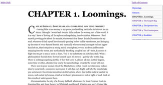
To start, we’ll set a simple baseline: break the text into separate pages for each chapter, provide a simple navigation structure to tie them together, and add some minimal text formatting. I did add one or two refinements to style the first letter and first line of each chapter, and enough layout formatting to keep the basics of paragraph structure and the content a bit more balanced on screen. The source code and the entire text are now freely available online. But to create an experience that even comes close to that Rockwell Kent beauty, we need to do a lot more.
Over the next few newsletters, we’ll apply more and more of what we’ve covered here in previous issues, and take it even further.
- Make the typography responsive to screen size
- Add web fonts (both static and variable)
- Update the responsive typography to a more dynamic solution
- Add a web font loader and style fallback fonts for a better loading experience
- Add typographic controls for the user to set preferences for light/dark mode (coupled with OS setting detection), font size, and spacing
- Add bookmarking to save or share your place in the text
- Add support for offline reading
- Experiment with a more book-like experience, especially on touch-based devices
By the time we’re done, we’ll have a pretty complete typographic and layout design that could be adapted or tweaked to work with almost any text. Beyond just making a website out of a book, the intent is to really examine what makes a great reading experience, and make it even better on the web than we can in print or any other current digital format.
And maybe I’ll finally land my whale.
§
To get started, I’ve created a site using the Eleventy static site generator. I’ve endeavored to keep that setup as simple as possible, but some amount of build-process complexity was necessary to balance ease of development and quality of output. The entire source is available on Github and the compiled site is automatically deployed to Netlify. At any point you can always download the source from Github and look in the ‘_site’ folder to find the complete, compiled site. This way you don’t have to set up the build process if you are not so inclined. If you are, I’m including some basic documentation on getting the project up and running in the README.md file.
I’ll create a ‘release tag’ with each issue, so you’ll always be able to look at the code corresponding to that issue, but the latest version will always be what’s deployed on Netlify, and viewable at https://mobydick.rwt.io