Swiss inspiration & morning rituals observed
This week’s issue took a bit of a meander. I started thinking I might make another Google Fonts API tutorial. But part way through that I got another email from International Poster Gallery celebrating the work of Swiss designer Herbert Leupin. One in particular caught my eye: Tribune De Lausanne, 1955—one of his most popular works. It beautifully captures the message that one should start their day with coffee and Le Tribune.
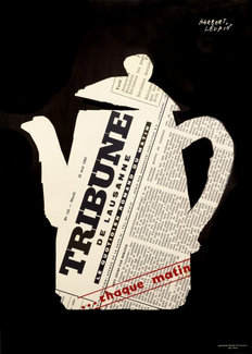
The way the text is set inside the coffee pot grabbed me, and I started to think about masking and clipping again. I created a silhouette of the coffee pot outline and saved it as a PNG with transparency so I could play with the ’shape-outside’ property. That ended up not working like I’d hoped as it doesn’t scale the same in different browsers. So I used it to make a polygon shape as an outline and assigned it to a custom property. Since the same syntax is used for both shape-outside and clip-path, this is a perfect use case.
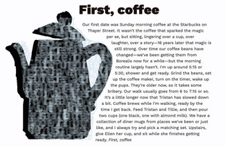
Adding a figure element with an empty DIV inside, I used that as a placeholder for the next part of the experiment. I set the coffee pot as a background and assigned a width and height roughly the same aspect ratio in viewport width units (so it would scale with the window). The empty DIV has the clip-path applied to it, and the Javascript takes the text content of the whole container and ‘pours’ it into the container. Then some styles to make the text size bigger, reduce the opacity, reduce the letter-spacing and line height, and set it to allow word-breaking wherever necessary. Completely and totally illegible, but that’s just fine: it works beautifully as a texture fill over the silhouette in the background.
Then I started to think that all of this seemed just a bit odd given it was typesetting the first chapter of Moby Dick.
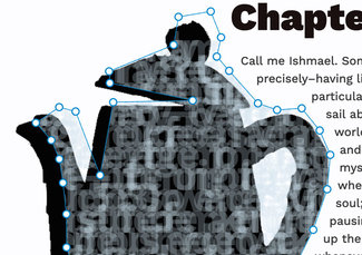
In the image above you can see the polygon points highlighted in the Firefox developer tools. They made easy work of making the complex outline. Then I just copied the code into the custom property value and applied it to both the shape-outside and clip-path. This give us the text wrap and the text container.
:root {
  --coffeepot-polygon: polygon(48.14% 12.00%, 29.27% 18.21%, 29.47% 20.94%, 53.72% 25.02%, 30.48% 25.44%, 26.63% 42.54%, 19.47% 27.61%, 14.68% 26.59%, 7.85% 30.26%, 12.36% 34.33%, 14.72% 38.75%, 15.79% 44.32%, 16.78% 51.65%, 16.81% 59.44%, 19.01% 65.11%, 22.23% 66.6%, 21.17% 88.32%, 166px 94.95%, 76.07% 95.21%, 77.25% 77.44%, 80.76% 73.85%, 80.15% 69.36%, 89% 55.31%, 93.08% 45.82%, 93.98% 37.76%, 90.89% 32.05%, 85.62% 26.85%, 78.41% 27.24%, 72.83% 25.69%, 64.4% 18.07%, 60.77% 14.75%, 62.03% 10.24%, 59% 30px, 49.58% 5.45%);

.pot {
  ...
  shape-margin: 1rem;
  shape-outside: var(--coffeepot-polygon);
  ...
}
.pot .contents {
  ...
  clip-path: var(--coffeepot-polygon);
}
So I wrote a short bit about Ellen, me, the dogs, and our coffee routine. Seems like I’ve diverted more than a little from my first notions, but ultimately we’ve ended up with a lot of those elements anyway. Work Sans (variable) is coming from the Google Fonts API, we’ve got some fun experiments with images and shape-outside and clip paths, and a bit of JavaScript to pour the text into the coffeepot, mix it all together and make a bit of texture out of it.
While I admit this week’s experiment was maybe a bit more personal, I do think it still ‘fits the mission’—we have a simple pairing of a heading and copy, given an interesting layout that makes use of modern CSS techniques inspired by classic graphic design. The effect is still readable, accessible, scalable, and easy to maintain. I hope you’ll give some of these techniques a try!
Since the text in the demo is too long for alt text, I've included it here as well.
§
First, coffee
Our first date was Sunday morning coffee at the Starbucks on Thayer Street. It wasn’t the coffee that sparked the magic per se, but sitting, lingering over a cup, over laughter, over a story—16 years later that magic is still strong. Over time our coffee beans have changed—we’ve been getting them from Borealis now for a while—but the morning routine largely hasn’t. I'm up around 5:15 or 5:30, shower and get ready. Grind the beans, set up the coffee maker, turn on the timer, wake up the pups. They’re older now, so it takes some bribery. Our walk usually goes from 6 to 7:15 or so. It’s a little longer now that Tristan has slowed down a bit. Coffee brews while I’m walking, ready by the time I get back. Feed Tristan and Tillie, and then pour two cups (one black, one with almond milk). We have a collection of diner mugs from places we’ve been or just like, and I always try and pick a matching set. Upstairs, give Ellen her cup, and sit while she finishes getting ready. First, coffee.