The reader’s right: preferences and light modes
There are a couple of things I’d like to show you this week. One is a relatively small but important step forward for the book project: supporting light modes (with user preference setting). The other is more important to me in this moment.
Self-reflection and education
In the days following George Floyd’s murder, while I listened/amplified/learned from how the Black community responded—donations and retweets only go so far. I read a fair bit, and am continuing to do more. But as a white male who has benefitted from that gender & skin color in work, speaking opportunities, and countless other ways—no matter how well-meaning I might be, I felt a little part of the problem.
I wanted read more of Dr. Martin Luther King Jr.’s writing, and his Letter from Birmingham Jail seemed an important place to start. I went looking, and could only find relatively unformatted PDFs or just plain HTML. So I decided to make the version that I wanted to read. I hope it honors the author and the text even a fraction as much as reading impacts me.
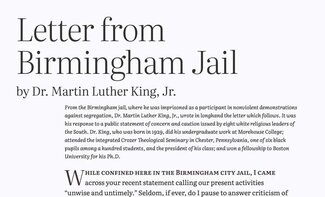
The typesetting is fairly minimalist, but as comprehensive as I could make it. I added some pull-quotes that resonated with me as I read it, but otherwise the text is as I found it in a PDF that I downloaded from the Carson-Newman University website. Some other versions can be found on The King Institute site at Stanford or on the African Studies site at the University of Pennsylvania.
There are two features included that were already planned for the book project: light mode support (which we’re adding this week) and making it work offline. Working through adding a manifest, and using Jeremy Keith’s excellent tome Going Offline from A Book Apart, the site became a Progressive Web App. It works normally when visited in a browser (with the addition of offline-available caching), and can also be saved to your device’s home screen (or PWA directory in Chrome on desktops) where it will work much like any other installed application.
I’ll go into detail on that process soon for the book, but this project is complete, open-source, and live at it’s own domain and available to all. You can find the source on GitHub, and view the live site at LetterFromJail.com. I also added an ‘about’ page with references and ways to get involved with Black Lives Matter and other organizations.
I haven’t figured out who should own it going forward, but hope to explore making a connection with The King Center to ask if they want it, or perhaps an organization with ties to both Black and web communities. I just know it shouldn’t be me. Ideally I can find an organization that will give it a good home and I can turn over the repository and domain to them. I hope I can stay involved in maintaining it, maybe even adding more of his writing—but that’s a conversation for later. I welcome any thoughts or suggestions you’re willing to share.
“The question is not whether we will be extremist, but what kind of extremists we will be”
It is an inescapable truth that the world in which we live (particularly here in the US) has been built on layers upon layers of racism, persecution, and inequality. And while this newsletter may be about web typography, we all have a role to play in making our world, our industry, and our communities more welcoming, inclusive, and fair. By making Dr. King’s letter more accessible and readable, it is to be hoped that others might take inspiration from it as well.
Of darkness & light: letting the user decide
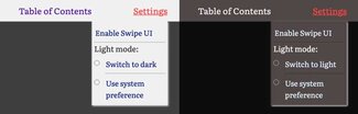
I wrote about this first back in WTN #26, but I’ll give a quick recap. Many desktop and mobile devices now support a light/dark mode at the operating system (OS) level. This means you can set a system preference to have a light background with dark text, or ‘flip’ the contrast and use a dark background with light text. This will change things in all system applications, and any apps that have been designed to support it as well. And since we now have a well-supported media query in CSS to detect that OS preference, our websites can react automatically as well.
This is how I first approached it: if the user has expressed a preference for one mode or the other, the website would automatically adjust. The standard design in ‘light’ mode (most often with dark text on a light background), and a reversed contrast in dark mode (with a dark background and very light colored text). But that leaves out an element of preference on the site itself. In either case—light mode or dark—the visitor to the site might prefer to view it in the other mode. This is an important element in supporting accessibility and really trying to put the user in control of their own experience.
We started the process of giving that control with the Swipe/Scroll setting, which sets a cookie to store that preference to ensure it works the same on repeat visits. Now we’re extending the site’s capabilities with a new setting for light mode.
The language in the settings menu is intended to stay relevant to the settings, so we’re using the ‘:after’ pseudo-element, a ‘:not’ selector, and a media query to provide clear language around switching or resetting the preference depending on the current selection. This seemed a bit more accessible than trying to figure out what a toggle should mean in every combination.
.dark a.toggle-lightmode.switch:after {
  content: ' to light';
}

html:not(.dark) a.toggle-lightmode.switch:after {
  content: ' to dark';
}

@media (prefers-color-scheme: dark) {
  html:not(.light) a.toggle-lightmode.switch:after {
    content: ' to light';
  }
}

.light a.toggle-lightmode.switch:after {
  content: ' to dark';
 }
Betwixt & between
We’re using similar JavaScript to the ’Swipe UI’ setting to update a ‘.dark’ or ‘.light’ class on the HTML element, and absent that class, letting a media query for color scheme preference take over. Thanks to our use of CSS custom properties, we can concentrate everything that needs to change (text, background, link, and accent colors) in a single file of about 25 lines that covers both the media query ('prefers-color-scheme: dark’) and the presence of a ‘.dark’ class. With the media query we also layer in a ‘:not(.light)’ selector to ensure that we don’t swap out colors to the dark mode version of the user has explicitly set their preference to ‘light’.
@media (prefers-color-scheme:dark) {
  html:not(.light) {
    --color-background: var(--color-dark-gray);
    --color-background-accent: var(--color-warm-dark-gray);
    --color-text: var(--color-paper-light);
    --color-a-link: var(--color-light-blue);
    --color-a-visited: var(--color-light-gray);
    --color-a-hover: #{$color-red};
    --color-a-focus: #{$color-red};
    --color-a-active: #{$color-red};
    --color-text-accent: var(--color-light-gray);
  }
}
.dark {
  --color-background: var(--color-dark-gray);
  --color-background-accent: var(--color-warm-dark-gray);
  --color-text: var(--color-paper-light);
  --color-a-link: var(--color-light-blue);
  --color-a-visited: var(--color-light-gray);
  --color-a-hover: #{$color-red};
  --color-a-focus: #{$color-red};
  --color-a-active: #{$color-red};
  --color-text-accent: var(--color-light-gray);
}
More than just color-swapping
It’s important to note that we’re not just reversing the colors. We’re selecting a palette that will work and be accessible in either mode. We’re also making a couple of small typographic adjustments. As screen quality and text rendering has improved, it’s become more and more noticeable that text will appear a little bolder when shown light on a dark background versus the other way round.
So when we activate the ‘dark’ mode, we also lessen the font-weight just a tad, and add just a tiny bit of letter-spacing. It’s a very small amount, but it is noticeable—and adding just a touch more spacing between characters does improve legibility a bit and help preserve overall spacing. If we didn’t do both, you’d end up with text reflow that might feel a bit jarring too.
@media (prefers-color-scheme:dark) {
  html:not(.light) {
    ...
    p {
      font-weight: 350;
      letter-spacing: 0.0015em;
    }
  }
}
.dark {
  ...
  p {
    font-weight: 350;
    letter-spacing: 0.0015em;
  }
}
As in all things, these settings seem to work well with this font, in this environment. It’s important to test for yourself on your own project and adjust the specific values accordingly.
§
Next we’re going to look at a couple more user settings, and polish up the user interface a bit, and perhaps look at some ways we can allow the reader to save their place to come back later, or perhaps share that location within the text with someone else.
Resources
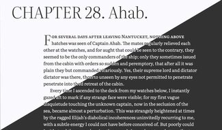
- MobyDick.wales
- The GitHub respository
- Light and user preferences (WTN #26)
- Robin Rendle on dark mode and variable fonts at CSS Tricks
- Perception of Black and White on the Fontshop blog
- LetterFromJail.com (and the code repository on GitHub)