Friday, 27 March, 2020
Once again this week there were a few different threads coming together to inspire this issue. I’m continuing to explore amazing examples of graphic design in the form of publication covers and posters, and focusing on how we can achieve these kinds of effects and techniques on the web in meaningful, scalable, sustainable ways. Those threads include a new variable font from HVD Fonts, a great post on skewed text, a beautiful book from Slanted on KH Drescher’s Berlin typographic posters, and a tutorial from Sara Soueidan on creating textures with SVG filter effects.
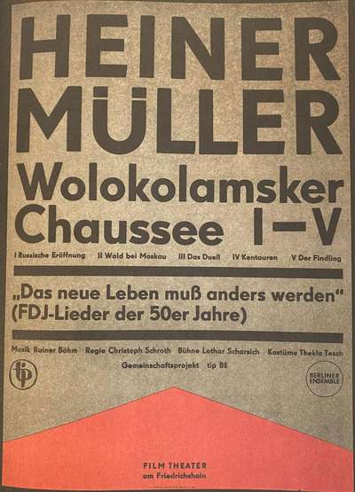
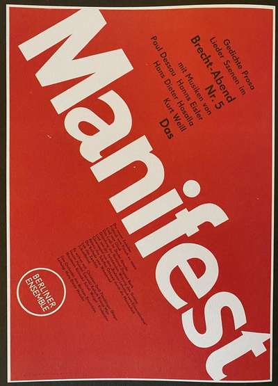
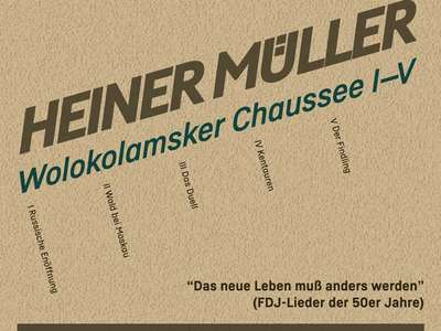
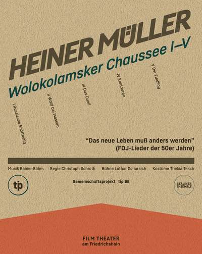
I got my copy of Slanted’s compendium of Drescher’s posters last week, and it is stuffed with wonderful examples of typographic design. One or two really stood out, so I decided to use them as the main inspiration. Both are for Berliner Ensemble, but quite different. The umlaut in ‘Heiner Müller’ reminded me of Christoph Koeberlin’s tweets about some of the alternate character designs he’d worked on for Fabrikat Normal from HVD Fonts. In the other, ‘Manifest’ is set diagonally with other text along the same diagonal axis. This reminded me of Nils Binder’s post on diagonal layouts that he published about a month ago.
:root {
  --angle: -16deg;
}

h1 {
  /* set the 'slnt' axis */
  font-style: oblique 8deg;
  /* trigger the OpenType stylistic set for the alternate Ü design */
  font-feature-settings: 'ss03';
  font-weight: 850;
  letter-spacing: -0.09em;
  opacity: 0.85;
  transform: skewY(var(--angle));
}

ul {
  /* rotate the list to match the headings */
  transform: rotate(var(--angle));
}

li {
  /* switch to single-story 'a' */
  font-feature-settings: 'ss01';
  /* set the text perpendicular to the skewed angle */
  writing-mode: vertical-lr;
}
Tapping in to a really interesting umlaut alternate, the slant axis, and a skew technique gives us a more dynamic headline that could spice up any landing page or blog post. The angle is set with a CSS custom property so we can use the same value when skewing the headlines and rotating the list of acts. The names of those acts are then set using a vertical writing mode so the display at a perfect perpendicular to the rotated text. Setting the list items using grid kept them evenly spaced across the layout.
The bottom half is a bit closer to a recreation, but even that included some fun elements to style like the logos for Tip and Berliner Ensemble, and the color background shape for the footer. Setting borders slightly differently, setting the letters in ‘Tip’, using letter-spacing to match up the lines in Berliner Ensemble, and creating the shape of the background combined a few tried-and-tested techniques without sacrificing text accessibility.
Because the original was a letterpress print on what looked like a somewhat mottled and textured paper, I thought it would be good to add something similar. Harkening back to some talks I saw from Sara Soueidan on SVG filters, I hunted down a tutorial she wrote for Codrops. Using a noise filter I was able to create the paper texture entirely in SVG (which is inline in the HTML), keeping it tiny and fully scalable. I’ve been waiting for a chance to try out some of her techniques and am tickled that it worked out so well here.
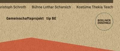
The final touch was to reduce the opacity of the main header, solid horizontal rule, and red background color in the footer to allow just a little bit of the texture to come through. Not enough to impact legibility, but just enough to reference the look of the original letterpress design. Overall I’m really pleased with the outcome. You can see it and experiment yourself over on CodePen.
The whole layout is also responsive as well, though I’ll admit I didn’t spend too much time on the smaller views. But it does show how these techniques can still make your designs much more dynamic and engaging, no matter the screen size.