Part 5: Dynamic Typography Redux: clamp() on it
This week has a big update to the typographic scaling that features some very new CSS about which I’m pretty excited. It’s featuring a new way of defining low, scaling, and high values for things like font-size that removes a bunch of complexity from how I was handling this before. What I appreciate is that we can keep the different sizes we have defined so far for small, mid, and larger size screens—and just layer in the new scaling technique where it’s supported (which is pretty much every shipping browser these days). We’ll right away have font-size and line-height that scales nicely across the whole range fo screen sizes without needing a single media query. Let’s dig into a new approach to making our typography dynamic.
Clamp()-ing on to a new approach
Over the past couple of years I’ve focused on scaling typography based on a technique called CSS Locks, which I wrote about a while back in the newsletter. Conceptually it focused on starting on smallest screens with the smallest size you wanted a piece of text to appear, and scaled that text up along with the screen size until it reached a maximum size specified. But this depended upon breakpoints and a lot of pretty complex math. Recently however support for a new technique has become supported in all the shipping browsers that provides a much simpler approach.

Now, rather than specifying font sizes across three breakpoints with a big complicated formula in the middle, we can control the scale the font-size for all viewports inside an @supports block with a single line of CSS. There are some great articles about clamp(), min(), and max() on CSS-Tricks and on Jeremy Keith’s website for lots more detail. We'll focus on clamp(). Essentially we supply the smallest size, a scaling value that relates to viewport, and a largest size as our three values. The first and last are values we’ve been using all along. The middle value is a combination of a relative value and a viewport-based one. We’ll come back to why in a moment.
p {
  font-size: clamp(1rem, calc(0.5rem + 1vw), 1.25rem);
}
Clamp() works by sizing the text to the smallest value at the smallest viewports, starting to scale the text up as the viewport-based value gets bigger, but won’t allow the computed size to get bigger than the ‘high’ value supplied. The key to even scaling is to try different viewport unit values in the middle part of the formula. Jeremy had a good method in his post, but I prefer to spread the scaling out a bit more, so finding just the right scale value takes a bit more experimentation.
The reason that middle value is calculated this way to ensure that user-initiated text resizing will still work. A purely veiwport-unit-based font-size won’t resize no matter what the user tries.
Looking at the description above, this seems like a pretty run-of-the-mill update. But even adding in some variable calculations and replacements in order to make the system more portable, this represents a massive reduction in code and complexity. I’m really excited to start using this approach much more.
Simple is (almost always) better
I also had a great conversation over slack with Roel Nieskens (the creator of WakamaiFondue.com) wherein he shared a dramatic simplification of my JavaScript check for variable font support—so that’s been incorporated too. This is working nicely in every browser I’ve tested (including IE 11 and lower) to make sure we have the correct font loading process. Here’s the new version:
var vfSupport = "CSS" in window && "supports" in CSS && CSS.supports("(font-variation-settings: normal)");The variable assignment will get either a true or false value if the browser supports the ability to interpret CSS @supports blocks and then in turn reports that it can interpret variable fonts. Nice and neat. Thanks Roel!
Pattern-matching
I added artwork for a few more chapters, and in the course of doing so found a couple more content patterns to think through. In Chapter 7 I came across what were described as plaques on the wall in the chapel. The text itself seemed to fit the semantic description of being a blockquote, but with some specific formatting to call it out a bit differently. Since I already have a more ‘inline’ versus separate blockquote styles defined, adding a third variant seemed reasonable.
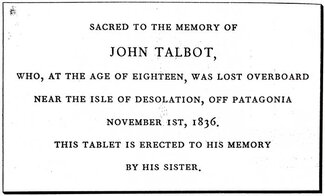
Setting it off with a border was pretty straightforward, and I added a box shadow to give it bit more presence (similar to the Rockwell Kent version). But in the print editions (I’ve accumulated a couple more to compare) the text is set differently than that which surrounds it, and I settled on wanting to set them in small capitals.
.bq--plaque p {
border-color: var(--color-text);
box-shadow: 1px 1px 2px rgba(0,0,0,.75), 2px 2px 2px rgba(0,0,0,.75);
font-size: 0.9em;
text-transform: lowercase;
font-variant-caps: small-caps;
-webkit-hyphens: none;
hyphens: none;
line-height: 1.75;
}
.bq--plaque .name {
display: block;
font-size: 1.25em;
font-weight: 450;
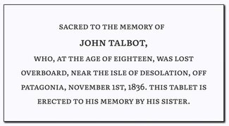
}While ‘all small caps’ are not available as a feature in the font, regular small caps are. So I applied a ’text-transform: lowercase’ and then enabled the OpenType feature for small-caps. The only remaining bit was to wrap the names for each plaque with a span so I could style them a bit larger and bolder, and define them as a block element so they broke onto their own lines. This gave me a nice, responsive design pattern that worked across all three plaque elements.
Number nudging
Another touch I applied was with number styles. I noticed that in the Rockwell Kent edition, they used old-style figures throughout. I felt those would fit well in our edition, so I used 'font-variant-numeric: oldstyle-nums;’ to set them as the default. They didn’t seem quite right for the chapter headings though, so I set the chapter titles specifically to use lining figures. You can see the old style figures in the plaque screenshot above.
body {
  font-variant-numeric: oldstyle-nums;
}
h1 {
  font-variant-numeric: lining-nums;
}
Footnote finagling
While I was browsing through the text I realized that footnotes exist in a number of chapters, but were simply denoted with an asterisk and appear right below the paragraph containing the reference (see the end of Chapter 32 for an example). I wanted to find a better markup solution, but there does isn’t much consensus on format. I based a solution on a write-up on Daring Fireball that seemed well-considered and comprehensive. A reference link is placed inline and typeset as a numerator, which also preserves the same line-height settings in the surrounding text. The ‘sup’ HTML element tends to add space above the line of text in which it’s set, so this approach blends a bit better typographically without impacting semantics. The footnotes themselves are presented as an ordered list at the end of the chapter.
The pattern from Daring Fireball is really user-friendly in that you can link from the reference point down to the footnote text, and then there is a return link at the end of the note that scrolls you back up to where you were.
Middle marks
I also found what could legitimately be described as a section divider in Chapter 32. I really like the traditional ’section mark’ and so repurposed the horizontal rule element. I tend not to use the ‘hr’ tag all that much, but it’s often present in rich text editors so it’s easy to instruct editors to use it that way. I set the border to none, added in the type sizing rules for paragraph text, and used the ‘:after’ pseudo-element to supply the section mark itself. If you look most of the way down to the bottom of the chapter, you’ll see it in action. I covered this in more detail in one of my earlier newsletters.
hr {
  border: none;
  text-align: center;
}
hr:after {
      content: "§";
}
Still room for improvement, but enough for now
This did leave me with a couple of typesetting choices I want to rethink, including the chapter titles (and by extension, the table of contents and navigation). There are also a couple of other text styles that are a bit more like stage direction, so those will probably get an update in the coming weeks as well.