Part 4: Fixing FOUT with font loading & fallback tuning
Last week we added web fonts to our project—both static and variable versions. This week we’re going to add font loading management and style our fallback fonts. I first wrote about some of these ideas and techniques back in 2011 for Monotype’s blog, and they’re still relevant today. This is also the first time in the project that we’re adding JavaScript to the mix. I point this out so you can understand the motivation in my own philosophy about web typography. I want to focus efforts on doing as much as possible with good HTML and then CSS, as I feel that’s the most appropriate. Typography is an enhancement to the content, so I want to do as much with each additional layer as possible.
The first layer is HTML—so we focus on good, sensible markup of headings, paragraphs, etc. Then we add sizes and margins and color. Next we add fonts and additional styles for greater hierarchy and aesthetics. Adding JavaScript at this point is meant to smooth out the process during the loading of the page, and again on subsequent pages. Not necessary, but an enhancement. I don’t want to introduce anything that, should it fail to load or execute, will undo the work that came before. So we’re introducing FontFaceObserver from Bram Stein to smooth out the loading process, and as a bonus we’re also going to add Widow Adjust from Nathan Ford. I’ll explain that one later on.

There are several reasons adding the font loading manager is important. Ever since the advent of web fonts, there have been issues with the rendering of content on the screen. First it was FOUT, or Flash of Unstyled Text. This is where you see a web page load in a default font like Georgia or Arial and then refresh once the web fonts fully loaded. On slower network connections or with larger font files, this could sometimes happen several seconds into the reader’s experience. If the fonts are sufficiently different, could cause significant reflowing of text and interface elements. This was such a jarring experience that some clients refused to use web fonts even if it meant giving up on their own brand typeface.
Apple actually changed the behavior of their Safari browser because of it, and a new acronym was born: FOIT, or Flash of Invisible Text (yes, I know there is a logical/semantic issue with this term, but hey, I didn’t invent it). Safari would actually not display the text at all until the web fonts loaded. Initially this had no timeout, so you might see a blank page with a few random underlines (where links occurred) for thirty seconds or more while waiting for the page and fonts to fully load.
What’s worse: eventually the other browsers adopted the same behavior. What the browsers (and the rest of the web design and development world) did was prioritize vanity over usability. At least over time they all eventually standardized on a 3 second timeout before rendering the content in a fallback font, but in an age when you only have 3 seconds to get content on screen before 50% of your visitors abandon your site—it brings to mind that famous Clint Eastwood/Dirty Harry quote:
Do you feel lucky punk?
We did finally get control over the browser behavior via the ‘font-display’ property. There are a few different options but my preferred one (and also the default on Google Fonts these days) is ‘font display: swap’. This tells the browser to render the content in the fallback font right away, and then swap out for the web font once it loads. But that only solves half the problem. It get’s the content on screen but doesn’t give us a way to reduce the jarring experience of text reflow when the page is redrawn. This brings us back to FOUT, which I contend is actually a feature, not a bug.
@font-face {
  font-family: 'Literata';
  ...
  font-display: swap;
}
In fact by embracing this swap we can reduce our ‘time to readable content’ by almost 2 seconds, bringing that time down from 3 to 1.2 seconds. And with the work we cover in the next sections, we ensure the text is on screen, well-formatted, and easy to read even if the web fonts never show up. (I’ve been spot-checking performance by testing the site on webpagetest.org on a ‘3G Fast’ speed setting)
FOUT is only FOUT if it stays Unstyled
We can fix that, and have been able to do so since 2010. The Web Font Loader was a joint effort between Typekit and Google, and is a bit of JavaScript that would do two things: first, it would allow the font loading request to be asynchronous; and second, it would insert classes into the HTML element of the page that would allow you to call different CSS based on loading status of ‘wf-inactive’ or ‘wf-active’ (or wf-loaded). I tended to focus on the presence of ‘wf-inactive’, as that was the condition for which I wanted to correct. In the years since, Bram Stein from Typekit (and now Adobe) created FontFaceObserver as a new iteration on that idea. This time it ties into the Font Loading API and let’s us set up a promise or two during the loading process. I’ll explain that a little more in a bit, but let’s get back to the importance of that ‘wf-inactive’ class.
Taking the U out of FOUT
When we get this class in the HTML element when the web fonts are not yet active we have a new condition for which we can declare font styles. In addition to something like:
p {
  font-family: Literata, Georgia, Times New Roman, serif;
}
We can follow that with something like this:
.wf-inactive p {
  font-family: Georgia, Times New Roman, serif;
  letter-spacing: 0.0275em;
}
This let’s us do two things: by redeclaring the font-family for paragraphs without referencing the web font, we get that content on screen right away. But since we have this scoped style just for this scenario, we also have the chance to tweak fallback styles to minimize reflow once the web fonts load and the page redraws. In this case we’re just tweaking letter-spacing, but you can also tweak font-size, line-height, margins, and even word-spacing to help reduce the amount of visual transition.
It’s important to remember that in most cases, people aren’t objecting to the fonts changing—they're objecting to the appearance of change. Much like an image loading in blurry and then sharpening, fonts changing without content moving around often goes unnoticed.
Let’s get back to the nerdy bits
I'm not going to dive too deeply into it, but I do want to call out a few things about the JavaScript in the head of the page. First: yes, it does have to be in the head of the page, and it has to be inline. In order to achieve our goal of nearly instant rendering of content, we need to load the FontFaceObserver file right away, and then execute the inline script before the browser goes ahead with attempting to render the page. That’s why it needs to appear at the top of the page rather than in the footer.
Next, let's look at what we want the JS to do.
- Add a ‘wf-inactive’ class (by adding this with JS, we know we won’t mess with the rendering of the page with our regular styles should the JS fail to execute)
- Check session storage for a variable saying the fonts are loaded. If so, swap the class with ‘wf-active’ and go ahead rendering the page
- If no variable is found, check for variable font support. We do this by reading the contents of a CSS custom property that will tell us if the browser supports VFs using its own feature detection
:root {
  --vf-support: false;
  @supports (font-variation-settings: normal) {
    :root {
      --vf-support: true;
    }
  }
}
Now our JS can take over:
function vfSupported() {
  const vfCheckString = getComputedStyle(document.documentElement).
    getPropertyValue('--vf-support').trim();
  if (vfCheckString) {
    if (vfCheckString == 'true') {
      var vfCheck = true;
    } else {
      var vfCheck = false;
    }
    return vfCheck;
  }
}
Once we know if VFs are supported, we can carry on with constructing one of two promises: one for loading variable fonts, one for loading static ones. Either way, once we have a promise fulfilled, we swap the classes and set a session storage variable. This way on the next page load the browser will know much faster that the fonts are in cache and avoid a repaint of the screen that can happen especially in Chrome while it's checking the cache. Bram has lots of documentation on different ways to structure the promises, but since in most circumstances the variable fonts are supported, having a single promise for both variable fonts makes the most sense.
So now we have the right class added to the page, and the CSS we worked on earlier can take over. Next we’ll look at what I’ve added to make the CSS tweaking a bit easier.
Fallback styles at the click of a button
I’ve added in a button so you can toggle the web fonts on and off. I use it to flip back and forth, using the developer tools to tweak the fallback styles until I minimize reflow. Then I copy the changes back into the project. All in all it usually only takes me an hour or so to get the styles close enough that you don’t see much movement during the loading and redraw process. And it’s a totally self-contained snippet that you can easily drop into any project.
This is all part of the goal: achieve a typographic ‘harness’ you can move from one project to the next, focusing all the changing elements in one place. In our case, all of the variables we might change in the core typography are in one place, and then the minor corrections for the loading process are concentrated inline with the rest of the responsive typography components.
Bonus feature: leave no orphan behind
The term ‘widows and orphans’ typically refers to things like one line of a paragraph at the bottom of one column of text, or only a single line bleeding over to the top of the next. But it also can also refer to a single word on the last line of a paragraph—and this has been one of the most vexing things about typesetting copy on the web for years. I once showed a fix for this to a group of editors from Vanity Fair and other such publications—and of all the typographic tidbits I showed that day (it was a half-day workshop), this was the one that got me hugs all around. People who care about words, care about how they are presented. But when you can’t predict the size of the screen or the width of the column, how can you tailor your copy or your design to avoid it? You can’t.
However, since we’ve added some JavaScript anyway, I thought this was as good a time as any to introduce Nathan Ford’s Widow Adjust. I’ve used it’s predecessor, Widow Tamer, for years. And while he has a lot more features packed into Type.js, I actually prefer the single-function focus of Widow Adjust. In our case we’re using it to dynamically adjust the right-hand padding on our paragraphs in order to end up with at least 15 characters on the last line. Since we’re not inserting any markup, only adjust ing padding, we don’t have to worry about breaking a word: the browser will handle all the text layout and hyphenation normally.
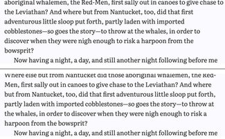
Under the hood what’s happening is the JavaScript library is going through each element we specify (all the paragraphs in the content area) and adding padding-right as much as necessary to achieve the last line length we’re looking for. Since it only ever acts upon once chapter at a time, this happens so quickly as to be almost imperceptible. And as it is also triggered on window resize, it always keeps up with browser window changes.
wt.fix({
	elements: '.chapter p',
	chars: 15,
	method: 'padding-right',
	event: 'resize'
});
I’ve only added this for paragraph tags, but it’s also something that might make sense for other elements. If we come across that we can always add it later. But for now, we’ve added yet another typographic refinement that requires zero effort on the part of the content editor or creator. It just works.
Keeping the image of respectability
On the build process front, I’ve added in a feature that Zach has been working on for Eleventy (the static site generating framework I’m using on this project): a responsive image plugin. The illustrations are beautiful, and I want them to be kept at a very high quality. But serving a 1600px wide image to users on a phone just didn’t sit right. And as we want this to be a sustainable solution for any long-form content, getting the images right from the start was important to me.
So when Zach shared a link to this (it’s an early work-in-progress), I jumped at the chance to test it out. So now we have a responsive image element setup that automatically generated resized images and constructs an image tag with ‘srcset’ and ‘sizes’ to serve appropriately-sized images to different size screens.
There are lots of ways to do this, but I wanted to simulate a typical content management process. Often this is a higher-resolution-file-than-ideal getting uploaded, so we want to make sure the system takes care of creating smaller derived images and writing markup to ensure only an appropriately-sized image is served to smaller-screen devices. All without requiring a lot of image resizing or custom code. I also snuck in an easy performance win by adding a flag to use the ‘loading='lazy'’ attribute for images farther down the page.
Performance health check
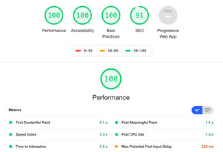
I’m happy to say that the Lighthouse scores are testing at 100 for Performance, Accessibility, and Best Practices. SEO isn’t quite there yet but as soon as I work out a way to grab part of the first paragraph for a META description tag, we should be at 100 there too! Not that I’m concerned about SEO for the book, but if people end up sharing a chapter link I would like something meaningful to show up.
The score so far
So we’ve now got the whole book. We’ve loaded the fonts, set up the typographic hierarchy that scales per element and by screen size, styled the chapter openings with drop cap and first-line styles, added responsive images, and even saved all those orphans. And we’re getting it all on screen really fast.
Next week we’ll be taking the responsiveness even further by making the typography more dynamic—incorporating some new features in CSS that are just landing in all the browsers. And so far, all of this is just as relevant to regular websites as it is to web-based books and other long-form content. Stay tuned! We’ll be turning our attention to ‘book-ishness’ soon :)
Resources
- Latest live version at mobydick.wales
- Source code on GitHub
- FontFaceObserver
- Bram Stein’s Webfont Handbook
- Zach Leatherman’s post on font loading strategies for CSS Tricks
- Nathan Ford’s Widow Adjust
- Zach’s responsive image plugin (caution: work in progress)