Glyphs as graphics: make your headlines hit harder
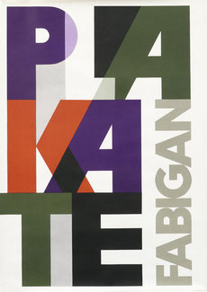
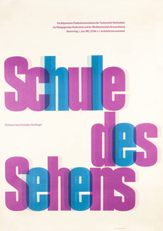
When looking through some vintage posters on the International Poster Gallery’s site not long ago I was really struck by this work by Austrian painter and poster artist Hans Fabigan and another one by an unknown artist that use type as the central graphic elements in their respective designs. It got me thinking again about creating more visual elements out of text, and I wanted to see how it might work when combined with some other recent experiments. The basic premise is playing with scale, transparency, and overlaps to create a really graphic element out of the main page title. Not so much that it’s unreadable, but enough to create a more solid element to anchor the design without compromising ease of content editing and accessibility.


While this technique is drawn from a poster design, there’s no reason we can’t adapt it to use on a web page. In this case as a main page title, but the same ideas could be used to make a teaser or landing page that packs some major visual impact.
Bringing it to the web
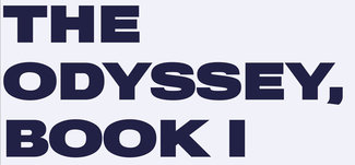
We’ll start with a font that has a lot of width and weight, giving us a lot of heft to play with.

Now we’ll add some CSS to create the transparency and overlap. This is all pretty standard stuff, but by adding them together we can allow the words to break as they need to, make the text color slightly transparent, and reduce the letter and line spacing to create a more solid overlapping block of shapes. The transparency helps maintain enough visual clarity so the reader can recognize the letters without undue difficulty.
.overlap {
  /* set up transparency and overlap */
  color: rgba(0,0,45,.5);
  letter-spacing: -0.25em;
  line-height: 0.7;
  word-break: break-all;
  word-spacing: 0.35em;
}
Just a few lines of CSS gives us this, which may be just enough in some cases. Even without anything more, it's starting to look pretty interesting.

Finally it seemed like it would be fun to vary the color a bit more. Pulling ideas from a great article by Michelle Barker on accessibly splitting text and combining with some ‘plain vanilla’ JS to put it in action, the script splits the text, wraps each element in a span, and adds some ARIA bits to ensure it still reads as a single string of text with assistive technologies. Then we add a few nth-child selectors at varying intervals to create a more random-feeling alteration of colors. The final effect is still easy to apply and modify, but adds a nice bit of flair to the overall experience.

Michelle used splitting.js in her experiment, but I had to work out something that didn’t require an external library, so I’ve created something similar with plain JS. The idea is to take the text content of the element (in this case the H1) and add the necessary bits without requiring any additional markup on the text of the element itself.
// Text from the split-text element
const splitElement = document.querySelector('.split-text');
const str = splitElement.innerHTML;

const words = str.split(' ');
const chars = str.split('');

// Remove the existing text so it can .be replaced by the characters in spans
splitElement.innerHTML = '';

// Set up an aria-label so screen readers will still read out the whole string
splitElement.setAttribute('aria-label', str);

chars.forEach(function (item, index) {
  var c = document.createElement('span');
  // and give it some content
  var letter = document.createTextNode(item);
  // add the text node to the newly created span
  c.appendChild(letter);
  // add the newly created element and its content into the DOM
  splitElement.append(c);

  // Add aria-hidden to each character if the aria-label has been applied to the parent
  if (c.parentElement.getAttribute('aria-label')) {
    c.setAttribute('aria-hidden', true);
  }

});
Now that we have the spans around each letter we can apply a smattering of nth-child selectors with different repeat-counts to create a more random alternation of colors for the letters to complete the effect.
/* mix up the letter colors a bit */
.colors span:nth-child(odd) {
  color: rgba(0,0,75,.4);
}

.colors span:nth-child(5n+1) {
  color: rgba(35,50,00,.5);
}

.colors span:nth-child(7n+0) {
  color: rgba(0,80,95,.55);
}
These techniques can add some real punch to your design without requiring lots of additional markup or compromising accessibility. It’s easily tweaked, and would be a snap to integrate with a CMS (possibly as one of several styles to be utilized).
I hope this helps fire up your imagination and gets you thinking about more ways to use type as a graphic element—and not just as text to be read.
Resources
- Example project on CodePen
- Splitting.js
- Michelle’s article on using it accessibly
- Find some inspiration from these gems at International Poster Gallery