Part 3: Adding web fonts—giving voice to our words
This is a big week for the project. While it was an important step last week to establish some basic responsiveness, we couldn’t really nail down the typography until we added the typeface. Too many aspects of the feel, proportions, and overall ‘color’ are tied not only to the specifics of the typesetting values, but also to the typeface itself. It’s important to remember that not only are we working with spacing around letters and words, but the typeface choice involves looking closely at the spacing inside the letters, and finding balance between the two.
Introducing Literata (v3)
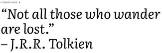
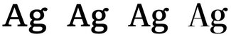
This week we’ll be adding in a new typeface in both static and variable form, and I’m really pleased to be able to share that choice: Literata (v3) from TypeTogether (on behalf of Google Fonts). I’ve been working with this version for a few months now and am super excited to finally be able to share it with all of you. Literata was originally commissioned by Google to be the font for their ebook reader application back in 2014. Now in its third iteration, they’ve expanded the weight range and added optical sizes for both static and variable versions. It’s really lovely, and has been designed from the beginning for long-form reading on screens.
This version features 4 different optical size versions of the static fonts, plus a variable version. They all feature a weight range of 200-900 in upright and italics. Since the Github repository only has the source files, I’ve compiled all of them as ‘woff’ and ‘woff2’ (just ‘woff2’ for the variable one) and included the entire family in case you want to use them. Note that they’ve been subset to Latin 1 Extended already, so if you need a larger character set you might have better luck building from the source files on GitHub.
Fine optics
The optical size static fonts are tuned for 7pt, 12pt, 36pt, and 72pt usage. I’ve opted to use them for ‘smaller than body’, ‘body text range’, ‘medium headings’, and ‘big headings’. While using these in our typesetting does then entail loading more font files, if the goal is to make the best reading experience then this is what we should do. And once we add the variable fonts, it cuts the data download and reduces the number of file requests. You can see the comparison of optical sizes alongside the variable version over on CodePen.
Bringing Literata to our literature
If I were sticking with a more typical approach to font selection, I would likely have chosen 5 different files at most: 4 for body copy (regular, bold, italic, bold italic), and perhaps one other weight for larger headings. But since the goal is great typography, it felt like more of our overall data load could be dedicated to fonts.
So I leaned in to the available optical sizes and tailored our font selections for intended size in addition to weight. This brought our font tally to 10 or so—but that’s still only around 350k of font data. When the variable font versions are loaded, it drops to only 2 requests and about 300kb of font data. Given that each chapter typically has only 2-4 images and so far we’re loading no Javascript at all, devoting some download to fonts (which are cached form page-to-page anyway) seems just fine.
Of note: we could have saved almost 100kb of font data if we had stripped out more of the OpenType features, but retaining true small caps, ligatures, and alternate numeral styles will be a big part of the design, so seemed a worthy tradeoff.
About @font-face
If you take a look at the font declarations, you’ll see they’re quite extensive: I’ve included every weight (upright and italic) for every optical size, plus the two variable fonts (caniuse variable fonts support). We’re not loading all of these, but I thought it might be easier for you to be able to just copy that file and pare it down to what you want to use. A font download isn’t triggered until it’s called for in a font-family declaration, so there’s no concern about unnecessary data download.
In order to then use the fonts in our styles, we’ll continue with our practice of progressive enhancement: first we declare the static fonts (with fallbacks), then we include an ‘@supports’ block to layer in the variable fonts. Since CSS has to be parsed first before anything else happens, the browser will never download both static and variable versions referenced in the same selector.
h1 {
  --text-opsz: var(--h1-opsz-l);
  font-family: "Literata Display", Georgia, "Times New Roman", serif;
  font-weight: 300;
}
/* Load variable fonts instead for browsers that can render them */
@supports (font-variation-settings: normal) {
  h1 {
    font-family: "Literata Variable", Georgia, "Times New Roman", serif;
    font-variation-settings: "opsz" var(--text-opsz);
    font-weight: 250;
  }
}
Time to sweat some details
Now that we’re loading the right fonts we can revisit the typography overall and make some adjustments. Since we now have a much wider weight range and a set of optical sizes to work with, we can set about using that vocabulary. I decided to play with the extremes of weight with the book title and chapter titles: 900 weight on the former, but only 250 for chapter titles.
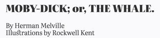
This, coupled with the highest value for optical size, gives a really distinctive feel and let me make the headings even a bit bigger without feeling overwhelming. I also enabled discretionary ligatures for headings so we can get those lovely connecting strokes between lower case ’st’ and ‘ct’ (among others).
h2 {
  font-family: "Literata Deck", Georgia, "Times New Roman", Times, serif;
  font-variant-ligatures: common-ligatures discretionary-ligatures;
}
You can also see below in the styles for the first line of the paragraph that we’re utilizing a slightly different weight and true small caps for the first line. Since we’re using the OpenType feature to get the small caps, we already have some emphasis on that first line. I wanted the type to stand apart, but using the bold weight as well was a little too much. So where we’re using the variable font we’re able to tailor the weight a bit and call for 525 rather than 625 (the weight we’re using for bold). These values are for the variable fonts; we’re calling for 500 and 600 weights in the static files.
strong {
  font-weight: 600;
}
@supports (font-variation-settings: normal) {
  strong {
    font-weight: 625;
  }
}

.chapter > p:first-of-type::first-line {
  font-variant-caps: small-caps;
  font-weight: 500;
}
@supports (font-variation-settings: normal) {
  .chapter > p:first-of-type::first-line {
    font-weight: 525;
  }
}
But is it ‘book-ish’ yet?
Overall, even with just a couple of minor changes, the whole feel of the project has taken big leap forward. But it didn’t feel done. I started to think more on what would make it feel more like a book, so I went back to look at a few in print and electronic form. Thankfully I had three I really like in both formats to look at in greater detail.
Starting on the smallest screens, I honed in on a few specific aspects of the design that needed some attention: margins, line-height, and weight. Typically the three aspects of paragraph design that form the basis of good typography are font-size, line-height, and line-length. Since I didn’t want to reduce the font size below a default 100% size, I thought I’d look at font-weight instead; and since the focus initially was on the smallest screens, line-length was going to be dictated by margins.
As I mentioned, three eBooks stood out to me from ones in my collection: Web Typography by Rich Rutter and The Shape of Design by Frank Chimero (both on iBooks), and The Book by Keith Houston on Kindle. I’m not sure that I felt any of them were exactly what I was looking for, but their differences gave me a lot to think about. Some margins felt too big, some type choices felt heavier or lighter than I wanted. But all in all significantly better than most I’d seen.
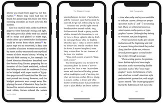
So the challenge was to look at these examples, decide what I liked best about them, and then try to adjust the settings on our typography to get a result that felt right for our project. I wanted to maintain roughly 45 characters per line if possible (on a recent iPhone ’non-plus’ size), so I increased the margins a bit. That felt better, but vertically it was still a little cramped so I opened up the line-height a bit too. Finally, since we have the variable font to play with I tried reducing the weight just a little bit from 400 to 385. This lightened the overall color just a tiny bit, and taken all together seemed to really refines the overall design.
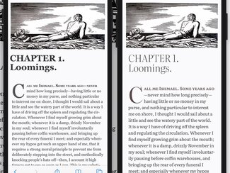
One of the things you might notice in comparing these two is that the font size appears different. That’s actually not true: both are set to a default 100% or 1rem. But the more generous x-height and optical size corrections on the right make the text more open and legible. It does have an impact on line length, but regardless the feel is much more comfortable.
Overall I’m really excited with how this is looking, and am enjoying the reading experience. I spent a little more time updating the header and footer, and turned the end mark into an SVG so we can recolor it more readily. I’ve also added some additional artwork for chapters 2 and 3. That will be an ongoing process, and I still want to work out a better solution for making the images responsive. That should be something I can work out at the template level so hopefully will be a more site-wide update in the coming weeks.
Next week we’ll get into one of the most frequently overlooked performance and rendering bottlenecks: font loading management and styling our fallback fonts for a better experience during the page loading process.
Resources
- Latest live version at mobydick.wales
- Source code on GitHub
- Literata on TypeTogether, GitHub, and Google Fonts
- Optical size explained
- Literata optical size demo on CodePen
- Web Typography by Rich Rutter
- The Shape of Design by Frank Chimero
- The Book by Keith Houston
- Part 1: Introducing the project
- Part 2: Responsive typography