Friday, 3 April, 2020
Inspiration has struck yet again in the form of an email from International Poster Gallery in Boston. I love vintage travel posters, and this Rio advertisement by Joa circa 1950 really grabbed me. The big graphic use of type as compositional object and mask, the strong diagonal interpretation of the boardwalk at Copacabana Beach, all emerging from a luscious deep blue. It’s a really beautiful design.
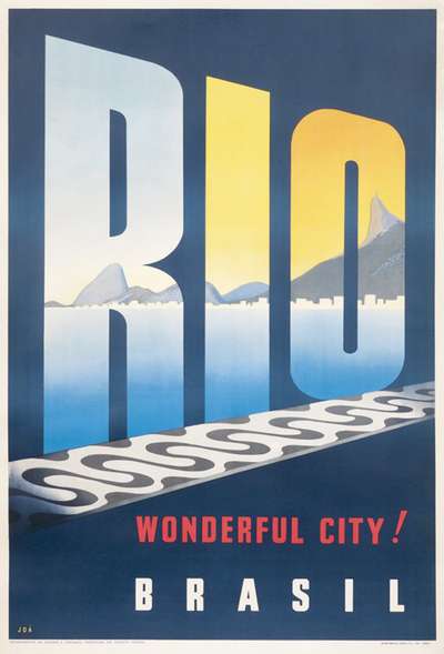
Aside from just looking good, the techniques that really intrigue me are the combination of using a super heavy typeface as a mask for a secondary image, and skewing the text with a perspective effect to further enhance the strong directionality of the composition and illusion of space that it creates. These are wonderful techniques that add a real dynamism to the design, but are rarely seen on the web.
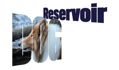
It occurred to me that a couple of these techniques have already been covered and could be combined in a fun way to create a similar overall design on the web. We covered masked and clipped text and image back in issue 29, and last week we played around with skewing live text. Adding a perspective distance to the transform can give us the receding effect we want, and keeps all the text ‘live’ with no additional classes added to the markup.
This is really important: in order for an effect like this to be viable on the web, we want to ensure it can be set up in a system. By focusing on the ability to substitute any photo and any string of text, the effect could be generalized enough to incorporate into a CMS, allowing for enough variation that it can still feel fresh. I would envision incorporating several of the techniques we’ve covered so that whenever you want to have a more unique headline, you have plenty of choice and flexibility without having to custom-code everything.
When I started working on this demo, I knew I needed to find a typeface with a lot of ‘surface area’ in order to work well as a mask and show enough of the photo underneath. As has often been the case, I knew I had something at hand from DJR’s FontOfTheMonth.club that would work: Bild! David released a variable version with a width axis that, when combined with the perspective and skew effects would really exaggerate the effect perfectly. I used Bild Widths for both parts of the title, and put the open source gem Work Sans (the variable version) to the task of the tagline.
.reservoir {

/* perspective skew */
  transform: perspective(10cm) rotateY(-30deg);
}

.dog {

  /* Image masking bits */
  background: url(https://s3-us-west-2.amazonaws.com/s.cdpn.io/57225/IMG_8982.jpeg);
  background-size: cover;
  -webkit-background-clip: text;
  background-clip: text;
  background-position: -12vw 3vw;
  color: transparent;
  ...
  /* perspective skew */
  transform-origin: center left;
  transform: perspective(20cm) rotateY(30deg);
}
In the code above I’ve removed the positioning and general text style bits—but the relevant bits about masking and skewing are what’s central to the design. Note that in positioning the masked photo you’ll want to match the font-size units and background-position ones so they scale in a relatively uniform manner. In this case I’ve used VW units so they scale with the window size.
It felt like something was missing, and the boardwalk pattern from the original poster gave me an idea. I went hunting for CSS background gradient patterns and found a collection of them from CodePen. I grabbed one that felt vaguely waterlike, and modified it to give me the overall palette I was looking for. Once I reduced the contrast enough, it sat in the background nicely, and I can imagine that as a really interesting texture if this were done as a lithograph.
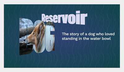
I’m really happy with the result—not so much as a piece of artwork on its own, but once again as a demonstration of techniques that can be used on the web in interesting ways. I think it’s worth challenging ourselves to keep learning about and exploring great graphic design and finding ways to reinterpret it in the context of a multi-device web. Not everything will translate—or should—but if we take a little extra time and push past just getting it on screen, we’ll create a more compelling experiences that will really stand apart in a web of so much of the same.