Part 6: On the nature of ‘book’-ishness
This week is one I’ve been awaiting for quite some time. Really since before I even started this process. It’s also the first time I’m posting something that I know is broken in a lot of browsers. But where it works properly, it works really well and I kind of love it. This week, we go from simply putting text on the web to making it feel like a book.
I’d had the idea that something like this might work for quite a while, but there were too many missing parts. Finally about a year and a half ago my friend John Berry asked me about collaborating on a project to create a web-based book for a friend of his. This was the push needed to see how much could be done now that the web had advanced a bit more. Turns out it’s come farther than I’d realized.
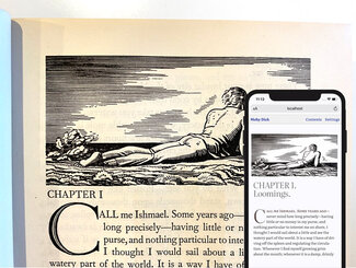
While we’ve been able to add quite a number of typographic details on websites for a while now, it’s not how I’d like to read a book. I’ve always felt the missing part of longer-form reading was the notion of a paged experience (like a book), rather than scrolling down a web page (like, well, a web page). The reason I think this matters is it creates a unit of content within the whole that helps define place and progress. A single long scroll makes it really difficult to gauge progress, and I think contributes to greater reading fatigue due to not having that little break that comes with completing a page before turning to the next.
After some initial experiments with small, targeted use of CSS Multicol, I got to thinking about how that might interact with viewport width units once they became widely supported.
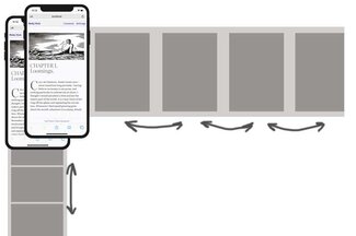
It turns out that if you cap the height and set the column width to 100vw with a column count of ‘auto’, the browser will do the rest. With the container set to allow scrolling along the ‘x’ axis (wide), we right away have nicely divided screens of content flowing from one column/page to the next. And this can easily flip back and forth between viewing modes—giving the reader a choice
.main-content {
  overflow-x: scroll;
  scroll-snap-type: x mandatory;
  overflow-y: hidden;
}
article {
  columns: 100vw auto;
  column-gap: 0;
  height: 80vh;
  widows: 2;
  orphans: 2;
}
There are certainly some caveats with regard to support, but overall it works pretty nicely and can be easily scoped with a toggle class to go back and forth between viewing styles, or base it on browser capabilities with @supports.

Initially I created a couple of JavaScript buttons that would scroll the content to the left or right, but I knew that CSS Scroll Snap was becoming a thing and I wanted to try it out. Unfortunately it turns out you need a block-level element to which you can snap, and the artificially-created columns don’t count as such. But with a little bit of JS, we can fix that too. I muddled my way through figuring out the width of the multicol element, figuring out how many ’screens’ wide that is. With that, we can create a div for every screen-width and line them all up using Flexbox. Now we can snap to the left edge of each div, giving us the effect we’re looking for: a nice smooth swipe to the left or right will always land on a nicely centered page of text.
I was able to improve this a bit last year when Rachel Andrew published an excellent piece exploring CSS fragmentation over on Smashing Magazine. That helped fill in my understanding of the spec and it’s varying level of implementation and support. It also pointed out some typographic refinements that I didn’t even know were possible.
I’ve added some JS to create the divs to snap on, and another bit that will add the ‘swipe’ class to the page, check for the browser cookie, and manage the on/off settings. I'm using a combination of inline JS for speed (so we render content the right way the first time) and in our main JS file to create some reusable functions for resetting the page swiping settings and div markers for scroll-snapping.
Not really all that much code to create such a nice effect:
// inline JS
document.documentElement.className += " swipe";

// Check for Swipe UI preference
if (document.cookie.split(';').some((item) => item.includes('swipe=on'))) {
  // set a cookie to save the setting
  document.cookie = "swipe=on;max-age=31536000;path=/;samesite=strict";
} else {
  document.getElementsByTagName("html")[0].classList.remove('swipe');
}

// in scripts.js
window.onload = function(){
  pageCounter();
  swipeCheck();
}
window.onresize = function(){
  pageCounter();
}
function swipeCheck() {
  if (document.getElementsByTagName("html")[0].classList.contains('swipe')) {

    // check all the swipe UI toggles on the page

    // set a cookie to save the setting
    document.cookie = "swipe=on;max-age=31536000;path=/;samesite=strict";
    pageCounter();
  } else {

    // check all the swipe UI toggles on the page

    document.cookie = "swipe=on;max-age=0;path='/';samesite=strict";
  }
}

function pageCounter() {
  var contentContainerWidth = document.getElementById("main_content").scrollWidth;
  var windowWidth = window.innerWidth;
  var pageCount = Math.floor(contentContainerWidth / windowWidth);
  document.body.style.setProperty('--page-count', pageCount);

  var currentDiv = document.getElementById("pager_wrapper");
  // clear out existing child 'page' divs
  currentDiv.innerHTML = "";

  // add the newly created element and its content into the DOM
  for (let i = 0; i < pageCount; i++) {
    // create a new div element
    var pageDiv = document.createElement("div");
    // and give it some content
    var newContent = document.createTextNode(" ");
    // add the text node to the newly created div
    pageDiv.appendChild(newContent);
    pageDiv.classList.add('pager-wrapper--page');
    // set margin-left to keep divs in place
    currentDiv.appendChild(pageDiv);
  }
}
Setting(s) the stage
I’ve added a new menu item up top, and made both touch or click-enabled rather than hover. We’ll be adding more to the Settings menu soon, but for now it includes simply a toggle link to turn the ‘Swipe UI’ on or off. This setting is saved as a cookie so it persists from page to page and visit to visit. The cookie has an expiration date of a year from when it is set, so even coming back in another session you’ll still get the same interface you set the time before. Try turning the Swipe UI on and see what happens next.
Where we’re trying to go
Let’s define some goals. First, I don’t want to disrupt the basic functioning of it as a site, or require changes to the markup. Second, ideally when activated it should be just as fast and smooth as scrolling up and down. And finally, it shouldn’t be breaking content across columns (i.e. ‘pages’). Honestly the first two were pretty easy. The last is what’s proving to be most cantankerous.
Word flow
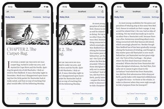
Text generally flows nicely from one column to the next, so that aspect is fine. An added bonus comes in the form of how text is balanced between columns. There are two attributes we can set that come into play: widows and orphans! In this case, the more traditional meaning: how many lines from a new paragraph are required at the bottom of one column (versus pushing to the next one), or how many lines are required at the top of the next one. Since we already have a pretty good solution for single words on the last line, where this is supported we have some fairly comprehensive typesetting guardrails in place. Support is actually pretty good, though it’s not yet there in Firefox.
Blocks of this and that
Some elements we want to keep from breaking across columns: blockquote elements (plain text or ones with borders, like in Chapter 7), and images. Those look particularly weird when that happens. Thankfully we have a relatively-well-supported ‘break-inside’ property, which we can set to ‘avoid’ (and have it actually work). The content simply gets bumped to the next column. For full-width content this can cause some empty space at the bottom of the column where it would have started, but that’s better than half an image.
Where it works
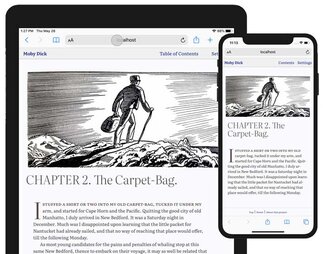
Where this really shines so far is on a phone (at least in iOS. I don’t have a good emulator setup or physical android device to test, but I’ll get sorted out soon enough). I really like browsing through the text by just swiping to the side. It feels just as natural as an eBook reader, but with the variable font optical sizing, widow & orphan control (all kinds), and general attention to margins and spacing it feels so much better to me. I haven’t had a chance to try on a physical iPad, but the emulator seems to render things as I’d hoped as well. I’m looking forward to picking up an iPad this summer to spend more time finessing for that form factor.
Where it (sort of) works
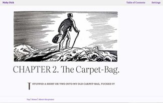
Firefox does get a fair amount right, but falls short a bit with the initial cap. That tends to get cut off at the bottom of the column rather than pushing the whole paragraph to the next. Otherwise, the content flow (including images and blockquotes) is pretty good and very smooth.
Where it breaks (badly)
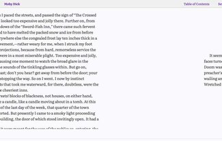
Things are not well in Chrome-town. What I’m seeing in Chrome is really disappointing: text running off the bottom of the screen at the bottom of one column, the space preserved for the overflowing text on the next one but not showing up there (just white space).
I’m not seeing this behavior in an earlier experiment though, so I’m starting to suspect a bug surfacing between the implementations of Multicol and clamp(). I’ll be making a reduced test case on CodePen to try it out without all the surrounding stuff to try and verify. This may also be at the root of the Firefox rending problems too.
So why am I shipping this?
I weighed the pros and cons of putting this out there and decided it was worth it for several reasons. The main one is it’s heading towards a better reading experience than anything currently available on digital devices: more typographic control, more access to great typefaces, more support for new technologies like variable fonts that add to the level of finesse we can achieve. And we haven’t even gotten to the other new feature ideas I have brewing.
Second is to demonstrate to the other browser vendors what’s possible, and what needs improvement and/or implementation. Realistic use cases go a long way to help convince teams to spend their precious resource time on any given problem. I’d like this to be a way to explore, identify, and bring attention to those problems.
Finally, while this is a fairly straightforward book, others might benefit even more from being in a browser. If I were to do another book on typography, I’d want to include some sort of code editing/display capability (like an embedded CodePen or something like that), and keep the content easily editable with some form of content management system behind it. All of which pushes this much further than is currently possible in any eBook form.
I think these are strong reasons to ship this—warts and all. I want you to see what’s possible, while still maintaining a site (in the normal scrolling format) that works for everyone. I might put more guardrails in later on, but for now I want people to see how good it can be, and where it’s falling down a bit. After all, the purpose of this project is to learn, to push boundaries, and re-examine just what a book is, how to make a digital one better in some ways than print, and to rival print in more ways than we previously thought possible.
In the coming weeks we’ll be adding more user preference features like light mode support, text size, contrast, and spacing, and more enhancements to the ‘book’-ness like chapter progress indicator and persistent bookmarking.