Part 7: The reader’s right—preferences and light modes
7 Jul, 2020
There are a couple of things I’d like to show you this week. One is a relatively small but important...
Web typography tips covering design fundamentals and more advanced editorial design and performance techniques
7 Jul, 2020
There are a couple of things I’d like to show you this week. One is a relatively small but important...
29 May, 2020
This week is one I’ve been awaiting for quite some time. Really since before I even started this process. It’s...
18 May, 2020
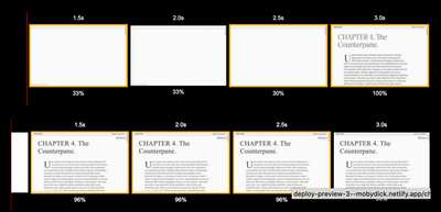
This week has a big update to the typographic scaling that features some very new CSS about which I’m pretty...
11 May, 2020
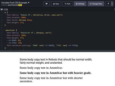
Last week we added web fonts to our project—both static and variable versions. This week we’re going to add font...
4 May, 2020
This is a big week for the project. While it was an important step last week to establish some basic...
27 Apr, 2020
The feedback I’ve received over the past week has been amazing, and matches my own excitement about this project. I’ve...

20 Apr, 2020
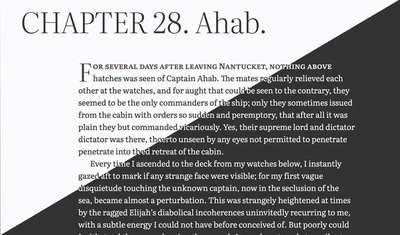
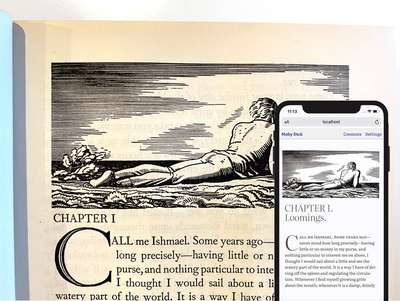
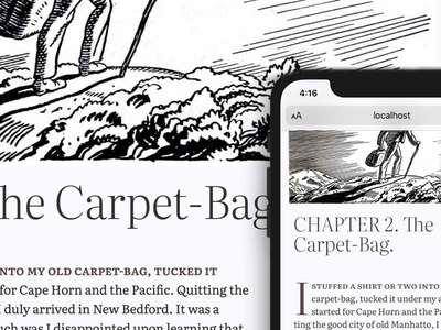
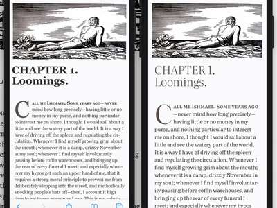
I don’t know when it was I started using the text of Moby Dick in my workshops and talks. Likely...
10 Apr, 2020
This week’s issue took a bit of a meander. I started thinking I might make another Google Fonts API tutorial....
3 Apr, 2020
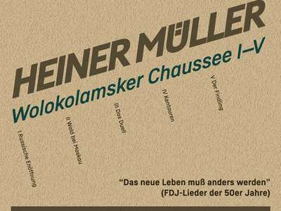
Inspiration has struck yet again in the form of an email from International Poster Gallery in Boston. I love vintage...
27 Mar, 2020
Once again this week there were a few different threads coming together to inspire this issue. I’m continuing to explore...
16 Mar, 2020
A few things coalesced to inspire the issue this week, and they bring us back to exploring some beautiful cover...

6 Mar, 2020
This week marks the launch of a project nearly a year in the making. Or at least it’s been almost...
29 Feb, 2020
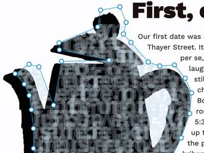
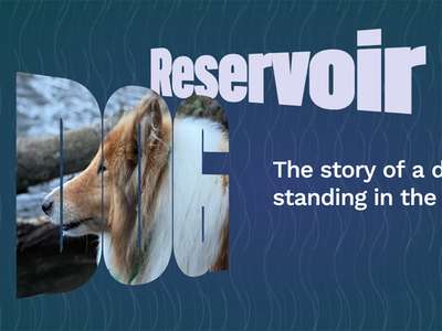
This week we’re going to dig in to more text effects. In keeping with the idea of exploring more editorial...
7 Feb, 2020
Following on from last week’s issue (and inspired a bit by receiving the latest Type Directors Club annual in the...
31 Jan, 2020
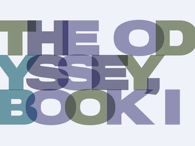
When looking through some vintage posters on the International Poster Gallery’s site not long ago I was really struck by...
22 Nov, 2019
One thing I’ve ended up doing on several projects lately—including my own site—is to style ordered (and unordered) lists with...
27 Oct, 2019
Last week I wrote a bit (well, a lot) about what the web wants from type designers, foundries, and providers...
18 Oct, 2019
[Spoiler alert: it’s you, and your variable fonts] I wrote a bit about this in my ATypI wrap-up, but felt...