Variable Fonts: What web authors need to know
Last week I wrote a bit (well, a lot) about what the web wants from type designers, foundries, and providers when it comes to variable fonts. This week I’d like to talk about how we teach the web community how to use them. There are more and more people writing about variable fonts, what they are, and how to use them—which is amazing. But sometimes it’s hard for event the most knowledgeable authors to keep current with the latest developments and be sure the information that’s being provided is really up to date. And since this is a new and evolving space, that’s perhaps not that surprising.
So this week I’d like to provide a simple, stripped-down look at the latest evolutions in the CSS specifications, updates on browser implementations, and why we should be using the appropriate CSS attributes where supported rather than resorting to ‘font-variation-settings’ all the time. I hope that this will be a useful resource, and while I can’t update the email once you receive it, I will keep it updated on my site as things change in the future.
I’m going to cover this from the ground up, as it were. We’ll start with the @font-face syntax itself—which I only discovered recently has changed in the past few months—and cover how you can write it to support both the current and upcoming implementations. Then we’ll look at the attributes that fully supported, why it’s important to use them, and talk about the differences between doing so and with using the lower-level syntax of font-variation-settings
About @font-face
Due to the pace at which variable font support was initially implemented in browsers, the specifications have been evolving along with that support, and that has left support in place for versions of the syntax that are no longer considered valid. Because of this, while it’s still possible to use the older implementations, there is no certainty that they will always continue to work. Which is why it’s best to write your code in such a way as to support the best defined current specs and include the upcoming ones as well where possible. That way your code will just continue to work. Let’s get to specifics.
When support was initially implemented, specifying the format for a font ‘src’ worked with the older, simpler syntax of just declaring the file format (e.g. ‘woff2’)—but fairly quickly that was updated to explicitly declare that it is a variable font, so the recommended syntax was to add ‘-variations’ (previous spec here). So a typical declaration might look like this:
@font-face {
  font-family: 'Plex Sans VF';
  src:
    url('../../lib/font/plex-sans-vf/IBMPlexSansVar-Roman.woff2’)
    format('woff2-variations');
  ...
}
As support for other varieties of font formats have come along, it became clear that the font file format (in this case ‘woff2’) and the features it supports (‘variations’) were going to need to be separated as we now have both variations and color (and possibly both). So that syntax was updated a few months ago, but has yet to be implemented in any browsers (you can see the new spec here showcasing how you would do this with a color font). Thanks to the way CSS works though, that doesn’t mean we can’t support both syntaxes, and as browser implementations get released, they’ll just start using the new syntax once they understand it. The @font-face source/format syntaxes can be listed one after the other (the newer one first), as browsers will pick the first one they understand. Since they don’t know what to do with the newer one yet, they’ll skip it and move on to the next. This way we support both the current implementation and the newer upcoming one.
I’ll note that while it will generally still work to simply use ‘format(‘woff2’)’—that was never a recommendation from a specification point of view, so I don’t recommend relying upon that as there’s no telling if that support may be removed at some time in the future.
So your new syntax should look something like this in order to support both:
@font-face {
  font-family: 'Plex Sans VF';
  src:
    url('../../lib/font/plex-sans-vf/IBMPlexSansVar-Roman.woff2’)
    format(‘woff2 supports variations’),
    url('../../lib/font/plex-sans-vf/IBMPlexSansVar-Roman.woff2’)
    format(‘woff2-variations’);
  font-stretch: 85% 100%;
  font-style: normal;
  font-weight: 100 700;
}
Don’t forget that you also should be including any applicable ranges for font-stretch, font-style, or font-weight. These serve two purposes: they help future you know what they have to work with when using the font (and future you will thank you for that clarity), and they tell the browser what to do when they encounter a value outside that range: they will ‘clamp’ to the lower or upper value so as to avoid artificially distorting the font or synthesizing an angle or weight that should not exist. In a bit of foreshadowing, this also relates to why we want to always use the proper CSS attribute when they are supported—otherwise this protection gets lost with the lower-level syntax use.
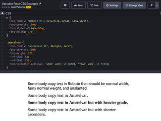
Weight a stretch, will you?
Of the five ‘registered’ axes, at this point all but Italics are fully implemented in all supporting browsers. That means that we can use font-weight, font-stretch, font-style (for slant), and font-optical-sizing just as the specifications recommend. And when we do that, we get the benefits of proper inheritance, predictable specificity, and the guard rails of the low- and high-end clamping of values for weight, stretch, and angle. I have a bunch of examples here that we’ll look at in turn.
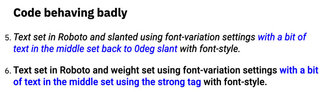
When you resort to using font-variation-settings, you’ll find that specificity of selectors and inheritance will misbehave: the low-level syntax will trump other, more specific selectors that use the proper attributes or are just default behaviors (like bold with a ‘strong’ tag) In example #5, the blue text should be upright rather than slanted, and in #6 it should appear much bolder than the text around it. There will also be another critical drawback: loss of semantics in your styles. I think this may be one of the most important reasons to avoid setting font weight, stretch, and slant this way.
If all you supply in your CSS is font-variation-settings strings (font-variation-settings: 'weight' 650;) and the browser fails to load the variable font, that style information is lost. The fallback font will simply display at the regular weight. But if you use ‘font-weight: 650;’ the browser will simply clamp to the closest option it can find, which would typically be the bold weight of whatever was loaded as a fallback.
Furthermore, you are also then giving screen readers a clue as to how this content should be read. I’m not nearly expert enough with how screen readers work to comment in greater detail, but I do know I’ve heard a difference when text that is styled as bold or italic. Without clues provided by the regular CSS attributes, that extra semantic information disappears, and meaning is lost for the listener.
The other benefits you get are independence, clarity, and predictability. When you specify a few different axes using font-variation-settings, you either have to redeclare the whole lot of them every time you want to change one axis value, or you have to use CSS custom properties to manage them individually. This isn’t necessarily bad, but when looked at in context of a whole site’s worth of CSS, that can get to be quite a lot to juggle. The clarity comes from knowing that you only have to look for font-weight attributes to change font weight anywhere you need to, rather than having to search for multiple ways to define that attribute. The predictability part comes in when future you is not the one maintaining this code. It’s far easier to understand what’s happening (or not happening) with your site if there’s one common way to specify font styling for both older and newer browsers (and fallbacks to boot).
Optical Sizing
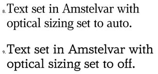
As of this writing, ‘font-optical-sizing: auto’ is working as it should in Safari, Firefox, and Chrome. If you look at the two examples (#8 and #9), you’ll see much greater stroke contrast in the first. This is a sign that the optical size axis is working, refining the letterforms when the text is displayed at a larger size. If you look closely at #7 compared with #8, you’ll see the automatic application working properly at smaller and larger sizes.
Of course, there are a couple of exceptions
While testing this out, I did find a couple of oddities, but not enough to say it seems like something’s not working conclusively. It’s quite possible it’s a font issue in one case at least.
Slant
With the version of Roboto Variable I tested with seems to behave badly in Safari, where it is defaulting to slanted rather than upright. This isn’t happening with a commercial font I tested, so I’m fairly sure it’s something to do with the font but haven’t proven that just yet.
Optical Sizing
While perhaps not specifically a bug, it appears that setting ‘font-optical-sizing: none;’ in Safari has no impact. If for some reason you wanted to force the optical sizing to a different value, you would need to use font-variation-settings. Safari, Firefox, and Chrome now all treat ‘font-optical-sizing: auto’ as the default behavior.
Italics
I wrote a fairly detailed look at the state of Italics support a couple months ago, and unfortunately it’s still pretty broken across the board. The only way to get them to work with any consistency is to use font-variation-settings.
Putting it together
So here’s a recap. Use the proper attributes wherever possible to avoid all the issues outlined above. If we don’t help form good habits now, it’ll be really hard to correct that later on.
@font-face
Specify the format using the currently-supported and upcoming syntaxes. This makes it clear that it’s a variable font, and will then just shift to the new syntax automatically when it gets implemented.
font-weight
Use this all the time. No reason to ever use font-variation-settings for this axis.
font-stretch
Use this all the time. No reason to ever use font-variation-settings for this axis either.
font-style: oblique
Use this all the time (so long as the font you’re using behaves properly in Safari). No reason to use font-variation-settings for this axis as long as the test mentioned works as expected in Safari.
font-optical-sizing: auto
Since this is default behavior, the only reason you may want to use font-variation-settings is if you want to force the optical sizing axis to a different value for aesthetic reasons.
font-style: italic
Sadly this is still broken, so setting this via font-variation-settings is the only way to go.
custom axes (like grade)
These are the ones that will always need to be set via font-variation-settings. Also important: custom axes must always be in all-caps (‘GRAD’) as opposed to the 5 registered ones (e.g. ‘ital’).
It’s worth mentioning that when you do use font-variation-settings, you’d do well to set the values using CSS custom properties. That way you can change individual values without having to reset the whole string. Because support for variable fonts came later, you can be sure that if variable font support is there, so is support for custom properties.
Here’s a couple sample declarations:
.font-stylings {
    font-family: your-variable-font-family;
    font-stretch: 85%;
    font-weight: 525;
    font-style: oblique 8deg;
    --vf-ital: 1;
    --vf-GRAD: 0.5;
    font-variation-settings: ‘ital’ var(--vf-ital), ‘GRAD’ var(--vf-GRAD);
}
Now if you want to ‘unitalicized’ a bit of text, all you have to do is reassign that property and it will be scoped to just that class:
.font-stylings.unitalic {
    --vf-ital: 0;
}
I hope this is a helpful resource. I’ve put all of these together in two CodePens: the lots of examples both good and bad one, and a simpler one that shows only the most supported methods. For better practices, better accessibility, and a better web—I hope this guide (which I will keep updated on my site over here) will serve as a resource for you, and for any guides or articles you might write. If you have any questions, feedback, or corrections—please write!
Resources
- CodePen examples, good and bad
- CodePen example (just the good stuff)
- W3C spec on @font-face
- Roel Nieskens went into a pretty deep dive on the inheritance issues this week too