Part 2: Making the typography responsive and laying foundations for more to come
The feedback I’ve received over the past week has been amazing, and matches my own excitement about this project. I’ve spent a lot of time researching, writing, and teaching about creating better typography for reading on digital devices over the years. This is the chance to put it all together and focus on the whole reading experience beyond just the typesetting.
I also tracked down and bought my own copy of that Rockwell Kent edition on eBay and picked up what might be the most perfect domain name for the project I could imagine.
Let’s be honest: what top level domain could possibly be better for Moby-Dick than... wait for it... ‘.wales’ (all due respect to Mark and Emma Boulton and everyone else who actually live there). So from here on out you can read the book at it’s new home mobydick.wales.
This installment covers a lot of ground, so let’s start with a recap of the overall goals and the basics we put in place last week.
What we aim to accomplish
Great typography on the web should be designed in layers. The web is an imperfect medium, consumed by countless different devices over untold numbers of network connections—each with their own capabilities, limitations, and peculiarities. To think that you can create one solution that will look and work the same everywhere is a fantasy. To make this more than just one nice book website, the whole project and process needs to embrace this reality. So here are some guiding principles.
Semantics - Start with well-written HTML. I’ve done my best to alter the underlying HTML of the text as little as possible. This also means that when using these techniques with a CMS, you won’t have to rely upon content authors doing a lot of fiddly custom formatting or code.
Foundations - Start with typography that will look and work great even if web fonts don’t load. You can establish a lot of good typography with basic CSS and commonly installed fonts like Georgia.
Progressive enhancement - Once we have the basics covered, we can add our web fonts of choice. We’ll start with static or traditional web fonts as those are supported by the most browsers. Then we’ll add variable fonts for browsers that support them. In every place we can, we will support older browsers and less fully-featured devices, and layer in support for newer and more robust ones. This goes for CSS techniques, typographic scale, and layout choices in addition to those around fonts and font technologies.
Performance - You have about 3 seconds to get your content on screen before visitors bail. By using ‘font-display: swap’ and a web font loader we can not only improve the page-to-page performance, but we can also smooth out the initial experience. By adding styles to fallback fonts we can get content on screen immediately while web fonts are loading, and minimize disruption or reflow once they do.
Offline - Embracing the offline access techniques and technologies behind Progressive Web Apps helps improve overall performance and resilience by reducing the need to hit the network at all. And with books that means it can behave more like a traditional ebook.
Reader’s choice - Supporting different light modes, spacing, font size—these are all well supported in CSS. Making it part of our process is good for user experience, good for accessibility, and good for project portability too.
Book-ishness - This is perhaps the one part of this effort that is really specific to the project at hand: creating a web-based book. My hope is that we’ll see just how much further we can push that experience and tailor it for multiple kinds of devices and inputs.
What we’ve done so far
Last week was largely about just getting the text of the book into website form. We broke up the text into separate documents for each chapter, brought it into a site generator to make the maintenance a bit easier, and added navigation to get back and forth between chapters. We also set up some basic typographic choices:
- Set font sizes for hierarchy between headings and body copy
- Set line-height to help establish vertical spacing
- Set a maximum width on content to maintain a readable line length
- Decided on text-indent rather than spacing for paragraphs, as we’re designing for longer-form reading rather than a more typical skimming behavior
These choices were ok to start, but far from ideal across device sizes. This week we’re taking it a whole lot farther.
Part 2: Responsive typography and project foundations
There’s actually a lot more going on than just setting up the responsiveness of the typographic system, so I’ll break it up into three different sections:
- Typography
- User interface and content
- Code scaffolding and approach
Responsive typography
Typographic hierarchy is all about proportion. And when screen size changes, the specifics of those proportions should change too. Small screens like phones show less text, so we don’t need to exaggerate the scale differences between headings and body copy quite as much. They also pose different challenges with regard to line length with larger headings, and rag irregularities in the body (in left-to-right reading languages, that’s the uneven right-hand edge of the text). It’s part preference, part practicality to leave the text ‘rag-right’: justification (making both edges of the text even) doesn’t work well on the web, especially on small screens. My preference is to use hyphenation and a ragged right edge.
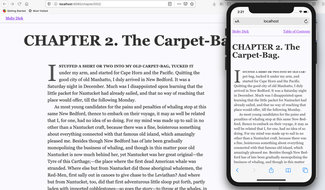
By using media queries, we can tailor the typographic scale differently across screen sizes and even turn hyphenation on for body copy on smaller screens. This way we can have more readable headings that still stand out on our phones, and create more balanced body copy without resorting to reducing font size. As screens get larger we can turn off the hyphenation as we won’t really need it there to balance the design. On those larger screens we’ll set our headings bigger, as they have more to compete with as windows get wider and layouts get busier.
h1 {
  font-size: 2.25rem;
  ...
  /* Mid-size screens */
  @media screen and (min-width: 42em) {
    font-size: 3rem;
    ...
  }
  /* Larger screens */
  @media screen and (min-width: 60em) {
    font-size: 4rem;
    ...
  }
}

p {
  font-size: 1rem;
  ...
  /* Mid-size screens */
  @media screen and (min-width: 42em) {
    font-size: 1.125rem;
    ...
  }
  /* Larger screens */
  @media screen and (min-width: 60em) {
    font-size: 1.25rem;
    ...
  }
}
We’ve started out by establishing a simple small/medium/large sort of scale, and applied that to headings and body copy—but have scaled those elements differently. This roughly corresponds to phone, tablet, and desktop—but it’s really about window size and resolution here more than the specifics of the device.
I also tweaked some of the margins and the text styles for the header and footer to improve the experience across the range of device sizes. That brings us to the user interface.
UI updates and content tweaks and additions
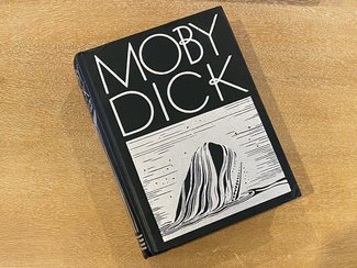
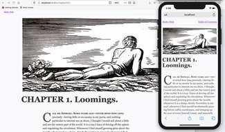
After viewing the project on my iPhone 11 (the smaller one) I wanted to make sure the baseline experience was better for smaller screens. I tweaked the alignment and scale of the chapter navigation in the header, reduced the font size and margins in the footer, and updated the previous/next chapter navigation.
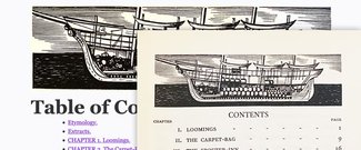
Since the Rockwell Kent edition showed up late last week, I also photographed some of the images and added them to the site. Since they’re such a big part of what I find so compelling, I wanted to get a few in and work on the baseline image styles. They’re all black-and-white and there aren’t that many per chapter so it’s not as beneficial to set up responsive images, but I do want to have good markup and ‘alt’ text. I set up enough styles to give some flexibility for size and alignment as well.
One of the only significant change I made to the HTML I got from Project Gutenberg was the addition of blockquotes. There was a bit of a mishmash in Extracts that looked like it would benefit from that kind of structure, so I went through and marked them all up consistently. Since there were two different kinds of usage I created a ‘quiet’ style that kept text size in line with the surrounding text, and a more normal one that was a bit bigger and set off from its surroundings. It may require more refinement in the future but for now it’s made for a nice improvement.
Code scaffolding and approach
In keeping with our goal of supporting the widest possible spectrum of devices, network capabilities, screen sizes, and coding approaches, the project is set up with a layered approach. If you install and build the project from the source, you’ll see how that works end-to-end. If you just grab the compiled site (from in the ‘_site’ directory), you’ll still see a fair bit. Here’s how it’s set up.
In order to support browsers that don’t ‘get’ custom properties, I’ve set up the project with a layered approach. Since I’m using Sass, I’ve set up a two-step process to define variables in Sass, which then also supplied to the definition of corresponding CSS custom properties. This way we can use the staticky compiled Sass variables in the initial declarations for font size, line-height, color, etc., and then redeclare them with the custom properties so we can alter them more easily in the future. I included a couple of extra transformations in order to keep it simple at the outset: just supply pixel values in the variables file and they’ll be converted to ‘rem’ or ‘em’ values as needed for the most flexible results in our final output.
/* Change px values here for all font sizing */
$p-size-s-px: 16;
$p-size-m-px: 18;
$p-size-l-px: 20;

/* Font size rem values (needed for dynamic sizing) */
$p-size-s-value: $p-size-s-px / $text-base-size;
$p-size-m-value: $p-size-m-px / $text-base-size;
$p-size-l-value: $p-size-l-px / $text-base-size;


/* Font sizes in rems */
$p-size-s: $p-size-s-value * 1rem;
$p-size-m: $p-size-m-value * 1rem;
$p-size-l: $p-size-l-value * 1rem;

/* CSS custom properties for all modern browsers */
:root {
  --p-size-s-value: #{$p-size-s-value};
  --p-size-m-value: #{$p-size-m-value};
  --p-size-l-value: #{$p-size-l-value};

  --p-size-s: #{$p-size-s-value * 1rem};
  --p-size-m: #{$p-size-m-value * 1rem};
  --p-size-l: #{$p-size-l-value * 1rem};
}
I’ve also set up functional assignments for color usage. It’s easier to change the color palette and only one place to update the color assignment. By having everything mapped from a specific color to ‘text color’ or ‘background color’ variables, it’s also easier to change those palette assignments for dark mode or a higher contrast setting.
Corresponding to the responsive typographic scale shown above, the text size and line-height variables are in sets of three values for smallest, mid-range, and largest values.
Progress so far
While we did have to do a fair bit of plumbing and foundational work, I hope it’s clearer now just how much we can do typographically without even loading a single web font. We now have the entire book comfortably readable on virtually any device, and we’re starting to get some of the artwork in and refinements in place that help make it a book instead of simply a collection of pages.
Next time we’ll be adding web fonts—and I’m really excited to show you a brand-new release. I’ve had the chance to work with it over the last couple months quite a bit, but it’s only now become public.
Resources
- View at the new URL mobydick.wales
- Project source on GitHub
- Resilient Web Design (a wonderful web-based book by Jeremy Keith, and inspiration in both content and execution)
- Got an email from fellow community member Justin with links to Oliver Byrne’s online edition of The Elements Euclid and Justin’s own edition of A Briefer History of Time. I’d seen the former, but not the latter. Great stuff!
- Part 1: Introducing the project
- Part 3: Adding web fonts