Learning typography: introduction & resources
Type is the voice of our words—and typography sets the tone
I get asked every so often about where to start learning the basics of typography: what it is, how it works, terminology, and so on. I wrote a bit about it in my book (Amazon affiliate link), but there are some other really excellent resources to learn the basics of good typography. I’ll try to represent a bit of both here.
Words have meaning, but letters have emotion
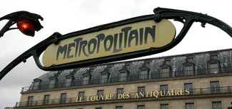
If I ask you to close your eyes and describe what you see when I say ‘Wild West’ (if you’re from the US), or ‘Jazz’, or ‘Paris Metro’—you probably get a picture in your mind. Of letters. It’s almost inescapable that we form associations in our mind between a thing we know, and the words we see printed or projected that describe that thing. Sometimes it’s to the level of being a stereotype or meme. Sometimes it’s more personal. But either way, the association is there. This is a big part of great typography: either creating or accentuating that connection between a message and a place or time. An organization and an emotion. The basics of typography are about making things readable. The nuance and finesse is making a connection.
Since the beginning of the written word, every technical evolution of how words get onto the page has brought with it both emulation and evolution. Early Italics were designed to mimic handwritten calligraphy. Roman, or upright, letterforms were mimicking carved letterforms from Ancient Rome. The first movable type made by Gutenberg was a Blackletter style which also mimicked a calligraphic style. In each case, the technology imitated the prior one while introducing subtle (and sometimes not-so-subtle) changes either required or enabled by the new. For centuries that referred to handwriting and calligraphy styles. In the past few decades, digital type has evolved to reference itself, and the techniques and technologies used to make it.
This is what makes the question ‘do we need any more typefaces’ so interesting, and so irrelevant. Every typeface is a reflection of the time in which it is made, both aesthetically and technically. Things we couldn’t do in years past (like a ligature or alternate character based on context) become enabled with the advent of newer technologies like OpenType. Styles like rigid geometric modern (see: Helvetica) or mix-and-match grunginess (see: anything from David Carson in the 90’s), or the sturdy Mid-Western hospitality of Proxima Nova (one of the best selling web fonts of all time) are all a product of a point in time. That time may be (somewhat) timeless (again, see Helvetica’s enduring popularity), or it may be very specific. But as time moves on, so do tastes. And so we’ll always want, need, and use the next new typeface that catches our eye—at the time.
I’ll get into a little bit of what typography is all about, but first it’s useful to get to know some of the vocabulary. I purposefully am avoiding ‘all the terms’ but rather focusing on ones that I think will help get you grounded in the landscape and start to see some of the broader distinctions between typefaces and styles.
Terms, unconditioned
Typography
The theory and practice of selecting and setting type for printed or digital works. More than just typeface selection and setting the type for a given piece of content, it ensures the correct glyphs are used and proper punctuation marks shown in order to achieve the most polished output based on the rules and norms of the times.
Typeface
A specific design of glyphs and punctuation that typically includes a complete set of letters, numbers, punctuation, and special characters. This often includes different weights of both upright and Italics.
Typeface family
A set of typefaces of related design that often includes a variety of weights and variants (like bold or italic), and styles. This can include stylistic variations like serif, sans-serif, rounded, or other classifications of type in a related system. A modern example would be Plex, from IBM and Bold Monday, which includes serif, sans-serif, and mono-spaced typefaces.
Font
Technically, the font is ‘physical’ form of a single weight and variant of a typeface—either the set of metal type or a computer file that contains the font data itself. For the purposes of this exercise, we’ll focus on the latter. So a font from the Plex Sans typeface might be ‘Plex Sans Bold Italic’ or ‘Plex Serif Regular’.
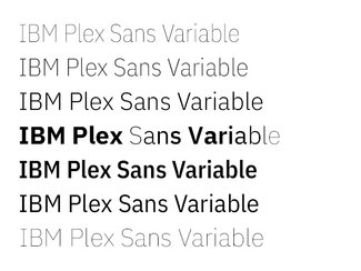
Variable font
Variable fonts throw a spanner in the previous two definitions, as a single variable font might contain all the previously-separate fonts (bold, regular, light italic) but also other typefaces in the family (different widths or even serif and sans-serif) all in the same file.
Plex Sans Variable has both a weight and a width axis in addition to Italics—so in this case it is encompassing what could be considered two separate typefaces (Plex Sans and Plex Sans Condensed) along with everything in between.
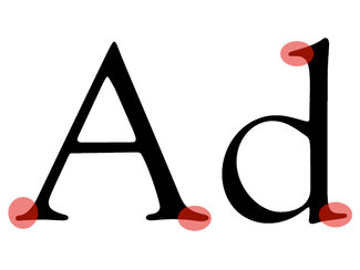
Serif
Tiny “feet” and other protrusions finishing off strokes of letterforms in typefaces such as Plex Serif or Garamond. Also refers to typeface that shares those characteristics. Goudy Oldstyle, shown here, is a classic example with beautiful forms that look good and read well at both large and small sizes.
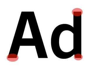
Sans-serif
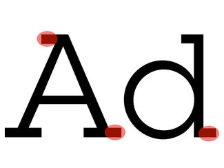
A typeface designed without any adornments at the end of the strokes forming the glyphs. Examples would include Plex Sans, Helvetica, or Arial. In this case, Trade Gothic showcases both strong even strokes and a neatly angled cut at the bottom of the lower case ‘d’ that tapers the bottom of the stroke ever so slightly. Almost the reverse of a serif.
Slab serif
A serif typeface where the serifs are the same thickness as the stroke weight of the letters themselves. Originally invented in the 19th century, they have become quite popular in the past few years on the web, and can make for some really bold, striking headers.

Terminals
A typographic term that refers to the ends of the strokes of glyphs. The angle of those ends can be perfectly horizontal (like in Helvetica) or angled (like Plex Sans). This can impart a more or less formal feel, and in some cases can greatly impact legibility, particularly at small sizes.
I’ve only included a limited number of terms that I think are really foundational to understanding and selecting type. For even more anatomical details, have a look at this typographic term cheat sheet (I’ve linked to this before, but it’s beautifully done, so worth doing so again)
Practical application
It’s far beyond the scope of a single newsletter to teach an entire introduction to typography, but it is possible to lay out some basics and point you to some further reading.
I’ve recently been thinking about it in two ways: typography for reading, which I loosely define as everything about making something easier to read; and typography for attention, which is much more about emotional connection and getting you to stop what you’re doing to take in what it has to say.
I’ve tended to focus much more on the former in my writing and talks over the years. This is mainly because I’ve felt that there is so much work to do in making text legible and readable on a myriad of devices that this was where I could have the most impact. There’s still work to be done (I’m looking at you, millions of blocks of centered text) but I think we’ve matured as an industry more and there is more attention being paid to this aspect of typography than ever.
When we only focus on readability, we end up with a lot of same. So this year I started turning my attention to the other side of that coin. When we focus on emotion, we get expressive. And with the combination of better technology (solving the performance problem), and the availability of variable fonts (enabling greater dynamic range), there has never been a time where so much has been available with which to design.
With that in mind, here are a few pass issues ad posts that might be helpful, and a bunch of books that will tell you a lot more.
Newsletter
- Paragraph basics (issue #3)
- Scaling for screen sizes (issue #5)
- Variable fonts (issue #12, issue #13, issue #14)
- Typography for reading (issue #15)
- Typography for attention (issue #16, issue #17)
Books
Some links go to author or publisher sites, some are my affiliate links to Amazon (if that’s where I could find them for sale). Please feel free to use the link or just search yourself for the title!
‘Thinking with Type’ by Ellen Lupton
One of the most clearly written introductions to typography out there. Just go buy this.
‘Detail in Typography’ by Jost Hochuli
A real gem, with a massive amount of information packed into just 60 pages. Well worth it.
‘Stop Stealing Sheep’ by Erik Spiekermann
The first book on typography I got when I was in school, and still a favorite. A wonderful introduction to how to use type well.
‘Inside Paragraphs’ by Cyrus Highsmith
I spent too many years in the design community in Providence, RI before ever meeting Cyrus, and hadn’t come across this book until a couple years ago. But I think it’s probably one of the best, most concise introductions to the foundation of good typography for reading you’ll ever come across. The paragraph is the foundational building block of any typographic system, and Cyrus’ wonderful exploration and explanation of what makes for a good paragraph is absolutely essential for any aspiring typographer.
‘Flexible Typesetting’ by Tim Brown
Tim is the first person whose writing about web typography I came across back in 2009 or so, and I credit him with opening my eyes to just how much we could do. In the years since he’s written a ton that has been a huge influence on me, and his work with Typekit and now Adobe Fonts is invaluable. This book is a must for anyone who wants to learn about how to set type on the web for a better reading experience. It’s absolutely the best resource out there right now.
‘On Web Typography’ by Jason Santa Maria
A wonderful introduction to typography through the lens of the web. Not a technical book, but rather a solid grounding in the concepts of typography as can be applied on the web.
‘Theory of Type Design’ by Gerard Unger
This one is a bit different. Written by a lifelong type designer, this isn’t a book about the theory of designing type, it’s a book about the theory of how and why typefaces have been designed. A subtle, but very important distinction. It’s geared as much towards the users of type as it is towards designers, and takes you through the design a numerous classic typefaces and aspects of typography and reading in a series of short, concise, and very accessible essays. Truly it should be required reading for any designer or person concerned with good use of type.
‘Web Typography’ by Richard Rutter
An incredibly well-researched book on designing and implementing great typography on the web. As with all technical books (like mine as well), the tech does move on—but there is still loads more in this book that will be a benefit for years to come, and Richard’s writing is wonderful. He’s one of the pioneers of putting real fonts on the web, and is one of the most thorough researchers I’ve met.
‘The Elements of Typographic Style’ by Robert Bringhurst
Not exactly a page-turner, but it is a really good reference on what makes for good typography in print. Not all of it applies well to the web, but it’s still worth having around.
On the web:
‘Professional Web Typography’ by Donny Truong
Donny is a deeply talented designer and typographer, and has released a second edition of his book recently, updating it to include variable fonts and some other newer developments. It’s very well written and an incredible resource. Well-deserving of a place on your digital bookshelf.
There are many more wonderful books on type and typography that I’ve gathered over the years, but I think the ones I’ve listed above make for a really solid library. Many are very concise and can be read in an afternoon or a day or two.