Variable Fonts: opening the door to a whole new typography
I’ve made a few mentions about variable fonts over the past weeks, and it’s high time I explain myself—and them—because they are really remarkable. So remarkable in fact that they’re just about the only thing I’ve been talking about at conferences since September of 2016 when they were introduced. In truth, I think they are the most significant development for design on the web since the advent of responsive design. A bold claim, but one that I feel confident history will bear out.
Let me explain
For as long as we’ve the ability to use linked or embedded fonts on the web, we have had to do that by including a separate font file for every weight, variant, or width that we want to use. So for typical websites, that means a routine collection of regular, italic, bold, and bold italic font files for whatever typeface we choose for body copy, and sometimes another one or two for headings or display purposes. These design decisions are often guided as much by overall user experience (UX) and performance considerations as they are typographic ones, since the more fonts you load, the more impact it can have on download times, data use, and delays in final page rendering so the visitor can actually see your site. As I wrote a couple weeks back, this has lead to a whole canon of advice on what is ‘good’ typography that is questionable at best—and in many cases simply false.
Well, at ATypI Warsaw in September 2016, that changed. Or at least that was the beginning. That’s when representatives from Adobe, Apple, Google, and Microsoft jointly announced the introduction of an evolution of the OpenType Specification called ‘Variations’—or what have become known as Variable Fonts. The OpenType format is what’s used to create cross-platform font files for use on desktop devices running MacOS, Windows, etc., and when creating WOFF or WOFF2 versions from them, you get a font file usable on the web. What’s so different about this evolution of the format is that, as John Hudson put it, you get 'a single font file that acts as many.’
So what does that really mean?
Consider that if you were to use every weight of IBM Plex Sans in regular and italics, both the full width and the condensed, you would have to load 32 files. Leveraging the best compression (WOFF2), you would still be loading over 960KB of font data. If you try out the newly released variable version you could load only 2 files (regular and italic) but get the full weight range and width—all for only about 230KB! And that’s for the complete character set supporting over 40 languages. Subset to a typical Latin 1 (or even Latin 1 Extended) it would be even smaller.
The secret is that instead of storing all of those complete outlines, the format stores only the regular outline of the glyphs, and the ‘deltas’ (or differences) between the points defining that outline and where they would shift to in order to represent a thicker or thinner one. That way it’s only that one outline plus a bunch of other points and offsets, creating a far more efficient overall format. I’m simplifying that a bit of course, but in generally that’s a pretty accurate summation.
Even if it ends up being the same or even slightly more font data than you might typically load, instead of being constrained to only two weights plus italics in a single width, you can make use of the entire range of weights to fine tune your headings based on font size. You can even tailor the width of the font based on usage and screen size as well.
I’ll talk more about why you might want to do that, but suffice to say that having the full range of options available can be totally transformative for your design voice.
Setting the stage
There are a few changes that need to be made to your @font-face declaration (I covered the basics of that a few weeks back), but they’re pretty modest. One nice change is with variable fonts you no longer need to worry about any other format than WOFF2. TTF works as well, but the file size compression and compatibility gains with WOFF2 are so great that there’s no reason not to use it. Not all font providers have taken that step yet, so if you end up getting a TTF version, it’s worth asking for them to provide WOFF2 instead.
Here's an example:
@font-face {
  font-family: "Roboto VF";
  src: url("path/to/variable-font.woff2")
    format("woff2-variations");
  font-weight: 100 700;
  font-stretch: 85% 100%;
  font-style: oblique 0deg 12deg;
}
There are a few things to note in the code above.
- The format it changes from simply ‘woff2’ to ‘woff2-variations’. Note that TTF and WOFF formats will also work; they just won’t get quite the same file compression benefits as WOFF2.
- Instead of a number or keyword listed for font-weight, we supply the low and high ends of the weight range as supplied by the font provider (or discovered using the Firefox Font Dev Tools).
- We specify any available width range in a similar fashion, expressed as the low and high end percentages. It’s worth noting though that even if the font comes with a different sort of range (1-1000 or anything else), you still have to supply it with the percentage symbol.
- If there is a slant axis, we specify ‘font-style: oblique [low value]deg [high value]deg;’
Note: I’ve omitted italics here in the event that it’s a variable font with italics in the same file, as there is still a bit of ambiguity around the syntax and implementation. An examples of two variable font files for roman and italics, grouped by family name, is shown below.
@font-face {
  font-family: "Plex Sans VF";
  src: url("path/to/variable-font-roman.woff2")
    format("woff2-variations");
  font-weight: 100 700;
  font-stretch: 85% 100%;
  font-style: normal;
}
@font-face {
  font-family: "Plex Sans VF";
  src: url("path/to/variable-font-italic.woff2")
    format("woff2-variations");
  font-weight: 100 700;
  font-stretch: 85% 100%;
  font-style: italic;
}
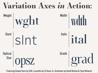
Axes of Awesome
The new format defines several axes of variation explicitly (registered axes), and also the ability to create any custom axis the type designer desires. These refer to the different aspects of the typeface that the designer has decided to vary, and not every font will have every axis. This ensures that the browser is never distorting a font; it can only vary the font along the axes available. The registered axes are weight, width, slant, italics, and optical size. I’ll explain that last one in greater detail next week, but the others are fairly straightforward.
Weight
As you might expect, instead of a set of font files corresponding to individual weights (i.e. thin, regular, heavy, 300, 800, etc), if the weight axis is exposed, you can set font-weight with any number value in the range for that given font. This is also likely to be the most often exposed axis of variation. The aforementioned Plex Sans Variable goes from 100-700, and Monotype’s FF Meta Variable spans 100 to 900. The CSS specification allows anything from 1-1000, so you may see some odd ranges in some fonts, especially early one. But as David Jonathan Ross pointed out to me recently, the OpenType Specification does indicate that the range should be 1-1000, with 400 designated as ‘Regular.’ Other than that, it’s really up to the designer.
One thing to keep in mind though is that CSS specifications have codified font-weight keywords ’normal’ and ‘bold’ as aliases for 400 and 700 respectively, so if you’re working with a variable font with a significantly different number scale, keep in mind that you’ll have to specify the weight you want to be rendered whenever an HTML element would normally just default to one or the other. You can play around with Plex Sans Variable weight here.
The CSS can be written either using the standard font-weight attribute, or using the lower-level syntax of font-variation-settings (which is the less-preferred method, and will behave a bit differently with regard to cascade and specificity).
.bolder {
  font-weight: 575;
}

.bolder {
  font-variation-settings: 'wght' 575;
}
Width
While weight will likely be most frequently seen, width is an incredibly useful one, especially when considering screen size and relative data density. When a typeface has had width options like ‘condensed’, ‘compressed’, or ‘wide’ available, the design voice that can be achieved is exponentially greater than with weight alone. Small changes can help make text more readable or help achieve more uniform results with regard to line wrapping or fitting column headers, etc. Bigger swings can be wonderful for creating really expressive display text. The experimental Voto Serif GX (designed by Adam Twardoch and the Monotype design team) goes from a svelte 50 up to 130.
Here again the type designer can specify just about whatever range they would like, but in CSS it is expressed as a percentage when specified via font-stretch, so it’s hopeful that designers will follow that lead and set 100 as ‘normal’ and go from there. This is the approach taken with Plex Sans (which goes from 85-100) and Mark Simonson’s beta of Proxima Nova, which ranges from 60-100 (yes, you really should tweet at him in support of a full release). You can play around with Plex Sans Variable width here.
The CSS can be written either using the standard font-stretch attribute (with the percentage symbol), or using the lower-level syntax of font-variation-settings with just the numeral (which is the less-preferred method, and as above will behave a bit differently with regard to cascade and specificity).
.narrow-width {
  font-stretch: 85%;
}

.narrow-width {
  font-variation-settings: 'wdth' 85;
}
Italics
In an interesting illustration of the format’s inherent flexibility, the italic axis is generally a binary one, with italic forms being either off or on. I’ll show an exception to that in another issue, but the nature of glyph differences often leads to type designers deciding to simply separate the fonts into two files: roman (or upright) and italics. I don’t really know if it makes life easier on the design/font production side, but generally speaking it just not as efficient from a file size perspective to make it worthwhile to include both roman and italic in the same file. With a well-formed set of @font-face rules, it’s even easier to get the fonts to behave in a unified manner.
I set up a demo grouping the two variable font files (roman and italic) here.
The CSS can be written either using the standard font-style attribute, or using the lower-level syntax of font-variation-settings with a ‘1’ or ‘0’ supplied with the keyword (which is the less-preferred method, and will behave a bit differently with regard to cascade and specificity).
.italic {
  font-style: italic;
}

.italic {
  font-variation-settings: 'ital' 1;
}
Slant
This is a fun one. Unbeknownst to me when I started working with variable fonts, CSS has had the ability to set a font style as either italic or oblique (with some number of degrees) for quite some time; fonts just weren’t really able to utilize the latter. Now that there are separate axes for them, we’ll likely see more sans-serif fonts with a slant axis rather than only seeing italics. The nifty thing about slant is that unlike the boolean choice of italic (off or on), slant can be expressed in some number of degrees, from zero (upright) to whatever the typeface designer has designated. One of the Roboto variable font experiments includes a slant axis of 0-12 degrees. I set up a demo you can play with for this one as well, though the slider wasn't working so you’ll have to just edit the CSS to try it out.
The CSS for slant can be written either using the standard font-style attribute (with ‘deg’ added after the numeral), or using the lower-level syntax of font-variation-settings with just the numeral supplied after the keyword (which is the less-preferred method, and will behave a bit differently with regard to cascade and specificity).
.slanted {
  font-style: oblique 12deg;
}

.slanted {
  font-variation-settings: 'slnt' 12;
}
But wait, there’s more
Next week I’ll dive into optical size, and perhaps one or two other interesting implementations of different registered and custom axes. Until then, have a play with some of the examples and let me know what you make!
Resources
- Weight axis demo
- Width axis demo
- Italic demo
- Slant demo
- Much more complete documentation in the guide I wrote for the Mozilla Developer Network site
- Essay on variable fonts showcasing FF Meta for Monotype