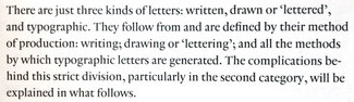
The paragraph: basic building block of your content
Now that I’ve got a couple issues out, I wanted to return to some typographic fundamentals—and I can’t think of a better way to convey them than in the form of the paragraph. I took a pretty deep dive into the history, evolution, and expression of them in a talk I gave a few years ago, and then in article form for PRINT magazine, both titled The Life of <p>.
This week we won’t go into quite so much detail, but enough to understand the basic relationships that help create a balanced, readable, sturdy block of text. One that will support your message and serve the text well as you build out your design.
Since a paragraph is defined as ‘one or more sentences of text that deal with a single point or idea’ (or a passage from a single speaker), it’s a good proxy for ‘the smallest block of text’ that will comprise our layouts: everything from the teaser text in a card layout to welcome text on the home page to long-form article content deeper in our sites. In each case, they are meant to be read—so they need to be set in a readable manner.
The rule of three
When considering a paragraph and how to set one well, there are three parameters that work together: font size, line height (or ‘leading’ in traditional parlance), and line length (or ‘measure’). I’m including the traditional terms here because I think it’s important to connect how type has been set by typographers and graphic designers. Understanding the terms and using them properly helps us understand one another—and the intent behind a given design file—in important and fundamental ways.
Font size
Much research has been done over the years that has lead to 12pt type being considered a standard size for readable text in print. Based on all sorts of data about average arm length, distance to your eyes, and various light conditions—it has come to represent ‘normal.’ Since the advent of the personal computer, similar research has been done around how far the average person sits from an average size monitor, and over the years that slightly increased distance has led every shipping desktop browser to standardize on 16px (note pixel, not point) as the default font size for body text.
The keen observers among you are likely asking all sorts of questions about desktop vslaptop vs phone, real pixels vs reference ones, and exactly what an average distance is from what average device. Suffice it to say that ‘font-size: 100%’ will in general give you consistent text size equivalent to 16px if you could imagine that being some sort of actual size. On phones however—it can be different. Every manufacturer does their own research, and you can sometimes see the physical differences, though they’re usually relatively minor.
The pertinent point is this setting—‘font-size: 100%’—will in all cases give you what that device manufacturer or OS/browser vendor represents (and has tested) as a good, readable text size. Generally it’s best to go no smaller than that device-determined 100% for body copy, though on larger screens you may want to correspondingly increase that body copy size to better balance the layout and factor in a slightly greater viewing distance from those very large screens.
Line height (leading)
The distance between two lines of type is generally referred to as ‘leading’ in print design, and I really love the origin. If you look at a block of text set in metal type with no additional spacing between lines, it is referred to as ‘set solid.’ If additional spacing is desired, a thin flat piece of lead would be inserted between lines of type. This could be adjusted by adding more strips or thicker ones. The purpose of doing this is to both make text easier to read and also allow for varying the mood or effect desired. On the web we have adopted the phrase ‘line-height’ to indicate the distance from the baseline of one line of text to the next.
Text set too close together gets harder to read, especially as line length gets longer. That’s why there's an important relationship between line-height and line length. Most tutorials and textbooks I’ve seen will default to starting at 1.5 times the size of the time. So it would follow that a default text size of 16px would be set with a line-height equivalent to 24px (1.5 x 16).
Line length (measure)
Robert Bringhurst wrote in his seminal work The Elements of Typographic Style that the ideal line length for text is from 45 to 75 characters (the low end for things like newspapers, the high end for longer form text like articles or books). The theory there is if the line length is too short, it looks choppy and there are not enough words or syllables to find a good rhythm in reading it. This reduces reading speed and increases fatigue. If the line is too long, it becomes harder for the eye to accurately (and quickly) follow the line to the end and get back to the start of the next.
The essence of these three characteristics is balance. You can’t change one without reconsidering the other two.
Context shifts
Remember—these considerations originated in a time when the page size and physical type didn’t change. They also hang heavily on something else: familiarity. We find text set in a particular way easy to read because that’s what we’ve become accustomed to seeing. We find particular kinds of typefaces easy to understand because we see ones like them all the time. Italics originated as a metal type interpretation of handwriting, and used to be the norm rather than the exception. Today, seeing an entire book set in italics would seem alien.
With the advent of the web and mobile devices, what we consider normal has evolved, both bigger and smaller. Some research indicates that familiarity has lead to slightly longer lines of text being as easy to read as the idealized 75 characters (perhaps 80-90). And screen resolution has improved enough that serif fonts can be rendered as cleanly as sans-serif ones, which for years have been held to be more readable on the web.
But as mobile devices have become dominant, that prevailing minimum of 45 characters is difficult to achieve without sacrificing font-size. So on smaller screens we have to also think about margins left and right, allowing them to shrink a bit and give more space to the text.
Because we cannot know where our text will be read, our typography has to respond to that context and allow for font-size to grow, line-height to increase, and line length to be capped in appropriate ways as our design is viewed on mobile and ever larger devices. This is the heart of responsive web design, and by extension, responsive typography. Now let’s look at how this might work.
Starting small
We saw a nice example of a printed paragraph above. Now we’re going to look at one on the web. Starting from the smallest screen and growing from there, our example paragraph starts with the smallest text size and line height we think will work well, and in order to keep from getting too close to the edge of the screen we’ll set a max-width in viewport units and left and right margins to auto. This will keep the paragraph centered and leave just a bit of margin so the text doesn’t crowd the edge of the screen but we get the longest line length we can for a better reading experience.
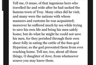
This is our paragraph with default styles geared towards smaller screens like mobile devices, shown in an iPhone 7. Note that the characters per line tops out at around 45, but is often a bit less. But otherwise, a generally comfortable reading experience that gets a decent amount of content on the screen.
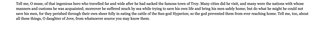
Unfortunately, this doesn’t work so well on larger screens. Note how long the lines are, and how cramped together they feel. This is going to make reading a tiresome experience, even though the exact same styles work very well on the smallest ones.
Regardless, this is still a very good starting point. Let’s look at the basics.
body {
  font-size: 100%;
}

p {
  font-family: Georgia, 'New Times Roman', serif;
  font-size: 1rem;
  line-height: 1.333;
  margin: 0 auto 1rem auto;
  max-width: 90vw;
}
First, we set the font size at 100% on the body. That gives us a good reset. Most browsers this doesn't make too much difference, but there’s no harm in making sure. As far as size unit values go in the rest of our CSS, you’ll note that we will be using only EMs or REMs. I’ll be going into size units in greater detail in an upcoming issue, but suffice to say that these relative size units will always give predictable, consistent appearance while still allowing for user overrides in the form of page zoom or user style sheets. This is really important for accessibility, and with all the smart build processes we all love to use, there is simply no good reason not to use them. Converting from PX values is just too easy.
In the ‘p’ selector, we set the font size to 1rem (or em), and set a line-height that will be appropriate on smaller screens. We then set a margin of ‘auto’ on the left and right to keep it centered (this is purely preference), and set a max-width pf 90vw (viewport units). The reason I used this rather than 90% is that 90vw always refers to the width of the viewport (or browser window), so if you have layout styles that cap the container, this won’t artificially skew the width or padding.
It’s worth noting that the line-height in CSS is set as a unitless value; meaning that you should supply simply a number, which acts as a multiplier of the font size on the element in question. If anything, supplying a unit of ‘em’ would yield the same result.
We now have a pretty solid baseline for small screens. Not so wide that it feels cramped at the edges, but still gives us a good readable line length and a line-height that feels comfortable and still gives us a bit more content on the screen at any given time.

The code in the media queries is doing a few things as the screen size gets larger. Let’s take a look and see what’s going on.
@media screen and (min-width: 35em) {
  .second {
    line-height: 1.4;
    max-width: 32em;
  }
}

@media screen and (min-width: 60em) {
  .second {
    line-height: 1.5;
    max-width: 40em;
  }
}
There are two aspects that change here as the screen gets bigger: the line-height gets a bit greater, and the line-length (measure) shifts from viewport units to a max-width set in EMs. The reason for this is that an EM value relates to the text size, and we want our maximum width to be relative to the size of the text as it appears at the time. Based on experience, I know that 40em will equate to about 90 characters per line or thereabouts, and will work the same in every browser.
There are other size units, like CH, that are supposed to relate to actual character width—but not every browser measures that the same way, so you can end up with quite different results. One browser includes the side-bearings in the measurement (the included margin on either side of a character or glyph)—a very different measure indeed.
As mentioned before, the increase in line-height is always a multiplier on the current text-size of a given element, so no unit value should be supplied.
But this gets us to ‘book standards’—what about that 27 inch iMac on your desk? As screen sizes and resolutions keep increasing, what we do on larger screens will become just as important as what we do on small ones. Let’s take our styles a bit further in the 3rd sample paragraph.

In this example we’ve added one more breakpoint, beyond which we want to scale our typography a bit more to make better use of the larger screen, and allow for a slightly farther viewing distance.
@media screen and (min-width: 75em) {
  .third {
    font-size: 1.25rem;
  }
}
The only thing we’re doing in this case is increasing the text size. Because we use a unitless value for line-height, and an EM value for max-width, they both work perfectly based on the size of the text.
A note about alignment
With the prevalence of card-style layouts and the use of frameworks like Material Design and Bootstrap, one particular trend has run rampant on the web, much to the detriment to the readability of our text, and our readers.
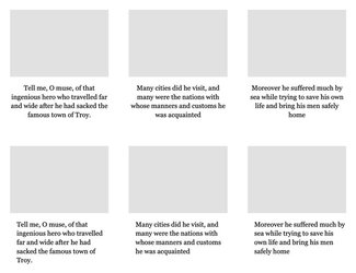
The desire for symmetry has led to the frequent centering of blocks of text—even quite long ones. Often the reasoning presented for this decision is related to our inability to know the size of the device upon which our design will be viewed, or to preserve some sense of symmetry with card-style elements laid out 3 or more across on the screen. But by centering the text, we remove an important consistent visual anchor for the reader’s eye when moving from one line to the next. With centered text, there is no consistent place for that next line to begin. This slows down the reader, leading to fatigue and lessening of engagement. Directly the opposite of the desired effect.
I would like to suggest that if any block of text is likely to run to more than 2 lines, you should try and avoid center-aligning that text. Instead, left-align, and if you need to make it feel more centered, try padding the left side of the text block as you see below. Notice that the blocks of text still feel visually centered in the layout, without compromising the readability of the text itself. For single, larger blocks of text, a similar technique is simply to set a max-width and auto left and right margins.
The code for the above is in the CodePen example, and is a really simple modification—but one that will be pretty specific to your design.
Wrapping up
There’s lots more to investigate in typesetting the perfect paragraph, and we haven’t yet delved into how variable fonts become part of this mix. But by following these guidelines, you can be sure to have the basics covered, and your text readable.
As is usually the case, the specific values I’ve used for line-height, padding, and margins (and even to some extent font-size) will vary a bit based on the specifics of the fonts you are using—but should serve as a good guide and jumping-off point in refining your own typographic system.
Resources
- Example paragraphs on CodePen
- Tim Brown’s invaluable resource ‘Flexible Typesetting’ from A Book Apart
- Robin Rendle’s excellent primer Six tips for better web typography on CSS Tricks (I prefer to think ‘reinforcement in numbers’ rather than ‘he said it better than I did’ ;) )
- ‘Inside Paragraphs’ by Cyrus Highsmith is a wonderful look at the solid typographic foundations embodied in a well-set <p>