Variable fonts, Part the Second: Optical size, custom axes, and other curiosities
Last week I finally introduced you to variable fonts a bit more formally. I covered four out of the five registered axes and bunch about how to implement them. This week I want to dig into the fifth registered axis, talk a bit about its history, and explore some of the other interesting aspects of the new format.
Optical size
For many of us, the only sort of type we know is digital. And digital type has generally worked the same way for a long time. There is a single outline for every glyph, and changing the font size simply scales that glyph to the desired proportion. But if the typeface has particularly high contrast between thick and thin strokes, simply scaling the outline uniformly can lead to some unpredictable results. Very thin stroke weights can become so fine at small sizes as to fall apart or effectively disappear. Conversely if the design has been optimized for smaller physical sizes, it can look ungainly when used at larger sizes. But this was not always how things were done.
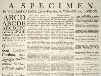
Going back hundreds of years, there has been a practice in the type design industry of crafting slightly different version (of ‘cuts’ of a typeface with subtly altered stroke weights: making them slightly thicker at physically smaller sizes to avoid breakage of the forms. At larger sizes the thinner strokes could maintain a more refined proportion, preserving the original detail and design intent. The examples below are details from the broadsheet shown above, printed by William Caslon in 1720 to demonstrate one of his early typeface designs. The upper-case letter C, shown at a normalized size, set at both 6pt and 72pt shows this technique quite clearly.

But by the 1960s, as phototypesetting and then digital type became the norm, this practice was largely lost. When converting the type to the new format, in most cases a single outline was chosen which was then scaled uniformly. While modern paper and printing has improved dramatically, there is still an unmistakable difference in legibility and refinement when you see it side-by-side. Occasionally you see digital typefaces sold in different optical size ranges (optimized for small body copy versus large display use), but it’s pretty uncommon.
With the advent of variable fonts we can revive the practice in a much more practical way. Rather than having to create, sell, and load separate font files, we can load that same single variable font file, and have the browser set the optical size for us. Intended to be applied automatically, we also can control the optical size setting explicitly should the need arise.
The intent is that the optical size axis values correspond with the size at which the font is set. So an optical size range of 12 to 72 when used on the web should correspond to an equivalent pixel value (or points in print applications). Browsers are supposed to be able to set this automatically, but as of this writing Chrome still doesn’t support the property so you have to set it manually to get more universal results.
Ideally according to the spec you should be able to set this (or even have the browser just do this by default):
.optically-sized {
  font-optical-sizing: auto;
}
To ensure it works in all browsers supporting variable fonts, you need to use this for now. Note that the value supplied should be an integer corresponding to equivalent pixel size of the font.
.optically-sized {
  font-size: 2rem;
  /* 2rem = 32px with default font sizing */
  font-variation-settings: 'opsz' 32;
}
I’ve set up a couple of examples looking at Amstelvar (a serif typeface where it makes a huge difference), and Roboto Delta (a sans-serif where it’s quite a bit more subtle). I make use of optical sizing on my own site with the variable version of Roslindale and the impact between text and headings is (I think) pretty stunning.

Custom axes
One of the main goals of the variable font format was extensibility: it’s simply impossible to know exactly how type designers will want to vary their typefaces in the future. And that’s really the point: evolution and exploration are already yielding some fascinating and fantastic results. One that I quite like is the ability to alter the height or depth of ascenders or descenders. This can have enormous impact on the overall tone of a typeface, but can also impact how we typeset with it. I love really tightly set headlines, and with the ability to tuck the ascenders and descenders in just a little bit we can tailor the typography quite a bit and avoid unsightly collisions from one line to the next.


.tight-fit {
  font-variation-settings:
    /* lower values shorten the ascenders and descenders */
    'YTAS' 750,
    'YTDE' 250;
}
Amstelvar has axes for ascenders and descenders, so I’ve set that up as an example to play around with as well. Of course there are many other custom axes that have been created. You can explore some fun experiments on CodePen to see some of them in action. I’ll cover more examples next week.
Not custom, but curious
David Jonathan Ross has been one of the most prolific designers of variable fonts to date. He’s been releasing one almost every month in his Font of the Month Club, often improving them even further over time. One of the most fascinating releases is the italic version of Roslindale Display: it separates the italic and slant axes, so you can choose to have italic forms in an upright stance, roman forms with a slant, or any combination of the two. And rather than change all the italic forms at once, they’re spread along the italic axis so it’s even possible to have a combination somewhere in the middle. I have to admit, I’m pretty smitten. I've shown them below, but you can also have a play over on CodePen.

I hope you’ve had some fun with these. We’ll take a look at more custom axes next week to get an idea of just how much we can do now on the web.
Resources
- Optical size demo with Amstelvar on CodePen
- Optical size demo with Roboto Delta on CodePen
- Ascender/descender demo on CodePen
- Combination italic and slant demo on CodePen
- FontOfTheMonth.club from David Jonathan Ross
- Download Roboto Delta on GitHub