Proportion & practicality, rhythm & flow
Ink and blood run thick in the streets when typographers debate typographic scale. Much of both have been spilled fighting for—and extolling the virtues of—the one perfect ratio between paragraphs and larger typographic elements (whichever ‘one’ that is). From Bringhurst to Brown, there are countless attempts to define exactly how type should scale from one size to another. The underlying goal is harmony in the design system: attempting to create meaningful relationships between elements.
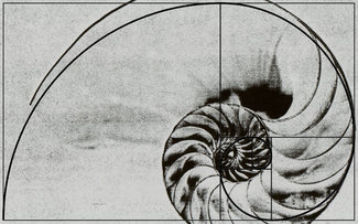
The theory being that the scale connects headings and text together in a way similar to how nature has evolved proportions between human features, butterfly wings and their patterns, the shell of a nautilus, the list goes on. And in a perfectly composed printed page, that may well work in beautiful fashion.
Trouble is, they don’t work on today’s web
Here’s the thing about modular scales: they’re only designed to work at one size layout. Change the paper size, change the scale. That’s because the hierarchy is based around those very specific parameters.
If one is to strip back the specifics and look at the ‘why’, we discover this is about information hierarchy. The main heading is the most important piece of text on the page, and therefore is set with the greatest emphasis (which usually means it’s the largest). Secondary headings are less important, but more so than the body. Captions on photos might be considered the least important of these elements, and are therefore often set a little smaller.
Notice that I’ve described the hierarchy without ever mentions a point or a pixel.
These days there are thousands of different screen sizes and resolutions in use on the web. There is simply no way to know what the screen size or window width will be when someone visits your site. Different purposes and different screen sizes require different proportions. The main heading is still the most important, the secondary headings are still next—but the specific sizes need to change.
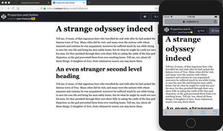
Having a heading three times the size of the body looks comical on a phone, and almost certainly will break in very awkward ways. I’ve seen entire phone screens covered with a headline fitting one word per line—or worse, breaking that single word across two lines one or two letters at a time regardless of hyphenation settings.
Scaling the scale
The answer is simple: the scale has to scale. I first started writing and speaking about this back in 2012, and covered it fairly extensively in a post on the (now defunct) Typecast blog and in my book, Responsive Typography. But the simple gist of it is that on small screens you can be more subtle, since there are fewer distractions and elements that need to be distinguished at any given time.
So an example might be that a main heading might be two times the size of the body copy on the smallest screens, two and a half times on medium size screens, and three times body copy on a large screen device. You could certainly try to keep to the values found in a perfectly harmonic modular scale, but it feels a bit forced.
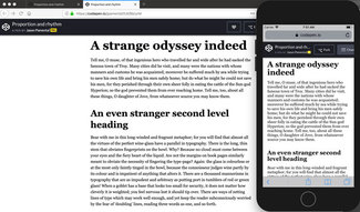
I tend to look at a few different size headings and body copy together on various screen sizes and adjust them based on screen ranges. One set of proportions for the smallest screens, and another for the largest ones. Then I’ll fine-tune them in between to maintain the hierarchy I’m looking for. It’s not scientific, but it’s clear to the reader on any device.
The code is pretty simple, and follows the same model as the scaling paragraph scale from a couple weeks ago.
h1 {
  font-family: Georgia, 'New Times Roman', serif;
  font-size: 2rem;
  line-height: 1.05;
  margin: 0 auto 1rem auto;
  max-width: 90vw;
}
@media screen and (min-width: 35em) {
  h1 {
    font-size: 2.5rem;
    line-height: 1.15;
    max-width: 32rem;
  }
}
@media screen and (min-width: 60em) {
  h1 {
    font-size: 3rem;
    line-height: 1.25;
    max-width: 40rem;
  }
}
The important takeaway is that it’s not about the pixels; it’s about proportion. Your design has to convey information, and the structure of that information is conveyed by the scale relationships between elements (and of course is built upon the semantic HTML elements used in the first place).
Vertically rhythmic
If you haven’t had enough bloodshed for one email, try looking up debates about baseline grids and vertical rhythm on the web (lots of references on this one). After you’ve had your fill, I’ll give you my personal take.
They generally don’t work
That’s not an absolute, but given the fluid nature of the web, the general inability to know the height of scaling elements like images and other media, and the constant changing of layout and line length, the entire landscape is far to malleable to control in such a rigid fashion. There is certainly a place for vertical rhythm, but only some of the time. Let me explain.
We routinely have text and images mixed on the web. But given the scaling world of responsive design, it’s impossible to say exactly how tall an image will be in relation to the text around it. Preserving an exact relationship between text above, an image, text below, and text in a sidebar next to the main content simply isn’t practical, if even possible. Not to mention at some screen sizes, the content will likely reflow completely—changing the relationships yet again.
So when designing for the web, it makes far more sense to just work in relative units of spacing that will harmonize with text size in that particular flow of content. In the main content area, setting paragraph spacing, line-height, margin below images, and spacing around headings into some fraction or multiple of the text size will preserve a rhythm between elements in the flow.
h1 {
  margin: 0 auto 1rem auto;
}
h2{
  margin: 2rem auto 1rem auto;
}
p {
  margin: 0 auto 1rem auto;
}
figure {
  margin: 0 auto 1rem auto;
}
We can’t necessarily line it up with content in a sidebar, as that will likely have its own complicating mix of images, text, and headings—all of which may be scaled slightly differently than the main content. Just follow the same pattern: make the content in the sidebar flow rhythmically with itself. On larger screens you can allow for more whitespace between columns, and on smaller screens that sidebar content will often reflow below the main area. In both cases, it’s far more important the content maintains its own flow, and is less tied to content in other areas of the screen.
Going with the flow
This is one of the most important truths of web typography as a differentiator from its paper-based counterpart: some things you just can’t control—so don’t try. Lean into the fluidity and look for ways to embrace it. Use the techniques that translate. And keep experimenting. I’ve been working through some new ideas over the past year that take the ‘scaling scale’ even further. If you end up seeing one of my talks this year you’ll learn more about it—and I’ll certainly be writing more about it here.
It’s a bit more complex, so I may hold off for a little bit until I cover a few more of the basics. But pairing these techniques with the fundamentals of the paragraph that I covered a few weeks ago will give you a solid foundation for your typographic system. Have fun, and don’t forget to share what you learn! I’d love to hear about it.
Resources
- ModularScale.com by Scott Kellum and Tim Brown
- Type Scale by Jeremy Church
- A More Modern Scale for Web Typography (by me)
- Sassline by Jake Giltsoff (a Sass tool for making baseline grids)