Thursday, 30 May, 2019
Last week I wrote about the idea of friction in design, sparked by a wonderful quote from Nina Stössinger. I’m pleased that a few of you have commented about it resonating with you as well. While in the last issue I focused on typography for longer-form reading where you want to actively reduce friction, this week we’ll take a look at the other end of the pendulum swing: type meant to halt you in your tracks and which demands to be read.
There are varying degrees to which this can be done, but the idea is by using type and typography that deliberately draws greater attention—and even in some cases makes the act of reading it just a little bit harder—one can influence the pace and attention of the reader.
Here’s that tweet again for reference (and because it’s fantastic):
Guys, no typeface is “like water”. Modernism is over. There are no crystal goblets, no defaults devoid of friction. Design has visible surfaces, inevitably, and they brim with significance and context and connotation and intent and tone.
Nina Stössinger (@ninastoessinger) April 9, 2019
Nina referenced the idea of design having a surface with context and intent. I think that the typography of headings and blockquotes are the sorts of elements that can (and often should) have a rougher surface—in a very intentional manner. These elements are often used as road signs and guideposts for the reader: they’re meant to grab your eye, draw you in, and hold your focus. By deliberately slowing you down and requiring more effort to visually decode what you’re seeing, the design can trigger a greater level of attention and retention of the message being delivered. Sometimes just by slowing you down, the message has a little more ‘stick’ to it.
There’s certainly ample history to support this idea: designers have been using type in deliberately challenging ways as long as there has been a notion of design in the first place.
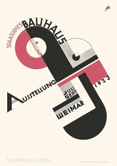
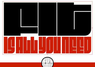
(bau)Haus music
There are whole books’ worth of great examples of typographic friction in poster design over the decades, but this one from the Bauhaus is a wonderful example. Type is equally important as part of the form, and hierarchy is driven by placement, scale, and directionality. It’s a beautiful example of friction that demands your attention and focus.
Analog dreams & electric sheep
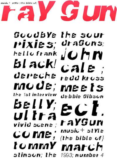
David Carson’s layering, cutting, combining, and breaking of letterforms is a hallmark of graphic design in the 90’s and early 2000’s. His work turns type into texture, mixes serif and sans-serif forms, duplicates counters, and in general reaches out, grabs your eyeballs and yanks them to the page. While it was the advent of digital tools that unleashed much of this experimentation, the end result at times looks more like a cut paper collage—in the best and most visceral of ways.
You’re sans-forgettable
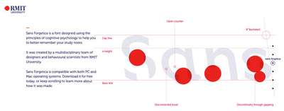
Late last year a group of researchers from RMIT in Melbourne released a study and a typeface they claim improves memory and reading retention by purposefully making it harder to read. There is far from enough evidence to be certain it actually works, but it certainly can serve as a playful and eye-catching display face.
A digital analog
When we think about adding friction to the reading experience on the web, we have to think in a few different dimensions. We still want it to be readable—visually, for those using assistive technologies, and of course, the robots—but that doesn’t mean can’t be visually arresting. Through typeface choice, layout choices, scale, writing direction, and techniques leveraging positioning and overflow, we have lots of opportunities to create friction. It’s a shame it’s not more common.
A few years ago, Jason Santa Maria famously took on the challenge of art directing every blog post on his site, with different layout, type choices, color, and more. Stunning, and unsustainable. Jen Simmons has been doing a host of amazing explorations of superb graphic design, translated to the web—in her talks and on her Labs site (start there to see the kind of typography I’m talking about)
So why have we cast away our voice?
Likely for a myriad of reasons, but the simplest and most likely candidates are time and complexity. The constant rush to publish means more time spent on the universal elements of design, and less (if any) spent on the specific. I think it’s time to change that while we still can. While there are still graphic designers who remember that there used to be something called ‘art direction’ involved in publishing a piece of text. Design decisions made based on the content—this content—that amplify the mood and message. Decisions that add friction.
We’ve created wonderful publishing platforms (like the ones I use to bring this to you: MailChimp, Drupal, and Medium) that allow us to create a design system that presents our content in consistent and pleasing ways, and removes much of the friction in the publishing process itself. But we stopped there. We never got around to building a few more tools that let us put the friction back in. So that’s what I’d love to see next: Tiny little style sheets paired with specific headlines and stories, adding the design and direction we’ve lost along the way to our new digital neighborhood.
<style type="text/css">
@media screen and (min-width: 60em) {
h1 {
--h1-font-size-max: 7;
float: left;
width: 4.25em;
shape-outside:
polygon(0px 0px, 4.25em 0px, 4.25em 43%,
3.5em 43%, 3.5em 100%, 0px 100%);
}
}
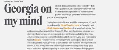
</style>By adding that simple bit of CSS above into a code embed block on that page on my site, I can add a bit of design and direction to the individual posts without having to push custom code through a deployment cycle.
I hope you’ve enjoyed these last two issues, and are thinking about typography just a little bit differently now. I know I’m still wrapping my head around the ideas of surface and tension, friction and flow—but that’s what I love about this industry. It changes every day, and what we experiment with today, shapes the browsers and trends of tomorrow. Let’s make a difference!
Resources
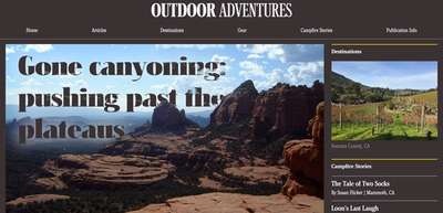
- Outdoor Adventure art direction example on CodePen
- Art Direction for the Web by Andy Clarke
- Jen Simmons’ Labs site
- Typesetting a headline (all screens)
- Typesetting a headline (larger screens only)