Typographic friction: testing the vertical limits
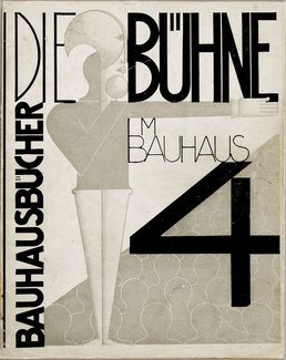
Jumping off from last week’s theme of intentionally challenging the reader with different kinds of typographic layout ideas, I thought it might be interesting to look at one of Jen Simmons’ topics of late: writing modes. Changing the direction of text in layout has been a practice in print graphic design for decades, and is in particularly fine display in many examples of Bauhaus design. While perhaps not the easiest to read in large quantities, there’s no reason not to think about it for larger display type or things like image captions or photo credits.
For a deep dive into writing modes I recommend a couple of presentations from Jen Simmons and Chen Hui Jing: they both do a fantastic job of explaining their intricacies with far greater authority than I can. But I’ve included a couple of examples this week that might serve to get you started. Rather than simply rotate the text using ‘writing-mode: vertical-rl’ (read more about this on MDN), I’ve added a few more layers to show how it might get used in production.
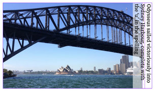
Here’s a look at where we’re starting.
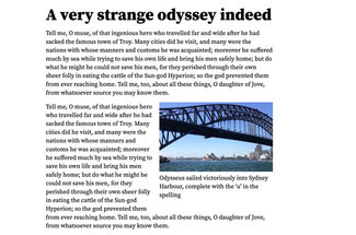
By default, changing the writing mode of a text element rotates the element 90 degrees clockwise (tilt your head to the right to read it), but does nothing else beyond that from a layout perspective. It’s still a block element, so the net effect is that it pushes all the content down.
There’s also another consideration: if we’re typesetting the main heading, we likely want that to be read first. So we’ll probably float the element to the left. But then the element would be on the left and to read it we’d have to tilt our heads to the right. That feels awkward (and perhaps against more common practice in Western graphic design). So we add a transform and rotate it 180 degrees. That, coupled with a float to the left gives us our heading down the left, with text wrapping around it. Not bad.
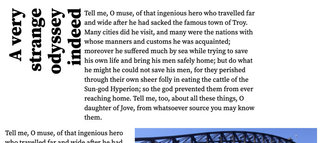
We’ll need to add some padding between the heading and text, but we’ll have to remember that we rotated the text, so when we want to add padding visually on the right, we have to assign it on the left. Getting better.
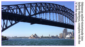
Here’s what we have so far:
.vertical h1 {
float: left;
text-align: right;
min-height: 50vh;
max-height: 85vh;
/* turn the writing on its side */
writing-mode: vertical-rl;
/* flip it around to the left */
transform: rotate(180deg);
/* we've rotated 180 degrees, so left is right :) */
padding-left: 1rem;
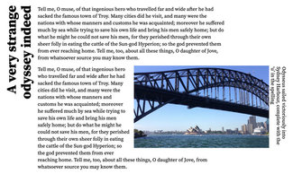
}One thing that came to mind was not wanting to have to scroll to read the headline. Viewport units to the rescue here: set a max-height of 85vh and it will simply wrap more as needed, making sure you can read the headline without scrolling. Pretty nifty stuff.
@media screen and (min-width: 35rem) {
  .vertical h1 {
    ...
    min-height: 50vh;
    max-height: 85vh;
  }
}
@media screen and (min-width: 45rem) {
  .vertical h1 {
    ...
    max-height: 55vh;
  }
}
But we’re still creating a somewhat awkward cut into the text area, and the gaps where the boundaries of the float are can sometimes be pretty large depending upon how the text is wrapping. So maybe we want to hang the heading outside the text area. Since we already are using a transform to rotate the text, we can add in a ‘transform-origin’ to change the point around which the rotation occurs, letting us rotate it right out of the main text area. This leaves a space in the layout though, as while we’ve transformed the text, it’s placement in the layout is preserved. So when the layout is wide enough to add this little trick, we want to pair it with one more modification: set a negative margin on the bottom of that element of -100%. This will close up the space where the text was laid out, no matter how many lines it wraps.
@media screen and (min-width: 35rem) {
  .vertical h1 {
    ...
    /* the negative margin-bottom removes the space blocking
    out the surrounding content */
    margin: 0 0 -100% 0;
    /* transform the point of origin for the rotation to
    position the heading outside the text block */
    transform-origin: center left;

  }
}
By layering in these techniques in stages as the screen gets wider, we’re able to still have semantically sensible content that’s easily readable on a phone, and then gets progressively more interesting as screen space allows.
I added a bit of flair to the figure and caption as well, so it didn’t feel left out. That did uncover what I suspect is an implementation bug—but that will require a bit more investigation. Thankfully folks like Rachel Andrew are really helpful in pointing me in the right direction to create a specific enough test case so browser vendors can investigate. In the meantime, I’ve left a couple of options in place. In the images below I’ve turned on the grid overlay in my Firefox Dev Tools to show the issue.
The issue arises in wanting to change the writing mode of the caption to place it on the right of the image. But in using CSS Grid to change the layout, there arises a computational conundrum in figuring out a ‘min-content’ row height that also impacts column width to keep the caption wrapping at the height of the image, but as it wraps, then that changes the horizontal space available for the image, thereby reducing the height… triggering another cycle of recalculation. So I might have uncovered a nasty rabbit hole that could be impossible to solve. Or I just need someone smarter than me to look at it a bit more. We’ll see 🙂 In the meantime, you can play around with this on CodePen and see what you can do with it.
I really like the idea I started utilizing on my site last week: rather than trying to engineer all these things in a universal manner, I’ve taken to writing a bit of CSS for specific posts. This lets me play a little bit and decide which ideas are worth codifying into a system. I hope you’ll give it a try too, and help us all move along to a more interesting and typographically sophisticated web.
Resources
- Check out the example on CodePen
- Jen Simmons on writing modes (24 Ways)
- More Jen Simmons on writing modes from CSS Day
- Chen Hui Jing on modern layouts at CSS Conf EU last week
- Writing modes on MDN