Drop caps (styling the initial letter)
A ‘drop cap’ or ‘initial’ is a specifically-styled first letter of a block of text that is usually larger and sometimes more ornate than the surrounding letterforms. In centuries past these were often elaborately drawn, but the practice still continues even when just enlarging the first letter in the same typeface or style. Usually indicating the beginning of a new chapter, article, or passage of text, it is often combined with last week’s tip of styling the entire first line.

As printing with movable type overtook writing manuscripts by hand, it was often the case that a space was left at the beginning of paragraphs for a capital letter to be hand-drawn after printing was completed. In an interesting turn (and a nice nod to next week’s topic), that indent remained long after the practice of drawing the capitals went by the wayside, ushered out by the ever-increasing speed of the printing press. Illustrators just couldn’t keep up.
On the web, one might argue that such an esoteric practice may not have a place. But reading tendencies on screens are different, and a larger, more graphic element can provide a strong visual cue for readers that a new section is beginning without having to resort to extra elements or spacing.
Here, there, (pretty much) everywhere
The capability of targeting the first letter of an element has been supported in all major browsers for quite a few years by way of the ‘::first-letter’ pseudo-element, but it does take a bit of finessing as it is not intrinsically related to the text around it. The more modern ‘initial-letter’ property works in conjunction with ‘::first-letter’ and defines the letter in relation to a number of lines of text (and how many rows you want it to ‘sink’ down next to the rest of the copy). Unfortunately, this property is currently only implemented in Safari—and is not a complete implementation either, according to the W3C specification. With a little finessing though you can still achieve consistent results using just the selector, as shown here.
It’s good to remember that you will likely want to target something more specific than the first letter of every paragraph. Like with last week’s tip on styling the first line, you might chain the selector with ‘:first-of-type’ or use an adjacent selector combination like ‘h2 + p::first-letter’—which would target only the first paragraph in a grouping or only the first paragraph immediately following an h2, respectively.
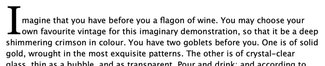
The CSS itself is relatively straightforward. First we have to ensure we have ‘position: relative’ on the element itself (in this case a paragraph), so that we can position the first letter relative to it. (Full set of demos are on CodePen)
p {
  font-family: 'Lucida Grande', Helvetica, Arial, sans-serif;
  line-height: 1.4;
  margin: 2em auto;
  max-width: 38em;
  position: relative;
}
Then we can move on to positioning the first letter:
p:first-of-type::first-letter {
font-family: Georgia, serif;
float: left;
font-size: 7.125em;
font-weight: bold;
line-height: 0.65;
margin: 0;
padding: 0.05em 0.1em 0 0;
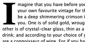
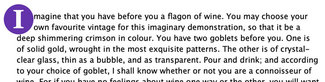
}The relevant bits for positioning start with floating the letter to the left so content floats around it, adjusting the size, setting the line-height (important for positioning relative to surrounding content in Safari and Chrome; Firefox is unaffected), and setting margin and padding around the first letter itself. With a bit of trial and error you can get pretty consistent alignment with the surrounding text baseline.
It’s important to note that size units here are very specifically ‘em’ units, rather than ‘px’ or even ‘rem’—the reason for this is that we want it to always be set relative to the surrounding text. This way it will always scale smoothly with any text size changes introduced by page zooming or other style overrides.
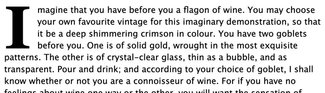
If course if you simply want to have a differently styled or sized initial letter, you can skip the positioning and floating. Simply making the ‘::first-letter’ style larger will let the letter stick up above the surrounding text but keep the baselines aligned, like in the image below.
The CSS for this is a bit simpler:
p:first-of-type::first-letter {
   font-family: Georgia, serif;
   font-size: 2.75em;
   font-weight: bold;
   line-height: 1;
   padding-right: 0.1em;
}
Future forward
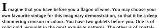
Finally, you can see how it renders in Safari using the ‘initial-letter’ property here. See how nicely the letter lines up with the baseline of the surrounding text. (Jen Simmons also has a some great demos on her labs site)
Note how much less CSS is required:
p:first-of-type::first-letter {
   font-family: Georgia, serif;
   -webkit-initial-letter: 3 2;
   initial-letter: 3 2;
}
Of course, to best follow the example set by Jen Simmons in her demos, we can use CSS feature detection via ‘@supports’ to layer both techniques in the hopes that one day we won't need the finickier version. The first image is in Safari, the second in Firefox.
Here’s the combined CSS:
p:first-of-type::first-letter {
font-family: Georgia, serif;
float: left;
font-size: 7.125em;
font-weight: bold;
line-height: 0.65;
margin: 0;
padding: 0.05em 0.1em 0 0;
}
@supports (initial-letter: 2) or (-webkit-initial-letter: 2) {
p:first-of-type::first-letter {
-webkit-initial-letter: 4;
initial-letter: 4;
/* undo other bits */
float: none;
font-size: inherit;
line-height: inherit;
margin: 0;
padding: 0 0.25em 0 0;
}
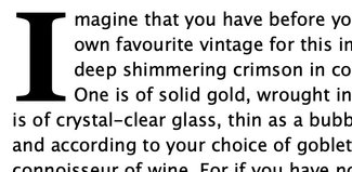
}While we’re at it, I figured we should include a bit of fun. Since we are positioning that first letter as its own element, there’s nothing stopping us from adding a bit of color.
The CSS for this has a bit more to it. Notice not only do we add background-color and border-radius, but we also need to work a bit more with margin and padding to position it how we'd like.
p::first-letter {
  background-color: #6333ab;
  border-radius: 50%;
  color: #ffffff;
  font-family: Georgia, serif;
  float: left;
  font-size: 3.25em;
  font-weight: bold;
  line-height: 0.65;
  margin: -0.25em 0 -0.15em -0.5em;
  padding: 0.25em 0.35em 0.25em 0.35em;
}
As you can see, there are lots of things we can do to add emphasis with these techniques. And this is all without adding any extraneous markup or classes. That makes is a much more durable technique, especially for use in a content management system. This will give consistent, predictable results throughout the site.
Now if you want to get really clever and on the server side add a class identifying the first letter, we could have some serious fun with a library of SVG-based illustrated capitals as image backgrounds, setting the text transparent—giving us beautiful illustrations that are always the correct letter, and without giving up the accessibility of the text itself. But perhaps that’s for another day ;)
Resources
- Examples on CodePen
- MDN ‘::first-letter’ pseudo-element documentation
- Jen Simmons' initial letter demos
- W3C specification (draft)
- MDN ‘initial-letter’ documentation
- Bug filed with Mozilla about ‘initial-letter’ support for Firefox (comment and show your support!)
- Can I Use support reference for ‘::first-letter’
- Can I Use support reference for ‘initial-letter’