Styling the first line
Seeing as this is the very first issue, I didn't want to start with something too complicated—at the same time I wanted it to relate a time-tested typographic technique in graphic design: styling the first line of a block of text.
This technique is pretty common in both magazine and book design, and is often used to set off the beginning of chapters, articles, or major sections within them. Small caps (specifically designed smaller capitals in place of lower case letters), like you see below, or a bolder weight are two frequent solutions.
In order to be useful, we want to avoid extra HTML markup and be sure it works no matter where it's viewed. With the sheer volume of screen sizes and devices out there, it's impossible to know exactly how many words will be on that first line. That's what's so great about this technique: it doesn't matter! It just works.
The ability to do this on the web has actually been well supported for years, but I've rarely seen it put to use. Particularly with responsive design, the idea that we can use a technique like this that will target the first line without any additional HTML makes this a great technique when used in a content management system to style posts in a consistent manner.

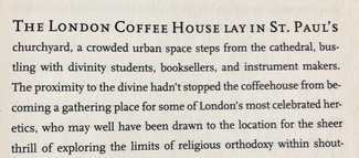
The image above is of an example hosted on CodePen, which you're free to play around with and see how it works.
Here's the CSS:
p {
  font-family: Georgia, serif;
  margin: 2em auto;
  max-width: 38em;
  /* try changing this number to see how only the first
  line changes, no matter how long or short the line */
}

/* This is what targets the first line of the paragraph */
p:first-line {
  font-weight: bold;
  font-variant: small-caps;
}
The code above will target the first line of any element (in this case, the paragraph). You can be more selective by using an additional adjacent or pseudo-selector like so:
/* target the first paragraph in any grouping */
p:first-of-type:first-line {
  font-weight: bold;
  font-variant: small-caps;
}
/* target the first paragraph immediately following an h2 */
h2 + p:first-line {
  font-weight: bold;
  font-variant: small-caps;
}
That’s it! Now you can easily style the first line of text in any element. Used with care, it can add a nice level of refinement to your typographic design.
This technique is often used in conjunction with drop caps (specifically styling the first letter of an element), but I’ll save that for next week. Like this one, it’s pretty well supported—just a bit more finicky to finesse in all browsers.
Resources
- Example on CodePen
- Browser support on Can I Use
- I cover this and other tips for styling paragraphs in my talk The Life of <p>