Getting bent: the current state of Italics in variable font support
One of the key objectives in the creation of the variable font specification was interoperability with static fonts, no matter where they’re used. If accomplished, that would mean on the web that a variable font with a weight axis and a ‘regular’ weight value of 400 would automatically map to that point on the axis when given CSS attribute/value of ‘font-weight: normal’. Likewise if there is a width axis with a value of 100 that corresponds to the normal width, that is what would be displayed when the corresponding ‘font-stretch: normal’ is supplied. Or in both cases, if nothing is specified, those would be the default values. And indeed, both of these work as intended in all the shipping browsers that support variable fonts.
But not so with Italics.
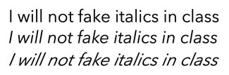
The format supports having both Roman and Italics in a single file, though some feel that there is enough differentiation in glyphs between the two that it may be more efficient to split them into separate files. It’s easy enough to set up either way, but in both cases what should happen is that the Italic axis should map to the ‘font-style’ attribute, meaning that if you specify ‘font-style: italic’ that should tell the browser to render the font with the Italic axis set to 1 instead of 0. The trouble is, it doesn’t actually work. At least not as you might expect.
It’s at least partly related to setting up the initial @font-face declaration. When doing so for a variable font, the setup is a bit different. I covered that in some detail a few weeks back, but the issue here a little fuzzy. When stipulating weight, the spec requires something like ‘font-weight: 100 900;’—indicating that the variable font has a weight axis from 100 to 900. Width works in a similar fashion: ‘font-stretch: 75% 100%;’ indicates a width axis from 75-100. But ‘font-style’ does double-duty, as it can be used to control either italics or an oblique angle. So the setup is less clear-cut. If there is a slant axis (‘slnt’) then the appropriate declaration would be ‘font-style: oblique 0deg 12deg;’ (or whatever the degree range is for that font). But if it’s got an Italic axis (‘ital’) it’s not as clear-cut.
A sidebar on slant
Just to clarify things in case you missed it, there are indeed separate Italic and slant axes, and they are truly different. Italics are generally at an angle, but also often include alternate glyphs or character styles, like a different sort of lower case ‘a’ or ‘g’, or an ‘f’ with more flourish. Those vary by typeface design, but in general that is what distinguishes Italics from slant, which is generally just an angle variation from upright (0) to some number of degrees. In most cases, you would be more likely to see slant applied to a sans-serif design, but that’s simply what’s more common today than any sort of hard-and-fast rule. The point is that they are indeed different.
Standard, deviation
My initial instinct was it should be ‘font-style: normal italic;’ to indicate it can either be normal or italic, but that’s not the case. In Safari (well, technically Webkit) it’s governed by the same syntax as that for slant, except the degree values don’t matter. It just indicates to the browser that there is an axis, and Safari takes a look. If the font has in Italic axis, it renders italics when called for. But no other browser follows that syntax. From asking around a bit, it seems that the spec is ambiguous enough that there is a lack of agreement on exactly how this should be implemented.
@font-face {
  src: url('url/to/font.woff2') format("woff2-variations");
  font-family: 'Font Name';
  font-weight: 100 900;
  font-stretch: 75% 100%;
  /* Webkit-only implementation to enable Italic axis */
  font-style: oblique 0deg 20deg;
}
To make matters worse, differences in how and when browsers decide to implement the axis and/or synthesize Italics produces a dizzying array of different behaviors. I have a CodePen set up with Avenir Next, one of the fonts Monotype is preparing to release, referencing both a combined variable font file, and separate Roman and Italics set up with family grouping in the @font-face declarations. With either of these, we should be able to see the proper behavior when an ‘em’ tag is used, or if we specify ‘font-style: italic;’—but you’ll see that the behavior is in no way consistent or predictable across browsers. We’ll look at them each in turn. (And to be clear, this has been confirmed with several different font files from different vendors)
Combined font file, no font-style in @font-face
Where we have a combined variable font file but have not defined anything for ‘font-style’ in the @font-face declaration, the only browser that does anything when a selector calls for ‘font-style: italic;’ is Safari. And in this case, not only does it activate the Italic axis, it throws a synthesized Italic on for good measure, effectively doubling the ‘Italicness’. You can negate the synthesis by adding ‘font-synthesis: none;’ but it’s never really preferable to solve the problem by adding more code. And regardless, at this point Safari is the only browser that does anything at all.
@font-face {
  src: url('url/to/font.woff2') format("woff2-variations");
  font-family: 'Font Name';
  font-weight: 100 900;
  font-stretch: 75% 100%;
}

.fsi {
  font-style: italic;
}

Combined font file, font-style defined using Webkit-supported syntax
When setting up the @font-face declaration using the syntax supported in Safari (font-style: oblique 0deg 12deg;), Safari does indeed render the correct italics without the synthesis applied on top. This is true for default italic styles (like the ‘em’ tag) or if you stipulate ‘font-style: italic;’ for a given selector. But Safari is at this point the only browser that supports this. It just seems odd to me that you would use the same syntax used to define the supported degree range for a slant axis the same way you would define what is typically an on/off condition for upright or Italic.
@font-face {
  src: url('url/to/font.woff2') format("woff2-variations");
  font-family: 'Font Name';
  font-weight: 100 900;
  font-stretch: 75% 100%;
  /* Webkit-only implementation to enable Italic axis */
  font-style: oblique 0deg 20deg;
}

.fsi {
  font-style: italic;
}
Combined font file, using font-variation-settings
Now while the goal is to be able to use the higher-level ‘font-style’ attribute, we do have the ability to set the axis using the lower-level ‘font-variation-settings’. But this is less than ideal as it brings with it the complication if increased specificity where you might not expect it, and the need to redeclare every axis specified that way every time you want to change a single value. So if you’re setting Italics in addition to one or more other custom axes, you have to redeclare all of them every time. However, at the moment this is the only way to get proper italics with a combined variable font file in every browser.
@font-face {
  src: url('url/to/font.woff2') format("woff2-variations");
  font-family: 'Font Name';
  font-weight: 100 900;
  font-stretch: 75% 100%;
}

.fvs {
  font-variation-settings: 'ital' 1;
}Separate font files, using font-style: italic
With separate font files, I had for a time thought we were in the clear. But with this set of experiments it became clear that there are still some issues to be resolved. First, let’s look at how the @font-family declarations are set up to enable the family grouping:
@font-face {
  src: url('url/to/font-roman.woff2') format("woff2-variations");
  font-family: 'Font Name';
  font-weight: 100 900;
  font-stretch: 75% 100%;
  font-style: normal;
}

@font-face {
  src: url('url/to/font-italic.woff2')
  format("woff2-variations");
  font-family: 'Font Name';
  font-weight: 100 900;
  font-stretch: 75% 100%;
  font-style: italic;
}

.fsi {
  font-style: italic;
}
Now with separate font files referenced for upright or Italics, it should be straightforward to use ‘font-style’—but this is again not currently the case. Here, Chrome and Edge are the only ones that select the right file and display it correctly. Safari and Firefox select the right file, but then apply a synthesized Italic on top for a pretty exaggerated result. While this could be corrected by then adding ‘font-synthesis: none’—you would have to do so for every element that might be rendering Italics. Far less than ideal.
Separate font files, using font-variation-settings
Like with the combined file, this works consistently in Safari, Chrome, Firefox, and Edge. But we have the same drawbacks as above: increased specificity and the necessity of redeclaring every axis value determined by font-variation-settings every time you want to change one of those values. Given that the strong preference of the W3C CSS Working Group is to only use font-variation-settings for custom axes, and the proper higher-level attributes for the standard ones, we clearly haven’t achieved that when it comes to Italics.
@font-face {
  src: url('url/to/font-roman.woff2') format("woff2-variations");
  font-family: 'Font Name';
  font-weight: 100 900;
  font-stretch: 75% 100%;
  font-style: normal;
}

@font-face {
  src: url('url/to/font-italic.woff2') format("woff2-variations");
  font-family: 'Font Name';
  font-weight: 100 900;
  font-stretch: 75% 100%;
  font-style: italic;
}

.fvs {
  font-variation-settings: 'ital' 1;
}Setting the axis square
To be clear, I don’t want to minimize the progress we’ve made. What we’re seeing in general is a high level of consistency in many areas of variable font implementation. But the lack of agreement on how to declare the presence of an Italic axis has left us a situation that breaks default behavior (i.e. content wrapped in an ‘em’ tag does not get displayed in italics) and hurts interoperability. I really hope this post and CodePen example help provide enough details for the browser vendors to find some common ground and get this sorted out.
I’ll be honest: ultimately I think the correct solution would be to break ‘oblique’ out to a separate attribute so we have separate controls. Font-style for Italics (with a value supported should the font enable more than on or off), and font-slant for oblique angles. But barring that, it seems like we should support something like ‘font-style: normal italic;’ for a font that have an Italic axis, and the current ‘font-style: oblique 0deg 20deg;’ (or whatever values are supported by the font) for those with a slant axis. This combination would best accommodate progressive designs like DJR's Roslindale Variable Italic, showcased a few weeks back, that indeed has separate Italic and slant axes.
Until then, though, the only way to consistently get the correct Italics with either a combined file or separate ones with family grouping, is to use ‘font-variation-settings: "ital" 1;’
As always—email, tweet, or send carrier pigeons with comments, questions, and links to what you’re making!