Weight, wait—don’t @ me
As I’m sure many of you do, I read a fair amount on the subject of web typography, performance, and design for the digital world in general. In doing so a bit more regularly since I starting this newsletter, I keep having some phrases jump out at me—and I’m increasingly saddened by their consistency. Over the years it has become pretty standard advice to minimize the number of different fonts you load for a given website design, and it’s advice that I’ve given as well.
But what I hear more often now is this advice couched in terms of ‘what is good typography’, rather than its truer origin: basic web performance. The advice goes something like this: ‘don’t use more than 2 or 3 weights of a given typeface in your design because that’s better typography.’
Except that is patently untrue.
Now, it is generally good advice to not use more than 2 or 3 typefaces in your design (such as Georgia, Helvetica, or Proxima Nova), as this does tend to give you a bit more harmony. But even that’s not an absolute. Let’s be clear: the motivating factor behind the previous phrasing is all about font download performance. It has nothing to do with what is or is not ‘good typography.’
I’ve also heard this line of reasoning applied from the inverse direction—implying that there’s no point in considering more than 3 or 4 fonts when discussing web platform technology evolution ‘since no-one ever uses more than that in their design.’ This simply completes the circular logic and perpetuates the falsehood. The greater danger here is if that statement is accepted as fact, then forward progress in web font performance could be seriously misdirected.
A history of misrepresentation
Since every weight or variant of a typeface is a separate file, it follows that if you wanted to use one for your body copy you would tend to want a regular weight, a bold, an italic, and perhaps bold italic. And possibly a fifth font for a contrasting header. That would mean you’re loading 5 different font files in order to represent the content on your site. Not everyone will opt to use web fonts for everything; for example, some will use system fonts for body copy. This tends to be the most people will include, because loading the font data takes time. And the more fonts, the longer it will take for the web site to render.
So it may be good advice in order to preserve better user experience, but it’s still not related to the quality of the typography itself.
In truth, all you have to do is look to magazine covers to see what is more typical in a well-designed layout: often times you can see numerous weights and variants in a single layout—each one being used to match perfectly with the size, placement, and desired visual hierarchy.

Look carefully at the typography on this cover. There are at least 3 weights of the serif, and 3 or 4 of the sans—plus some italics. Each one is used carefully to create visual tension and hierarchy, controlling the pace and guiding your eye. If you were to tally up the different faces, weights and italics it would be somewhere in the 8-10 range. Much more than would typically be allowed in our performance budgets.
If you want to talk about what is or is not good typography, head to your nearest magazine stand and look at the covers. Have a peek at Vanity Fair, Vogue, Atlantic Monthly—you’ll see just how good they are at modulating those characteristics to guide you around the layout. And while in some cases it’s about larger type and light weights, others it’s about smaller type and exploring just the right heavier weight: adding emphasis without reducing legibility.
Just as on smaller screens we don’t need as great a size differentiation to create hierarchy, we likewise don’t need as heavy a weight. This is as much about visual weight as it is about clarity: heavier weights at smaller physical sizes can be harder to read. Utilizing a 500 or 600 weight instead of the usual 700 for bold in those situations can be extremely beneficial.
Medium is the new bold
With that in mind, the downfall of our constrained font loading practice is there will likely be only one bolder weight of a given typeface available for use on your site. And that one weight might not be the best one to provide emphasis at any size. Let’s look at some comparisons.
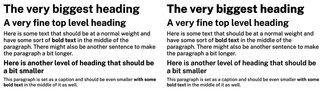
While the differences are subtle, it can have a significant impact on legibility. The text on the right uses a single regular and bold weights. The text on the right subtly tunes them to accentuate the differences between headings and maintain slightly better clarity. You can see it in the browser here on CodePen.
Now, I’m not recommending that you all fo a sudden decide to add a bunch more weights of fonts to your site willy-nilly. But you could think about trying a variable font and using the weight axis to fuller effect. One of the things I’m most excited about is the ability to be more thoughtful about the relationship between weight, size, and relative proportion to the type around it. I know, this is the second week in a row I’ve mentioned variable fonts without really explaining them. So I’ll link you to an essay I wrote about them, and get into a bit more detail next week.
Don’t believe the hype
My main point is this: we need to stop conflating technical considerations with guidance about what good typography is all about. Just as I wrote about the relationship between font size, line height, and line length—weight must relate to size and surroundings. And the more nuanced you can be with that, the more polished your typographic system will become.
Until next time, set boldly. Or slightly less bold, as the case may be ;)
Resources
- Example on CodePen
- My essay on variable fonts
- Another article I wrote about variable fonts for UXPA magazine