Digging in to dynamic typography
The core idea of responsive typography is that the main elements of typographic structure and hierarchy should scale based on viewport size. Small screens can have more subtle size or weight distinctions and still convey hierarchy. Reading comfort is best served by keeping font size, line-height, and line length in sync: tighter line-height (leading) for narrower columns; more open line-height spacing as the line length gets longer on bigger screens. It also aids legibility to modulate font-weight for headings as font size changes. The smaller the physical size, the more you might want to reduce the weight in order to maintain legibility (reducing weight from 700 to 625 on headings for example). It can also be useful (if it’s available) to slightly reduce the width of the text on smaller screens to fit a few more characters per line. This is especially useful with larger heading sizes.
Previously, I’ve always recommended using a series of breakpoints to adjust each of these parameters as the screen size changes. But this require a lot of code, and can be hard to maintain and keep in sync across different HTML elements.
As I showed last week and have been demonstrating in talks over the past year or so, new CSS techniques are opening up possibilities for greater fluidity with less code. Variable fonts let us do even more. This technique uses calculations in CSS (and augmented with JS) to scale elements such as font-size, line-height, font-weight, and font-stretch (width) fluidly from a supplied lower value to a higher one, starting at some breakpoint and capping the scale at a larger one. This prevents the text from ever getting smaller or lighter or narrower than the lower value, or bigger than the higher one.

This time I’ve eliminated all of the extra code and focused solely on the aspects of scaling the typography (you can follow along on CodePen). We can build on this in the future to layer in font loading, fallback font tuning, static web font support with the variable fonts scoped within an @supports block, and more complete abstraction to use the same CSS and JS with different font stacks and size ranges. But this is a bit more constrained. For the curious, I’m also featuring another of Monotype’s upcoming releases, Frutiger Neue Variable. It’s a real beauty, and the width and weight axes give a huge amount of range to a real workhorse of a typeface.
Last week’s example included scaling font-size and line-height with calculations, but font-weight and font-stretch were set statically for small, medium, and large values—spread across breakpoints. The reason for that is by their nature, CSS calculations like these have a unit value once the calculation is completed. That works for font-size and line-height, but not for font-wight (needs to be just a number) or font-stretch (which must be expressed as a percentage). While the CSS specification is updating to help you arrive at a unit-less value from a calculation, that capability does not yet exist in browsers. So this week I’ve added some JavaScript that I adapted from Mandy Michael’s Fluid Font Weight demo on CodePen.
The adaptations were made to allow us to feed in multiple sets of variables to scale values for font-weight and font-stretch in the same manner as font-size and line-height. Since we set the low and high end values in our element declarations, we don’t have to worry about the JS not working—but when it does, those values will scale as smoothly as everything else.
The setup
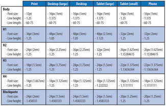
To get started we need to establish some initial variable values to be used in our calculations. Things like breakpoints; font size, line height, width, and weight value ranges; and the default starting point assignments for each element. We’ll look at breakpoints and the main heading (h1), but it’s the same for ‘h2’ and paragraphs.
:root {

  /* breakpoint variables */
  --bp-small: 25;
  --bp-medium: 45;
  --bp-large: 55;
  --bp-xlarge: 65;


  /* set px value sizes */
  /* initial px value for text */
  --rem-px: 16;

  /* EDIT HERE to set px value sizes */
  ...
  --h1-size-s-px: 40;
  --h1-size-l-px: 72;

  /* calcs to create values for the formulas */
  --h1-size-min: calc( var(--h1-size-s-px) / var(--rem-px) );
  --h1-size-max: calc( var(--h1-size-l-px) / var(--rem-px) );
  --h1-lh-min: 1.05;
  --h1-lh-max: 1.1;

  /* values to scale across breakpoint range */
  --h1-wdth-min: 75;
  --h1-wdth-max: 85;
  --h1-wght-min: 700;
  --h1-wght-max: 225;

  /* default starting scale value */
  --h1-wdth: var(--h1-wdth-min);
  --h1-wght: var(--h1-wght-min);
}
Walking down through the code above, we first set breakpoint variables in ‘em’ units, but just as numerals. That’s because we’ll need to do some math with them, so we’ll add the ‘em’ when we need it. Then you’ll see a value for the base text size (we’re setting things up with 16 as the base pixel equivalent). Next we set the pixel values for the low and high end of the size range for the ‘h1’ element. Now we combine them to end up with ‘em’ values to use in our formula, low and high values for line height scaling, width, and weight. Finally, we set the low values as the default values to start with. This last bit is important: these two custom property assignments are the ones we’ll be dynamically reassigning as the viewport changes with our JavaScript.
Starting small(screen)
Once we have the initial values assigned, we can use them to set up styles for the main heading on small screens, like so:
h1 {
  font-family: var(--font-stack-heading);

  /* set low-end scale values for smallest screens */
  font-size: calc( var(--h1-size-min) * 1rem);
  line-height: var(--h1-lh-min);

  /* JS will scale the next two values dynamically */
  font-stretch: calc( var(--h1-wdth) * 1%);
  font-weight: var(--h1-wght);
}
Sliding into scale
As we hit the point where we want to start scaling, we add a media query and include the formulas for font-size and line-height. The formula is a doozy, but Tim does a great job explaining his use for it with line-height. I’ve adapted it to use CSS custom properties so there is less variation needed when using the formula in one place or another, or in adjust the breakpoints where you want scaling to stop and start. Here’s the formula in use to scale the font size, and then we’ll break it down just a bit.
h1 {
  font-size:
    calc(( var(--h1-size-min) * 1em ) +
      ( var(--h1-size-max) - var(--h1-size-min) ) *
      ((100vw - ( var(--bp-small) * 1em )) /
      ( var(--bp-xlarge) - var(--bp-small) )));
}
So let’s restate that another way:
Please scale the font size from [this] to [that], starting when the screen width reaches [here] and stop when it gets wider than [there]
In this case, as we showed above, we want to scale from an equivalent of 40px to 72px, starting when the viewport reaches 25em, and stop scaling when the viewport is wider than 65em. The magic is where we bring viewport units into the formula. The other parts are fairly straightforward. But browsers can do math that we cannot—so that’s how we get two important outcomes: the value scales smoothly, but because we’ve mixed viewport units with ems, users can still zoom in on the text. When using strictly viewport units for sizing, the text will never scale—creating a huge accessibility issue.
The nice thing is all we have to do is swap out the variables for font-size (or line-height) and we can use exactly the same structure everywhere we want to use it. The only caveat at this point being CSS does not support ending up with a unit-less value. This is why we can only use this technique for things like font-size or line-height. To scale font-weight (which needs just a number) or font-stretch (which must be expressed as a percentage), we need a different solution.
Just a little slide to the left
Until we have browser implementations that allow for unit-less calculations (spec is updated, but not yet implemented. So we’ll use a bit of JavaScript instead. We want to do the same thing the CSS calc() is doing: scale a weight or width from one value to another (up or down) based on viewport size. The reason we want it to work in either direction is to allow for something like the top level heading to get larger and wider as the viewport increases, but at the same time we want the weight to reduce, giving us a larger, lighter the treatment on larger screens. Thankfully, this is where Mandy’s Fluid Weight CodePen comes in handy—so I’ve used that as a starting point to set up our solution.


Primarily the changes revolve around reading and setting more CSS custom property values for breakpoint settings, minimums, and maximums—and do that for multiple HTML elements. In this case we want to scale the width and weight of h1’s, h2’s, and p’s. Better JS wranglers than I could probably streamline this even more, but it’ll do for now!
First we set up the functions (one main one, one nested inside it), and then the event listeners (on load, and on resize). This ensures we get correct initial values, and keep them correct whenever the viewport changes.
function variableResize() {

  ...
  // set up values by reading existing CSS properties
  ...

  function scale(varName, minValue, maxValue) {

    ...
    // scale the value, and write it back to the CSS property
    ...
  }
}

window.addEventListener("load", variableResize);
window.addEventListener("resize", variableResize);
Inside the main function, first we set up the process by which we can read and save CSS custom property values. Then we read in a few values to set things like breakpoint values, and a series of variable sets for each HTML element that we want to scale. With each set of variables we call the inner function that calculates the new value and saves it back to the appropriate custom property.
function variableResize() {

  // get the computed styles into an object
  let bodyStyles = window.getComputedStyle(document.body);
  // set up a place to save new values back
  let root = document.documentElement;

  // Minimum and Maximum viewport size - must be unitless em values
  const maxWindowSize = bodyStyles.getPropertyValue('--bp-xlarge') * 16;
  const minWindowSize = bodyStyles.getPropertyValue('--bp-small') * 16;

  // Get current viewport size
  const windowWidth = window.innerWidth

  // Scale elements and min/max values
  const h1WidthVar = '--h1-wdth';
  const h1MinFontWidth = bodyStyles.getPropertyValue('--h1-wdth-min');
  const h1MaxFontWidth = bodyStyles.getPropertyValue('--h1-wdth-max');
  scale(h1WidthVar, h1MinFontWidth, h1MaxFontWidth);

  const h1WeightVar = '--h1-wght';
  const h1MinFontWeight = bodyStyles.getPropertyValue('--h1-wght-min');
  const h1MaxFontWeight = bodyStyles.getPropertyValue('--h1-wght-max');
  scale(h1WeightVar, h1MinFontWeight, h1MaxFontWeight);
  ...

  function scale(varName, minValue, maxValue) {
    ...
    // scale the value, and write it back to the CSS property
    ...
  }
}

window.addEventListener("load", variableResize);
window.addEventListener("resize", variableResize);
The other bit of note in the inner function is that we check to see which value is greater: the ‘lower end’ or the ‘upper end’ (based on viewport range), and calculate accordingly. That way we can scale weight down while font size goes up (or whatever else we want to impact. Here’s the code:
function scale(varName, minValue, maxValue) {
  // Make sure min/max are numbers
  minValue = minValue * 1;
  maxValue = maxValue * 1;

  //Scale within a range
  const percent = (windowWidth - minWindowSize) /
    (maxWindowSize - minWindowSize);
  if (maxValue < minValue) {
    var valueScale = minValue - (percent * (minValue - maxValue));
  } else {
    var valueScale = (percent * (maxValue - minValue)) + minValue;
  }

  // Get the new font width
  const newValue = windowWidth > maxWindowSize
    ? maxValue
    : windowWidth < minWindowSize
      ? minValue
      : valueScale;

  // Set my CSS Custom Property for width to update.
  root.style.setProperty(varName, newValue);
}
We’re only using this for width and weight—but don’t forget that you could scale any other value in a similar fashion. Just supply another set of base variable and range values.
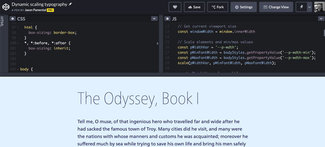
See the Pen Dynamic scaling typography by Jason Pamental (@jpamental) on CodePen.
You can toggle the HTML, CSS, and JavaScript on and off in the CodePen above, but you might want to pop over to view it on the CodePen site to get full editing capabilities to play around.
So why do it this way
The first thing some might ask is why not just use a modular scale system. There are many articles about them, and a really nice tool built by Scott Kellum and Tim Brown. The problem I have is that the earlier implementations didn’t address screen size—just the relationship between elements. But when those relationships need to factor in another dimension (viewport), they can quickly break down. What we need is a way to scale the whole system, from one set of relationships to another. We need something more robust.
There are a couple of other solutions out there that might fit the bill: Typetura.js from Scott Kellum and Sal Hernandez, and Textblock from Theo Rosendorf and Glyphic. Typetura in particular is interesting as it has a UI to prototype the typography and save the resulting code. They’re actively working on improving the tool and the UI, so it’s definitely something to watch and try. Both projects rely on JavaScript to work. While this is fine in many circumstances, my goal was to use as little JS as possible, relying on native CSS for as much of the rendering process as possible. This should result in faster, smoother page rendering.
No solution is perfect, but so far this has worked under the widest array of circumstances. As noted before, this does require support of variable fonts (which also coincides with support for CSS custom properties and calculations). It can be set up (as in other demonstrations) with support for static web fonts, but that makes for a harder demo to explain. It also requires that the initial value for font-size and line-height be smaller than the end value. But that does fit with a good number of use cases. It’s maybe not so often that you want to make the type smaller as the screen gets bigger.
Ending with a beginning
By bringing these three technologies and techniques together: variable fonts, CSS custom properties, and calculations—my hope is to help designers and developers familiarize themselves with these capabilities, paving the way for using them in other places and in other ways. One example is the layout offset from last week’s demo, but there are limitless others. I hope you’ll share what you do with it!