Of marks, ends, and middles: end marks, sections, and dead ends
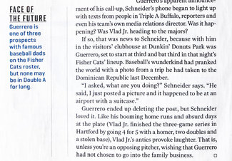
This week I’d like to explore something perhaps a bit whimsical, but nonetheless something with a clear place in design for the web: the end mark. Not of sentences in this case, but of texts. While there are three types of end marks for sentences (the period, or full stop; the exclamation point; and the question mark), the other sort of end marks have been used in publications for many years to indicate the end of a specific article or story. This became commonplace particularly as it became the norm for articles to be scattered across several pages or sections of a publication, signaling to the reader they had reached the end of that particular piece.

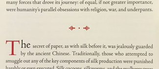
While often a simple square or small logo, they can really be anything at all. One of my favorites is using a fleuron or other similar ornament. Stylistically it can be tied to the overall aesthetic of the publication, providing that perfect final flourish. They may at first seem superfluous given that these days on the web it’s much more rare that sites play the game of splitting content into multiple page views (well, at least good sites anyway), there is always still a fair amount of ‘page furniture’ at the end of articles. Related stories and other footer elements can introduce a lot of noise–and with that in mind, putting a signifier on the end of the text itself can be a valuable addition to the user experience.

An end marked by another name
It was an amusing sidebar discovery found while researching end marks that there’s another sort that came about in the latter half of the 20th century: the tombstone. Mathematician Paul Halmos is thought to have started the practice of ending mathematical proofs with a small solid or outlined square. It has stuck so thoroughly that the mark itself is referred to as an ‘end of proof’ or ‘QED mark’ (from the Latin “quod erat demonstrandum” or “which was to be shown”). According to his memoir, he was inspired by seeing it done in magazines.
When an end is still the middle
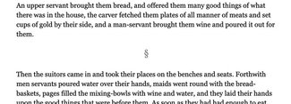
There’s one other sort of mark I’d like to mention as it feels stylistically tied, and in longer-form pieces can be a nice visual respite between passages of text. That waypoint is referred to as a section mark. And while they have a much more common usage in legal text (identifying a numbered or lettered section of a document), in this context they are much more ornamental. A kind of ‘sub-chapter divider.’ Like the end mark, they can add a bit of style and flair while still serving a useful purpose in pacing the reader through a story.

Form following on function
As with all of the tips thus far, I’d like to focus on ways to incorporate these marks without requiring superfluous or non-semantic markup. To do this we need to become familiar with a couple of useful, if less common, kinds of selectors and attributes. The section mark is essentially a divider, so in this case we’re going to repurpose the <hr> tag—the horizontal rule. This way even if the CSS never shows up, the tag itself is an indication of a division in the text without implying too much meaning beyond that. The end mark can be added after the last element in a body of text (in our case, an <article>).
In the following example I’ve used the traditional typographic mark for a section, but in truth you could use any number of ornaments, swashes, or marks (as seen in Keith’s work above).
hr {
  border: none;
}
hr:after {
  content: "\00a7";
  display: block;
  font-size: 1.5em;
  margin: 1em auto;
  text-align: center;
}
First we reset the default style of the <hr> to get rid of the line. Then we use the ‘:after’ pseudo-selector to add the section symbol, size it, and scale it as we’d like. Here’s the markup we add to insert it—all it takes is adding the <hr> in between paragraphs.
...
</p>
<hr />
<p>
...
The end mark is similarly easy to add, and so long as you know the typical structure of your content (from an HTML perspective) you can quickly set up your CSS to add the end mark without any extra markup whatsoever. In our case, the chapters all end with a <p> element, and the entire content is always in an <article>. So our HTML looks like this:
...
voyage of the counsel that Minerva had given him.
  </p>
</article>
And our CSS uses the ‘:last-child’ and ‘:after’ pseudo-selectors chained together to identify the last paragraph in the article, and inserts the end mark using the ‘content’ attribute, like so:
article p:last-child:after {
  content: "\2766";
  display: inline;
  font-family: Georgia, "New Times Roman", serif;
  font-size: 1.5em;
  line-height: 0.5;
}
Note in the CSS above that when setting the size larger than 1em (the size of the surrounding text), you need to make the line-height smaller or the mark will impact the line-height of that last row of the block of content. You could position it after (perhaps centered below the end of the last paragraph)—this is just one example of a fairly common treatment I’ve found in print.

Have fun playing around with this one, and I hope you'll consider putting them to use in one of your next projects. They really do add some useful visual landmarks for people scanning content, and put a final point on the end of an article that can easily get lost amidst ads, related content, and footers.
Resources
- Example on CodePen
- Ilene Strizver’s excellent piece on end marks for the Monotype fy(t)i site
- End marks (including a lovely Victorian example) on Wiktionary
- Wikipedia on fleurons
- MDN on :last-child selector