Monday, 30 September, 2019
I’ve been spending some time looking at some typography annuals, inspired by Aga Naplocha’s fantastic talk at Finch Front-End in Edinburgh, Scotland earlier this week. She was showing some fantastic design ideas based on different artistic styles and periods. One of the things that really struck me was how she was combining CSS shapes, masks, clips, and blend modes in such creative ways. I thought it might be interesting to try a couple of those ideas and see what we might be able to do with type.
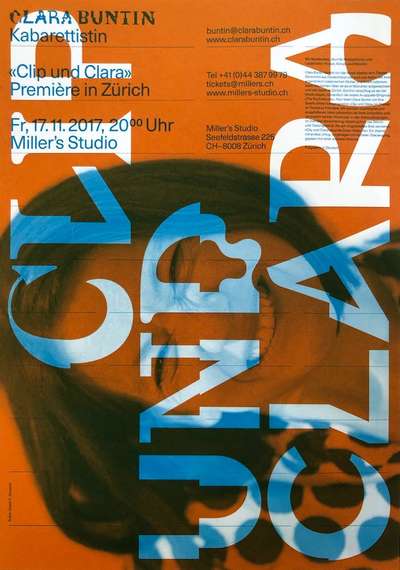
Aga was showing some effects that looked like they could have come from fashion magazine spreads. I wanted something more typographically focused, so I looked through the Type Directors Club Annual from last year and found a beautiful poster design that showed some similar effects. A design by the Jürgen X. Albrecht studio for the artist Clara Buntin, it does a beautiful job of layering text and image in a really captivating way.
Playing around with some of photos from my morning walks, I tried out a couple of different techniques that could be pretty easily replicated. Ranging from a simple overlay with a transparent color fill and a couple of text shadows, to a multiply effect, and finally an image clipping effect that fills the text with the image. While there are certainly issues to contend with regarding readability, given that it’s still a div and an h1 with regular text it should certainly be accessible to a screen reader, and with a little work could be given a toggle of some sort for users with vision acuity issues. Overall I think there’s still a lot of room to create more interesting typographic effects while still ensuring your site is usable by all.
Hero worship
I honestly don’t care for the naming convention, but for lack of a better one we’ll just roll with it. It’s a fairly typical design component: a big image with some text overlaid. Because it’s often implemented in a ‘use with everything’ sort of intent, in most cases the text is a solid color and placed on a semi-transparent block in order to ensure enough contrast between text and image. But new CSS tricks like ‘mix-blend-mode’ we can try different effects to get the text to stand out from the image behind it without having to resort to heavy-handed blocks of color.

/* these two attributes are the key to ensuring visibility */
.hero--title {
  ...
  color: rgba(205,205,205,.75);
  mix-blend-mode: difference;
  ...
}
Mixed, not stirred
The second example is making use of the ‘mixed-blend-mode’ attribute to create a really interesting interaction between the background image and foreground text in a slightly different way. In this example, the background color of the text element is interacting with them image underneath along with the text color itself. This creates a bit moodier sort of effect. You can play around with different keyword values for blending as well as the color values for background and text. Possibilities are pretty endless.
The code is pretty straightforward: the keys are sizing the time in a scalable way and leveraging the mixed-blend-mode attribute.

.title-filled {
  background: url(https://s3-us-west-2.amazonaws.com/s.cdpn.io/57225/mist_crop.jpg);
  background-size: cover;
}

.title-filled--title {
  background: rgba(0, 0, 0, .75);
  color: #fff;
  mix-blend-mode: multiply;
  ...
}
Just the text, ma’am (or mister)
If you’ve got a chunky enough font and a shallow enough image, you might want to give the third method a try. This one leverages ‘background-clip: text’ (and the vendor-prefixed version for Safari and Chrome) to fill the letterforms with the image. It can be really stunning, and often brings out fascinating interactions between image details and glyph shapes.

.title-clipped--title {
  background: url(https://s3-us-west-2.amazonaws.com/s.cdpn.io/57225/mist_crop.jpg);
  background-size: cover;
  -webkit-background-clip: text;
  background-clip: text;
  color: transparent;
  ...
}
Bear in mind that in order to get clipping to work in Safari and Chrome, you have to include the ‘-webkit’ prefixed line as well.
These effects aren’t for everyone, or for every layout. But it’s not that much CSS, so the idea of making it an optional style doesn’t seem so far-fetched. And it could go a long way towards breaking away from the Sea of Same we find on the web.