Contextual Alternations (for a fraction of the price)
Returning this week is the third issue in our exploration of OpenType features on the web. Two weeks back we explored ligatures, and numeral styles the week before. This time we’ll have a look at another way of using different styles of glyphs, only this time based on placement: we’re going to look at Contextual Alternates.
It’s about where you say it
Contextual Alternates are close cousins to ligatures, and are in fact accessed in a similar manner. They tend to serve two purposes: to provide alternative characters for use when ligatures are turned off (to avoid collisions between letterforms), and to replace character combinations often used to display symbols, like decorative arrows.
In many cases they are on be default, but it’s useful to dig in to the character map of the font to see what it supports. If you have the font files, one way to have a quick look is to use Roel Nieskens’ WakamaiFondue.com site. Just drag-and-drop the font file onto the target spot on the page and it will display all sorts of helpful information about the font. Just search for ‘calt’ and you’ll jump right to the relevant section.

One hand giveth, the other taketh away
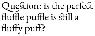
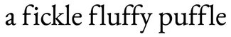
One place where you can most readily see contextual alternates in action is if ligatures are turned off. Because ligatures are used in the first place to handle setting characters that would otherwise have overlaps or collisions (think back to character combinations like ‘ff’, ‘fi’, or ‘fl’), if ligatures are not used, something else has to be done to avoid the overlaps.
Look closely at the following two examples where I’ve forced ligatures off, and then toggled contextual alternates. Notice the awkward spacing and overlaps with the ‘fi’ and ‘fl’—and where the contextual alternates are on, the finial of the ‘f’ has been shortened (the top right curved end of the vertical stroke) so that it doesn’t loom menacingly over the dot on the ‘i’ or awkwardly headbutt the serif at the top of the ‘l’. Having those present will keep your type in top shape whether you choose to use ligatures or not.
/* works with pretty much all browsers that support
   web fonts, but not the preferred syntax */
.liga-on {
  font-feature-settings: "calt" 0;
}
/* Works with current shipping browsers that support
   web fonts (Edge support is v75+) */
@supports (font-variant-ligatures: contextual) {
  .liga-on {
    font-feature-settings: normal;
    font-variant-ligatures: no-contextual;
  }
}
And now here’s how they should look when enabled:
/* works with pretty much all browsers that support
   web fonts, but not the preferred syntax */
.liga-on {
  font-feature-settings: "calt" 1;
}
/* Works with current shipping browsers that support
   web fonts (Edge support is v75+) */
@supports (font-variant-ligatures: contextual) {
  .liga-on {
    font-feature-settings: normal;
    font-variant-ligatures: contextual;
  }
}
Sometimes less is more, or more is less
The other kind of alternates you might like to use involve character combinations that help turn our ‘ascii-art’ attempts at arrows and such into actual, well, arrows and such. Many of us have used a hyphen and a greater-than symbol to create a right-facing arrow-esque symbol. Some fonts come with contextual alternates that, when finding those two glyphs next to each other, will replace them with a single alternate that is likely much closer to what you had in mind. Have a look at these, found in Playfair Display:
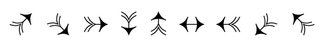
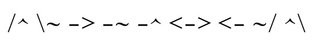
Unfortunately there isn’t any sort of universal set of contextual alternates; it’s really at the disgression of the type designer to decide what they feel is most appropriate and useful. But finding out what’s there will help spur on some ideas that will add some wonderful refinements to your typography. And don’t forget that you can add helpful tips to your content management system, so that when someone else is posting a blog piece that could really use that perfect right arrow, they’ll know how to get it.
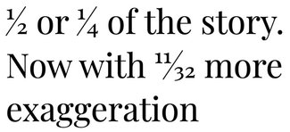
Another part of the story stacks up
A bonus form of contextual substitution can be found in that of fractions. When this gem of a feature is enabled, your recipe websites will go from drab to fab in no time flat. Or diagonal. There are features for both diagonally slashed fractions and vertically stacked ones, though the former are a bit more commonly found in my experience. They can be accessed via ‘font-style-numeric: diagonal-fractions’ or ‘font-feature-settings: "frac";’ (for the diagonal) and via ‘font-style-numeric: stacked-fractions’ or ‘font-feature-settings: "afrc";’ for the vertically-stacked variety if available.
/* works with pretty much all browsers that support
   web fonts, but not the preferred syntax */
.fractions-on {
  font-feature-settings: "frac" 1;
}
/* Works with current shipping browsers that support
   web fonts (Edge support is v75+) */
@supports (font-variant-numeric: diagonal-fractions) {
  .fractions-on {
    font-feature-settings: normal;
    font-variant-numeric: diagonal-fractions;
  }
}
Just remember it might make sense to only apply this as a style for specific cases rather than all the time as it can produce some confusing results when applied to blocks of text for unsuspecting authors.
Resources
- Examples on CodePen
- MDN Font Features guide
- MDN font-variant-numeric (for fractions)
- Contextual Alternates on TypeNetwork
- Contextual Alternates on Typofonderie
- Fonts.com post on finding alternate glyphs in graphics applications
- Playfair Display on Google Fonts