OpenType part 2: A leg up on ligatures
Continuing on from last week’s introduction to OpenType features, this issue we’re going to take a look at ligatures. A ligature can be described as when two or more individual letterforms or symbols are combined to form a single glyph. This practice predates metal type and printing by thousands of years, having been found in Sumerian writing (according to Wikipedia)—but our understanding of them is far more related to the more recent form.

In many cases ligatures are created for stylistic reasons: to even out spacing that might otherwise be too great or to handle what would otherwise be overlapping parts of letterforms. In English, that often means combinations like ‘fi’, ‘fl’, ‘fj’ but there are many others. While these are fairly common, there are other more ornate ones to be found, particularly like ‘ct’ and ’st’, that have a more historic look and are generally less used in the everyday. And there are also more discretionary ones—in the case of EB Garamond (the font used in the demos), it’s one for ’Th’. Otherwise there’s a rather awkward amount of space between the letters.

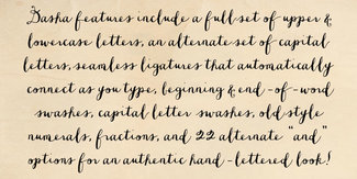
The practice of creating ligatures started in handwriting—oftentimes for speed as much as any other reason. But in digital fonts meant to look handwritten (like Dasha from the marvelous Jess McCarty’s Magpie Paperworks), they’re an essential part of the fonts, making the seamless connections between letters possible.
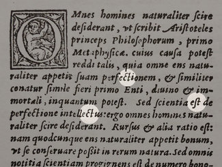
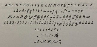
In metal type it was more about spacing and preserving a connection to the written word. Many typefaces were designed to provide a visceral connection to things made by hand. So even in the earliest years of moveable type, there exist a number of commonly used ligatures as seen here in one of Robert Granjon’s designs from the mid-1500’s.

During the latter part of the 20th century, as photo-typesetting and early digital type became popular, ligatures became much less common. This was due to their less-frequent inclusion in sans-serif typefaces that were becoming popular and to technical limitations in how font software worked. It wasn’t until the development of OpenType fonts and their widespread adoption in the early-to-mid 2000’s that ligatures came back into more widespread use. This was because the new format allowed for easier substitution of ligatures for separate glyphs at a software level. Now even on the web it’s far more common to see standard ligatures be on by default.
But seriously though, why do we care?
This is a reasonable question to ask. And the answer is not necessarily simple. One reason is spacing: the standard ligatures often even out spacing between letters, making the text feel more evenly spaced—therefore making it easier or more comfortable to read. Other reasons I’ve seen put forth relate to ‘making text look more historic’ or something to that effect. But I think that’s too simplistic.
As a designer and typographer, I want to choose type and make typesetting decisions that support the brand and the overall design direction chosen for the project. ‘Making it look more historic’ might be a criteria, but so could ‘make it feel familiar’ or ‘make it reminiscent of this time or place’. These are design goals, and typographic decisions will either support them or not.
My own feeling is that ligatures lend a bit of polish to a design, and help set it apart from so much of what I see every day. Not all of them should be used all the time perhaps (think historical ligatures)—but enabling them for headings and blockquotes could be a reasonable strategy if it supports the overall design.
Be intentional
My point is that all our decisions about typography and design should be in support of the content and the goals. The more care we take in doing so, the more it will show through in the final outcome. The more care the readers see put into that outcome, the more faith they will place in the content they are reading.
Let’s have a look at how to use them on the web. Note that all the example code showcases how to properly use progressive enhancement to display features with the proper attributes where they are supported. It doesn’t add much to the process, but the result will be a more future-friendly site.
Standard Ligatures
These are often defaulted to ‘on’ if they exist, but as I mentioned last week with numerals, you can never be sure which ones will be on or off so it pays to specify in your CSS.

/* works with pretty much all browsers that support
   web fonts, but not the preferred syntax */
.liga-on {
  font-feature-settings: "liga" 1;
}
/* Works with current shipping browsers that support
   web fonts (Edge support is v75+) */
@supports (font-variant-ligatures: common-ligatures) {
  .liga-on {
    font-feature-settings: normal;
    font-variant-ligatures: common-ligatures;
  }
}
Discretionary Ligatures
While the name might make these seem a bit more optional, the example in EB Garamond is in my mind just as useful and necessary as the standard ‘fi’ and ‘ffl’ sort. The one discretionary ligature to be found is ‘Th’—which does a very nice job of evening the space between the two characters. And since that combination was used at least six times in writing today’s issue (sorry, no bonus points for finding them all), it’s one that would find fairly regular use.

/* works with pretty much all browsers that support
   web fonts, but not the preferred syntax */
.dlig-on {
  font-feature-settings: "dlig" 1;
}
/* Works with current shipping browsers that support
   web fonts (Edge support is v75+) */
@supports (font-variant-ligatures: discretionary-ligatures) {
  .dlig-on {
    font-feature-settings: normal;
    font-variant-ligatures: discretionary-ligatures;
  }
}
Historical Ligatures
These are generally a bit more ornate, and perhaps less suited to use throughout your text. But for display use (like headings or blockquotes) they can really add a bit of polish and style. EB Garamond gives us two: ‘ct’ and ‘st’, and I have to admit I’m a fan.

/* works with pretty much all browsers that support
   web fonts, but not the preferred syntax */
.kitchen-sink {
  font-feature-settings: "liga" 1, "dlig" 1, "hlig" 1;
}
/* Works with current shipping browsers that support
   web fonts (Edge support is v75+) */
@supports (font-variant-ligatures: discretionary-ligatures) {
  .kitchen-sink {
    font-feature-settings: normal;
    font-variant-ligatures:
      common-ligatures
      discretionary-ligatures
      historical-ligatures;
  }
}
There’s always more to learn, and OpenType features are many. So that’s enough for this week, and next we’ll look at even more ways to make your text distinct using contextual and stylistic alternates.
Resources
- Examples on CodePen
- OpenType Features guide I wrote for MDN
- 'font-variant-ligatures' on MDN
- Decline and fall of the ligature (from 2007—maybe they need a follow-on: Ligatures! We’re baaaaackk!)
- An Even More Comprehensive guide to OpenType features in CSS