Facts about figures: numeric styles with OpenType features
Over the past few months we’ve looked at a lot of different typographic techniques, approaches, and technologies. Before we get into the next big technical series (it’s high time we talk about font loading performance and management), I wanted to dial the focus back down into some finer details. Specifically I want to talk about OpenType features—but that can be a really big topic. So I want to start off right, and go by the numbers.
No, really: we’re going to talk about numbers.

Eyes wide Open(Type)
OpenType features encompass a whole range of elements within a typeface, from tiny details of spacing between specific letterforms (kerning), to alternate glyphs (an extra style of a lower case ‘a’ for example), to special connected characters called ‘ligatures’ (think of combinations like ‘ff’ or ‘fi’) and even glyphs for specific fractions. It can also include different styles of numerals. I thought this might be a good way to introduce the idea of OpenType features, how to use them on the web, and why you might want to do so.
On the case
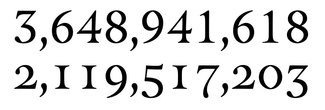
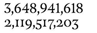
There are a few different styles of numerals you may have come across. though it might not be immediately apparent that it is one style of several within a typeface design, rather than the design itself. The three we’re going to look at are Lining and Old Style Figures, and Tabular (as opposed to Proportional) spacing. Here are the differences between them:
Lining Figures
Also known as ‘Titling Figures’, these are the most standard ones. They have equal heights, and line up on the baseline (or bottom edge) together evenly. You can think of them as ‘all caps’.

.lining-figures {
  font-variant-numeric: lining-nums;
}
Old-Style Figures
This style of numerals have uneven heights and look like they have ascenders and descenders jutting above and below the baseline. Sometimes referred to as ‘Text Figures’, this style of numeral tends to have an older feel to them and are designed to sit in line with lower case letters mixed in with other text.

.oldstyle-figures {
  font-variant-numeric: oldstyle-nums;
}
Tabular Spacing
This is not actually a style, but rather about consistent spacing along the horizontal axis. This means that each numeral occupies the same size space so they line up nicely in columns when used in data or financial tables.

.tabular-figures {
  font-variant-numeric: tabular-nums;
}
Proportional Spacing
While this used to be more the default, lately I’ve seen tabular spacing set as the norm in a number of fonts I reviewed for this issue. In general, unless you need to line up numerals in a table, you’ll get more pleasing results by specifying proportional spacing.

.proportional-figures {
  font-variant-numeric: proportional-nums;
}
This leads me to the notion of defaults. Every designer will make their own choices about which style and spacing are the defaults. In fonts I looked at this week, it was a split between oldstyle and lining figures, and many had tabular spacing as the default. But since you can’t be sure, you may want to be explicit in your CSS so you can be sure you get what you intend if a default should change (or a fallback font gets used instead).
You might start with something like this:
h1, h2, h3, h4, h5, h6 {
  font-variant-numeric: lining-nums porportional-nums;
}
p {
  font-variant-numeric: oldstyle-nums porportional-nums;
}
td {
  font-variant-numeric: lining-nums tabular-nums;
}
Not every typeface has all the styles and spacing of numerals, but more have them than you might realize—and they’re fairly easy to access in CSS. Likewise, not every font has OpenType Features enabled for use on the web—it does add a bit to file size. I had to hunt around a bit to find an open-source font that had all the combinations available: lining and old style figures, and both proportional and tabular spacing.
Note that you can also combine style and spacing in a single declaration:
.lining-tabular-figures {
  font-variant-numeric: lining-nums tabular-nums;
}
A tangled web (of support, anyway)
There are two ways to specify styles and spacing, and in the demo I show how to use both. This will cover for older browsers that don’t support the intended syntax, and the proper format for those that do. While it may seem simpler to just use the lower-level font-feature-settings, there are a couple of complications this can incur.
First is with specificity: even if you have declared font-variant-numeric: tabular-nums on the element you want, if anywhere up the chain of parent elements you have defined font-feature-settings: "tnum" 0;, that will supersede and you won’t get your tabular numbers.
Second is simply to do with verbosity. When declaring font-feature-settings, even if you want to change only a single value, you have to redeclare the whole string. So if you have used it to set other OpenType features (like ligatures, alternates, or fractions) in addition to your numeric styles, you have to redeclare the entire string. While you can skirt around that issue by using CSS Custom Properties to set individual values, since those are not supported in IE 11, you still have the same issue if you want support there.
Here’s an example showing the full ‘progressively-enhanced’ way of specifying:
.lining-tabular-figures {
  font-feature-settings: "lnum" 1, "tnum" 1;
}
@supports (font-variant-numeric: lining-nums) and
    (font-variant-numeric: tabular-nums) {
  .lining-tabular-figures {
    font-feature-settings: normal;
    font-variant-numeric: lining-nums tabular-nums;
  }
}
So that’s the story, by the numbers. Have fun, and don’t forget to send links to your perfectly-aligned data tables and case-sensitive numeral styles. I’d love to showcase your work!