We’re doing it wrong: there is no ‘one perfect design’ or layout
For a very long time we’ve been chasing the ‘one layout to rule them all’ in our designs. We’ve bootstrapped, gridded, and patterned our way to a layout that works with every piece of content. Components that behave with all or none of the supported fields. Alignments that flex to fit every screen. Platforms like Medium have come along, allowing organizations to easily publish content with consistency, polish, and magazine-like style.
Except that’s not actually how great magazines are designed.
I’ve fallen into this mindset myself over the years, and while I knew that something was missing, even having studied graphic design (and done a fair amount of print work) I couldn’t put my finger on it. Until now.
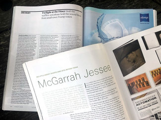
Lifting our heads to see above the rut into which we’ve fallen
I’ve somehow taken it as rote you should come up with a good layout for content, give it some flexibility for different kinds of content modules like images, quotes, asides—and then use that layout for content on your site, and that layout alone. It’s gotten better over time—building in a bit more flexibility within the content modules like width, alignment, captions, and whatnot. But overall, everyone from Medium to the New York Times to [insert just about any blog here] has settled on a pretty standardized solution for presenting longer form content on the web.
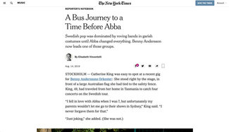
Don’t get me wrong: the focus on content, the better use of whitespace, the reduction of the claustrophobic clutter are all are good things. But while an improvement, it’s still a lot of the same. I wanted to showcase how we might vary our designs, so I grabbed a couple of magazines and started to look at their covers and tables of contents. I thought that might give me some examples to play around with. Then I started to flip through some of the articles.

A sudden, violent shift of perspective
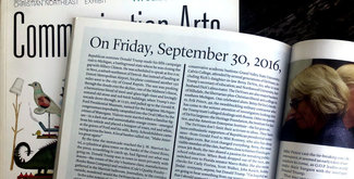
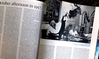
I counted at least six distinct layout styles in Vanity Fair, and easily as many in Communication Arts. Sure, there’s always generally some underlying similarities in grid, typography, and/or layout—but those structures get pushed and pulled quite a bit throughout both publications. TYPE magazine does this as well. If we want to create the same kind of vibrancy in our online publications, we need to rethink our notions about what makes for good design on the web. Just as it’s not necessarily true that fewer weights of a typeface makes for better typography—we shouldn’t assume that every content page should have exactly the same design. We can, to steal a phrase, think different.
Not willy-nilly-all-over-the-place different, but clear, purposeful variation that’s built into our design systems so they fit within the whole. This, coupled with a bit of per-page design flexibility afforded us by technologies like CSS Custom Properties and variable fonts, gives us the kind of layout and design flexibility that make publications like Vanity Fair so good.
Take it to the web, intrinsically
So in keeping with the idea of building on what we’ve learned, I took an article I wrote a few years ago and set it up using the styles from last week, but this time using another one of Monotype’s upcoming releases: Universe Next Variable. With it’s width range from 75%-140% and weight range from 300-900, it makes for a great set of fonts with which to experiment.
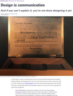
I added just enough CSS to make it a relatively familiar-looking layout of larger head and subhead, full-width images, and centered column of text. All the same attributes of scaling font size, weight, width, and line-height from last week. And the addition of some links at the top. These links trigger two additional layouts, but ones entirely driven by CSS—no markup changes were made.
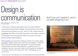
Each of the two different layouts are only 70-100 lines of CSS, but the effect is quite dramatic. All triggered by the presence of a single class. If we were to build this kind of flexibility into our content management system, the person publishing the content could make a conscious decision with each article. That, coupled with different choices on the component level for image sizes and alignments, etc, could result in a vastly more varied reading experience. We could bring design back into the publishing process. Sure, a great design system is invaluable. But that’s our plateau, from which we can launch for the peaks. Good design follows good design practices. Great design know’s how to break them.
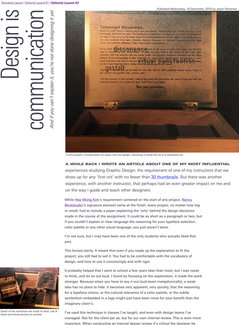
When Jen Simmons coined the phrase ‘intrinsic web design’ this is what she was talking about. Reimagining the concepts of layout, typography, and hierarchy inspired by great graphic design, but realized in a way that is native to the web—embracing all of the modern techniques and technologies we have at our fingertips.
If we are to progress the state of digital design, we simply have to overcome the ‘sea of sameness’ with which we are confronted every day on the web. It’s true the web isn’t print—we want to be designing in ways that are of the web—but as of yet, we’re still decades behind our erstwhile paper-based alternatives. We can do better.
Resources
- Article on CodePen (this links to the full-page view, but all the code is still available if you hit 'change view')
- Dynamic typography explained in last week’s tip
- Jen Simmons on Noti.st—loads of great presentations on modern layout techniques for the web