Light modes, user preferences, and embracing (and respecting) the cascade
I’ve just come back from An Event Apart in Chicago, where I was lucky enough to see a whole lot of wonderful talks. Two that really struck me were from Marcy Sutton on modern CSS and accessibility, and Val Head on inclusive motion design. You might wonder for a moment how those relate to web typography—but the connection becomes clear via a question posed afterwards on Twitter. I don’t think I had completely thought through the scenarios, and I’m grateful for all those who chimed in. First, a little background.
What happens if the site setting contradicts the OS setting? Which are you taking?
Huink (@Huink7)
Who’s in charge here anyway?
One of the themes that Jeremy Keith wrote about earlier this year during AEA Seattle was that of giving users more control over how they would like to view content. That got me thinking about typography, user preferences, and a wonderful quote from Tim Brown (via his book Flexible Typesetting):
The role of the typographer has changed. We no longer decide; we make suggestions
Tim Brown (@typesetting)
So what does that mean? Well, for starters, it means that we should code our typographic systems in such a way that if the user zooms in on the page or sets their text size preference larger or smaller, that our typography should react accordingly and respect their choices. That’s what I was getting at when I wrote about pixels versus relative units for font size a while back.
But there are more aspects of typography that can be tailored based on user wants or needs. Explicitly setting the font size larger or smaller is something we can easily enable—especially if we’re using CSS custom properties to set and scale our type. This is helpful for those who may want to change the text size less frequently than making the effort to set it universally.
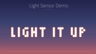
That’s not the only scenario though. Users with low vision, or those simply in a low-ambient-light situation, might benefit from a higher-contrast mode. Mandy Michael created a fantastic demo tying into the ambient light sensor built in to laptops and phones. Again, with CSS custom properties, we can easily expand the contrast between font color and background, but do so in a more controlled way. If we are working with a variable font with an axis for grade, we might even bump up the grade a little bit to give the text just a little more weight without changing the overall metrics.

Light modes
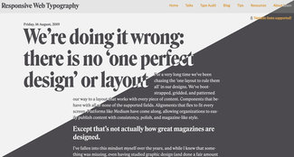
One of the features recently added to Windows and MacOS (and coming soon to iOS) is a preference for Light/Dark mode. This is the ability to invert the contrast of the OS and all applications that support it. Enabling ‘dark mode’ flips the background and ‘chrome’ of the OS and applications to a dark color, with white text instead of black. There also happens to be a media query that is supported in Safari, Chrome, Firefox and Android Chrome (also coming in the next release of Edge and iOS), and it’s quite easy to tie that in to our site styles as well. This way if the user has expressed a preference for that way of interacting with their system, our sites can respect that preference as well and we can adjust our design accordingly.
I’ve seen some negative reactions to this practice saying something to the effect of ‘will users really expect or want this’ because some people just like the OS that way. I’d counter that for those who change the OS mode, it may be for an important reason—like light sensitivity or chronic migraines. And if that choice is what makes the computer and the web usable, I’d rather err on the side of their needs. It’s feasible enough to allow for opting back out of the content shift via a button or switch in the site UI. Just because it’s not common yet, doesn’t mean it’s not a reasonable practice to adopt. Since all the apps respect the UI choice, it follows that web content should afford the user the same consistency.

I’ve added that to my own site and it only took about half an hour or so to do it. The media query is very straightforward, and once again if we’re setting colors with CSS custom properties we can flip the contrast on color and backgrounds relatively easily. Now, it’s also possible that the user might simply want to view the site in reverse-contrast mode—or actually prefer the ’normal’ design even if they like having their OS set to ‘dark’. That’s where the discussion I referenced comes in to play.
What should win?
The original question was raised in response to a tweet I posted, noting that both Marcy and Val had mentioned ensuring you respect user settings like ‘prefers reduced motion’, and a tweet from Chris Coyier on the subject that also included a button so the user could make the choice to enable a specific animation without having to change the setting in their OS. That prompted some really great discussion about what should win out: OS settings, website styles, or explicit user choices.
The OS setting should always be the site’s *default* behavior.
Amelia Bellamy-Royds (@AmeliasBrain)
But if you’re implementing a toggle anyway, then definitely allow the user to override their general OS setting with a specific choice for your website!
Absent any user settings within a site or application, OS preference (for light mode, reduced motion, etc) should always take precedence. Since we have media queries for both light mode and motion, those are easy to support. But that’s not the only scenario we should consider.
If we’ve enabled any sort of preference (I’ve been demonstrating the idea of a user accessibility preferences panel in my talks this year), we might decide to give the user the ability to explicitly set the interface of the site or app to dark mode (or high contrast, or larger text, etc). And if they have made an explicit choice on one of those options, we should respect that choice, thereby overriding the ‘unreferenced default behavior’ that follows the OS. I think this is very important.
Once we give the user the option set an option while using our site, it stands to reason that they’ve made this choice with more immediacy than when setting the OS preference. Therefore perhaps it should look like this:
- When visiting a site for the first time (before any settings can be set), media queries for ‘prefers-dark-mode’ and ‘reduced-motion’ should always be respected.
- If the user takes an action to turn on animations, toggle light/dark mode, or any other option about font size, spacing, etc. then those settings should take precedence until such time as the user resets them (on the site)
- If there is any ambiguity or uncertainty in a given scenario, default to OS preferences
Feel some type of way
Now I’ve been talking mainly about typography choices, but the same applies to motion. As Val and Marcy point out, we have a similar ability to respect user preferences either via the OS or by controls we expose in the interface of our sites and applications. You might think this primarily would be concerned with parallax scrolling, autoplaying animations, and carousels—but it’s equally important with common text animations like sliding in blocks of text, scaling them on hover, or even opening and closing accordions or mobile navigation systems. All of these are commonly animated, and for users with vestibular disorders can cause significant discomfort. It’s well worth looking at the sequence above and apply it to any element that moves in any way other than scrolling based on user input.

I’ve created a demo that shows light/dark mode support with an explicit user preference that would override (and including a reset button). This should give that complete coverage as outlined above. There are lots of comments in the demo, but I’m including the media query syntax here so you can see how simple it can be.
:root {
  /* color palette */
  --color-dark: #3a3a3a;
  --color-light: #eee;

  /* functional color assignments */
  --color-text: var(--color-dark);
  --color-background: var(--color-light);

  /* variable used to store user preference */
  --user-color-pref: 'unset';
}
body {
  background-color: var(--color-background);
  color: var(--color-text);
  /* add a transition to smooth the experience */
  transition: background-color 0.25s ease, color 0.25s ease;
}


@media (prefers-color-scheme:dark) {
  :root {
    /* flip the light and dark variables */
    --color-text: var(--color-light);
    --color-background: var(--color-dark);
  }
}
That’s pretty much all you have to do, and if you are using CSS custom properties it’s even easier to set up. One other thing you might note is in the demo I’ve also slightly adjusted the font-weight and letter-spacing properties when in ‘dark’ mode. This is to counter some instances where when the contrast is reversed, some fonts can feel a little thin or broken at smaller sizes. Increasing the weight (or better, text grade if that axis is available) and letter-spacing will open up the text just a little bit and help ensure optimal legibility.
While I’m certainly not the best with writing JS, I think this should give you lots to go on to start playing around with your own accessibility preferences. Have a look at the slides from my talk this week in Chicago. If you click through towards the end you'll see an embedded page with an Accessibility Aids tab. Click that and you can see how I've set it up in a little panel where you could put all of the options together in easy reach.
As always, don’t hesitate to get in touch with questions or just to show off what you’ve been making!