Units of measure: two wrongs, and a few rights
I’d like to take a little time to talk about the various units of measure we have at our disposal, why you should focus on two or three and avoid some others—and explain a bit about why. If we don’t take care in how we select and use them in our websites, we run the risk of breaking the experience for our visitors by interfering with their own preferences for text size, behaving unpredictably with page zoom, and scaling oddly when devices support different implementations of physical versus reference pixel dimensions (think high-resolution touch-enabled laptops as an example).

Points of interest
There have been a number of different units of measure as relates to type size over the years. Point size has become the standard in printing and graphic design, and originated in the 15th century. One point has at varying times been equivalent to 1.8 to 4mm or so, but has generally come to mean 1/72nd of an inch (unless you’re French and from the 15th century). This standardization was more firmly fixed as desktop publishing came to the fore, and became the basis of pixel measurements for the web. Sort of, anyway. That depends on if you’re looking at a Mac or a Windows machine, and in what decade and on what screen.
Macs generally evolved purporting to support 72 pixels per inch, where Windows standardized on 96. In truth, it’s unlikely for either to have actually been accurate in very many places as monitor sizes and screen resolutions have always been evolving. Fast forward to today’s Retina and other high density displays, and the notion of ‘how many pixels across’ something is becomes increasingly hard to relate to any sort of physical representation. This is where relative units of measure come in. But let’s review what’s available in the context of sizing text.
While CSS supports a number of different units of measure, these are the most frequently encountered applied to text:
- Point (pt) - doesn’t mean that much on screens, but is useful for print stylesheets. You do still maintain print stylesheets, right?
- Pixel (px) - often the unit of measure passed along with design comps, and corresponds to a fixed size
- Percent (%) - often used on the root element of the page to equalize rendering across devices (my fellow web veterans will recall the ‘62.5%’ method from the olden days). A good practice is to set it at 100% to ensure a good baseline text sizing on all devices
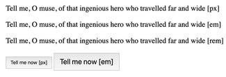
- Em (em) - a relative size unit that refers to the font-size applied to the parent element (wherever that parent may be all the way up to the root of the document). Absent any parent size specification, this will default to 100%, or 16px on desktop devices. However, when multiple parent elements have font-sizes declared, the results can be hard to predict
- Rem (rem) - another relative size unit, this one a ‘root’ em that gets its size equivalent from whatever you set the font-size to be at the root of the document, skipping over any other parent font-size settings. Support goes back several versions of all browsers (including IE), so they have become a very safe and predictable unit of measure in responsive design
- Viewport width (vw) - a newer unit of measure that pairs with viewport height; each of which equates to 1/100th of the width or height of the viewport. There are lots of great applications of these units for layout, and the interesting application for text is to size text relative to the viewport. This means that a string of text will scale smoothly with the viewport without requiring anything more than plain CSS. However, this does complicate user style settings and page zoom, so must be used with caution when setting text
There are a lot of articles out there about which unit is better for what application, but in the end it’s about what will work well for the reader—not what is easier for the developer or designer. So with that in mind, here’s my take. I’ll skip points, as they’re not that relevant for screens. Percent is really most useful in simply setting ‘font-size: 100%’ on the HTML or BODY element to ensure a consistent starting point.
That brings us to the usual fight zone of pixel vs em or rem.
Death to the (px)ies
It’s certainly easier to look at a design file, pick out a font size pixel value, paste it into your CSS and move on. And a number of the articles I reviewed on the subject suggest that these days that’s just fine. But let’s pause for a moment. Many of us use Sass and/or some other build system when writing CSS, so converting a supplied pixel value into a relative unit of measure isn’t that hard. So let’s look at why this might be better for the reader.

Browsers and devices give their users a few different ways to scale text and/or the whole screen or page. Operating systems have different settings for text size defaults and overall scaling. Browsers have two different ways they support similar actions: you can alter your default user styles, or you can use ‘page zoom’—the feature by which the browser can scale the entire page to make images and text larger. Setting breakpoints or font-size in pixels will cause the zooming or resizing to behave unpredictably, or in some cases prevent text from resizing at all. That’s a pretty significant issue for those who require larger text to be able to read the content at all. And to have made the decision to use them out of a quest for developer or designer convenience is pretty terrible. Using relative units gets around this issue pretty easily.

The (r)ems have it
I used to advocate pretty strongly for ems, as they were more universally supported than the newer rem unit. The inheritance confusion with ems can easily be avoided by following one rule: only apply font-size to a text element—never to a container. If you follow that guidance, you never end up with any sort of weirdness as you’re only ever changing the size on a specific text element, not having to worry about having set a font size modifier on an entire region of a page (like a sidebar). But since rems have become so universally supported, it’s worth looking at—and using—both. The main difference is one of viewpoint: a rem is relative to the root of the document, while the em is relative to itself.
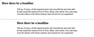
The use of rems in font sizing and setting things like max-width makes good sense, especially when you want to do something like set a maximum width on a paragraph and all the related headers. Set it in rems and apply equally to differently sized text elements.

If you were to use ems here, the values would have to change. This is because a max-width of 40em on body copy that is set to 100% will give you a calculated width of 640 pixels (40 times the default text size of 16px). Apply the same to a heading that has a font-size of 3em and you have something totally different: 40 times the heading size, which is 3 times the default 16px: a total of 1920px. But you can set the text size in whatever unit you want, and set the max-width as 40rem, and both the heading and the body copy would have the same equivalent maximum of 640.
Where you may want to use ems is where the measure should be equivalent and proportional to the text. So the margin between paragraphs is a good example. A margin-bottom of 1em will always give you that one line break in between paragraphs, not matter what size the text. Likewise padding on a button or form element: set the padding in ems so that no matter what happens with text scaling, the relationship between the text and the containing element remains consistent and proportional.
A view(port) to a kill
I first saw viewport width units applied to text size in a talk by Jen Simmons in 2014 or so, and it sort of blew my mind: a headline scaling smoothly with the window size, without requiring any Javascript shenanigans. The issue I saw eventually was due to the scaling being constant. This could lead to a heading scaling down below body copy size on a very small window (I minded the fact that it would keep scaling up ad infinitum a lot less). This would lead to strange things happening with content hierarchy. But nonetheless, it was really compelling.
A year or two later, Tim Brown published a piece about what he termed ‘CSS locks’ where he came up with some math that, in combination with media queries, could yield a scaling typographic system that effectively had a low and high end limit to the scaling, tied to specific breakpoints. I started playing around with this quite a bit last year, and will be digging deeper into that in my conference talks and workshops this year, and in future editions of this newsletter.
Sometime in the past few months I also came across a observation from Estelle Weyl that had never occurred to me: sitting text with vw units completely breaks page zoom, since every time you zoom, it simply recalculates and scales the text all over again: based on the window size. I found a reference to this on Mozilla’s MDN site when looking up calculations, and it turns out that’s what was saving my flexible typesetting from accessibility disaster! It involves both vw units and ems, so user preferences and page zooming remain intact. It’s a great way to get the scaling fluidity of vw units without sacrificing accessibility.
Wrapping it up with a relatively sized bow
One of the things Ethan Marcotte advocated in his book Responsive Web Design and subsequent writing was to avoid pixel measurements entirely. Base everything around the size of your text and percentages of the viewport width, and the design will scale well in proportion just about everywhere. And I’ve stuck with that ever since. The only place I think pixels have a home is in defining border thickness. And even there, you can use ems or rems just as easily. With all the differences in pixel densities of displays—to say nothing of the variation in dimensions—it just makes sense to pick the core element on the page and size everything relative to it.
My rule of thumb has generally been percentages for layout widths, and ems or rems for any vertical measurements, or for margins between elements. That way it helps maintain some sense of rhythm related to the size of the text, even if you don’t go so far as to try and follow some sort of text-size-related baseline grid system.
I hope this has been helpful. I know that standardizing on this it has helped immeasurably with large teams and big projects in helping maintain consistency and reduce QA and testing time. It does require a slight attitude change and more flexible outlook: there will never be an exact match to a comp. But that’s a good thing. A comp is not a website. It’s a picture of a website, frozen in one moment and browser width.
The rest is up to us to interpret as we put it into code.
Resources
- Examples on CodePen
- ‘Rems and ems for sizing’ article by Rich Rutter
- ‘Web Typography’ by Rich Rutter