A bit of fun with FF Meta
This week I decided to do something a little different. I’ve had these variable fonts from Monotype for a few weeks now and wanted to do some experiments with them to show them off a bit. So I’ve created something on CodePen.
FF Meta has long been a favorite typeface, and I really enjoyed making the first demo for Monotype when it was first introduced. At that time it only had a weight axis and italics. Now with the full release there’s a width axis too—so that comes into play as well based on viewport width. (Huge thank-you again to the team at Monotype for letting me do this! Learn more about Monotype’s variable font efforts here)
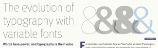
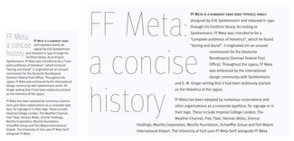
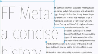
The text is from the FF Meta Wikipedia page. It’s not terribly exciting, but it gives us enough to play with. I’ve combined a bunch of techniques that have been covered in previous issues, and have thrown in a bunch of new bits from some current projects and talks. I can’t cover all of them in detail, but I’ll do my best to call them out and will be coming back to them in future issues.
You’ll find in the top left corner a link to ‘Toggle the Editorial Layout’—which when clicked will disable (or enable) some of the layout enhancements like the floated-and-wrapped title. The idea here is to show that you can take a fairly standard web page and by adding a few lines of CSS (possibly through a text area in the content template in your CMS), you can transform individual posts and make them visually much more interesting—without compromising the overall design system.
I’ll go through some of the more interesting tidbits.
Typographic system
I haven’t gone into detail about this in the newsletter, but over the past year or two I’ve been working on this notion of a dynamically scaling typographic system. Rather than scaling font size, line height, and other elements of the typography at specific breakpoints, I took some cues from Tim Brown’s article on CSS Locks, along with Mike Riethmuller’s CSS implementation for font size, and went from there. This is going to be the subject of a much more in-depth article at some point, but if you want to get more of an overview, check out the video, slides, and whatnot from my talk at CSS Conf EU in Berlin back in May. It’s proven to be a very robust approach, and powers the typography on my own site as well as that of the new web platform I helped design for the State of Georgia (20+ sites launched and counting).
Typeset title
I mentioned this in issue #16 about ‘Intentional tension’, and wanted to show that again. By adding just a little bit of CSS we can dramatically change the layout and feel of the design. The interplay between the title and text wrapping around it creates a much greater level of tension and visual interest.
Scaling margins
Using some of the calculation ideas from the typographic system, I used the browser’s ability to mix units of measure in math to create a scaling making of 1/3 and 2/3s of the leftover space on either side of the content. This kicks the main text area off to the left just a bit rather than leaving it centered. This works by using a combination of viewport units and the ‘rem’ units for the content width. We might not be able to do that very well, but browsers can and it makes the layout just a bit less like everything else.
p {
    margin-left: 0;
}
  @media screen and (min-width: 45em) {
    p {
      margin-left: calc( (100vw - 40rem) / 6 );
      max-width: 40rem;
    }
  }
  @media screen and (min-width: 55em) {
    p {
      margin-left: calc( (100vw - 42rem) / 3 );
      max-width: 42rem;
    }
  }
  @media (min-width: 65em) {
    p {
      margin-left: calc( (100vw - 44rem) / 3 );
      max-width: 44rem;
    }
  }
The code above takes into consideration the maximum width of the paragraph (which changes on larger screens since the type scales up as well), and lets the browser calculate the leftover space after subtracting the known maximum width of the paragraph from the overall width of the viewport.
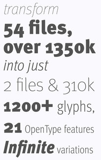
Font stats
To give you a sense of the range, I’ve created a bit of an info-graphic-style arrangement of some of the details. At minimum, the variable font files (I’m using separate files for Roman and Italics) replace 27 separate files (9 weights, 3 widths) each—but we also get everything in-between. These two files total just over 300kb, but they replace about 1.3MB of font data. If we optimized and subset them a bit more they’d be even smaller. A version I tested quickly that was subset down to just Latin1 Extended with a few less OpenType features was well under 100kb.