Variable Fonts and Our New Typography
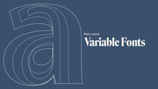
For centuries, typography has shaped the way we ‘hear’ what we read. In our web work, though, we’ve have to balance our typographic desires with user experience and performance, knowing that every weight, width, or style of a typeface required a different file download. Variable fonts change that, as they include _every_ width, weight, slant, and other permutation of a typeface, all in a single file not much bigger than a regular font file. Now, beautiful web typography can be crafted to respond to screen size, language setting, even ambient light. We’ll also look at how variable fonts and other modern CSScapabilities like grid can work together to enable better art direction and more interesting and unique design than every before possible on the web. It also goes through not just how far the new capabilities can take us, but how to make use of them right away.
I’ve also posted a bunch of demos over on CodePen that showcase different capabilities of variable fonts to play with as well.
-
Video of Jason's talk