Wednesday, 2 January, 2019
2018 was an interesting and exciting year. Not just for what happened, but for what didn’t. This is my own way of trying to capture some of those changes, why I made some of them, and what I hope to make of some others.
I’ve been working on the web in many roles for almost 25 years. Having worked on hundreds of sites and applications—designing interfaces, creating architectures, and writing countless lines of code—I’ve begun to want to make a different kind of contribution. One that goes beyond a single site, a single client, or a single purpose. Specifically, when I saw the potential of variable fonts and how they could change the nature of typography, began to work with them, test them, help shape their implementation and introduction—I knew this is where I needed to focus.
Early this year my eyes were opened to the possibility of moving away from web agency work by a job offer from Shopify. While that wasn’t the right offer right now, it led me to start looking at other positions centered around larger challenges at companies like InVision and Wayfair. I also spent time talking to a few of the big font companies.
They didn’t work out.
Launch sequence initiated
It didn’t matter. My perspective had changed, and a few key opportunities gave me the footing to jump. I quit the agency, bought a new laptop, and got to work. Consulting projects were mainly design-system focused on couple of sites, but also included important steps toward where I wanted to go: variable font demos for Type Network and Monotype (and the demo on codepen.io); some talks about the future of typography and variable fonts at Adobe, GoDaddy, and Amazon/Audible; and writing some guides for the Mozilla Developer Network web documentation site on implementing variable fonts and working with font features.
Then in August, I connected with the Georgia Digital Services team for a really fascinating project—one that I hope will be archetypal for the kinds of engagements I secure in the future. They were (and are) in the midst of a large project to design and build a new platform upon which all state agency websites will be hosted going forward. It will have a unified design system with several customizable color themes, a really thoughtfully designed content model, and an editorial experience that affords agencies an unprecedented amount of flexibility without sacrificing the integrity of the system as a whole.
It’s an ambitious project, but they engaged some top-notch talent to help them along the way. My role was a later addition: to review, revise, and refine typeface selection and typographic hierarchy; take some disparate comps and help turn that into a more consistent design system; fill in some gaps in the various theme color palettes; and think through a more complete integration of brand style guide and pattern library in a more comprehensive design system documentation site.
I’m really excited about where that’s going. I was able to incorporate variable fonts (with fallbacks for both non-supporting browsers and for better experience during the font loading process) and all of the dynamic typographic system work I’ve been writing and speaking about over the past year—and the development team at Lullabot has been doing an incredible job incorporating it into the PatternLab-based theme. Teaching the ‘why’ and the ‘how’ along the way from both design and technical perspectives has been incredibly rewarding. I can’t wait to see it come to life in 2019.
Teaching at scale
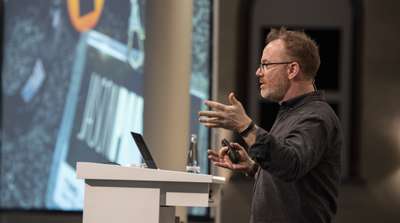
An important theme that became increasingly important to me was teaching: in the form of webinars, workshops, online courses, and podcasts. Working on a site you can at most impact a few designers and developers. But teaching a workshop of 15 or 20 or 50 means you get to share that knowledge with the attendees and by extension their teams (Responsive Typography v2 for Frontend Masters, Responsive Typography at ATypI Antwerp). Give a talk to a few hundred at events like TYPO Labs, Web Unleashed, or An Event Apart and create a buzz of awareness and excitement. Record a workshop or course, and that impact can grow to thousands (recorded version of Responsive Typography for Frontend Masters, Responsive Web Design Fundamentals for Gymnasium). Talk about it on a few popular podcasts, and you can point even more people towards those resources (Shoptalk Show, Boagworld, The Big Web Show).
Amplifying & contributing
In wanting to continue ‘putting my effort where my mouth is’ I put myself forth for two different opportunities that mean a great deal to me. I ran for and was elected to the ATypI board with a goal of trying to use the ATypI platform to help bring more typographic education to digital design programs. That effort is only just taking shape, but I’m excited to see where that goes. I also was accepted as an Invited Expert on the W3C’s Web Fonts Working Group where we’ll be focused on creating a new specification for something being referred to as ‘progressive font enrichment’ (think of it as a way to stream portions of a web font dynamically as they are needed, while the browser can ‘reassemble’ them into a single cached asset as subsequent page loads deliver more and more of the characters or glyphs in that font. This will have a huge impact on performance on the web, and further unlock the potential for better and better typography.
Piecing the puzzle, setting a course
So what does all this mean? How do I convey why someone would hire me? What is my (to steal a phrase from Ken Robinson, via Mark Bistline) ‘only we’? (er, me?)
They are some tough questions, and I’ve been giving them a lot of thought this year. At its core, it still comes back to typography. I firmly believe that it’s the most foundational element of design and central to tying together brand, content, and the user in a cohesive, engaging, and usable experience.
But there are a lot of gaps.
Many marketing and brand teams don’t know how much can be done with type on digital platforms. Too many digital designers (UX or otherwise) don’t have any formal education about typography. And developers have so many task on their plate that helping designers fill in the gaps of how typography should scale across screen sizes, or what the best font loading management techniques may be, or how to best mitigate font loading issues and fallback styles during that loading process too often fall by the wayside. And all of this doesn’t scratch the surface of what variable fonts can offer.
Expertise in the above is my core, my ‘only we’. Helping organizations and teams embrace and unlock the power of typography (often as part of a larger design system), design better typographic experiences, and implement it better than they thought possible.
Start making sense
It feels right to me: helping teams via reviews, workshops, and in some cases direct contributions; helping organizations with audits, typographic strategy and system improvements, and helping the web and type communities with testing, documentation, specification contribution, and evangelism. While I originally envisioned doing this for an organization like Adobe, Google, or Monotype, I’ve still found a way to do so on my own. Harder, but no less rewarding.
In addition to the ongoing work with the team in Georgia, I’ve been fortunate enough to have inquiries from a financial services company, an architectural firm, and a few others about questions ranging from auditing a new design system effort to giving a talk about the evolution of type and typography. If you or your team want some help strengthening your brand voice, improving accessibility and overall user experience, or increasing your site’s performance—get in touch. I’d love to work with you.