Friday, 26 April, 2019
I was recently extended the honor of participating in the W3C Web Fonts Working Group as an Invited Expert. The group was previously responsible for bringing us the WOFF and WOFF2 font format standards, and has had its charter extended to work on something new: taking on the performance problem of font downloads. This is a really important challenge to resolve, especially with regard to the emergence of variable fonts. I’ll explain where we’re headed in a moment, but first a bit a bit of history.
Boon & bottleneck
Download performance has always been a barrier to adoption—or at least a bone of contention—with regard to using web fonts on Western-language websites, even with font file sizes of 20-50k. Arabic and some Asian sites have often had to forgo using web fonts entirely as the files could be 2.5MB for an Arabic font, to as much as 16MB or more for a typical Chinese/ Japanese/ Korean (or CJK) one due to the complexity and number of glyphs in the character sets.
For a number of years Monotype, Adobe, and Google have had the capability to dynamically subset font files on a per-page basis. This allows them to serve font files with only the glyphs necessary to render a given page. Unfortunately, due to some technical limitations, these solutions were only ever employed for CJK and some other non-Western fonts. Google has experimented with other solutions as well, including allowing font requests to include subset ranges—but they have their own challenges of range sizes and losing OpenType features across subsets.
Setting the stage
Last year TYPO Labs in Berlin hosted a W3C CSS Working Group meeting where they discussed, among other things, the emerging standards and specs for supporting variable fonts. Along the way there was discussion of Adobe, Apple, Google, Monotype, and Mozilla collaborating with the W3C to develop a better, more universal solution for serving web fonts—particularly very large ones—that would work better and in a more sustainable and reusable way. A number of other type foundries and software vendors are contributing as well—it’s truly an industry-wide collaboration.
A simplistic description would be something like ‘font streaming’ but in truth that wouldn’t actually solve the problem: users would still be constantly downloading entire font files even if they only needed a small portion to render the one or two pages they might view on a given site. The problem with existing subsetting solutions is that either the subset is thrown away with each page view or the solution requires a proprietary server resource, thereby greatly reducing the usefulness of the subset while increasing the complexity and resource requirements on the server.
The ideal solution would combine the benefits of both of these approaches: subset a font request to what’s necessary for a given page, but add to the original font asset on subsequent content requests, thereby enabling the gradual enrichment of the font file. Adobe has been doing something like this for a while with their own custom implementation, which shows it’s possible to preserve the enriched font’s cacheability and greatly enhances the viability of using web fonts with very large character sets like Arabic and CJK.
So that’s what we’re trying to do.
(And to be fair, when I say ‘we’ I really mean all the amazingly smart engineers involved from all the participating organizations)
It’s all in the name
The concept we’re trying to bring to life has been dubbed ‘progressive font enrichment’—so it’s clear that there are no marketing folk on the working group ? But it does accurately describe what we feel the solution should accomplish: to enable the ability for only the required part of the font be downloaded on any given page, and for subsequent requests for that font to dynamically ‘patch’ the original download with additional sets of glyphs as required on successive page views—even if they occur on separate sites.
While there are still a number of ideas being investigated, the team at Google have created a proof of concept that illustrates the concept and potential quite well. As a group we’ve been adding details and suggestions, and this will likely continue to evolve—but since it has come up at a few events over the past weeks, we felt this was a good time to provide a bit more context along with a link to the demo itself.
The concept, proven
The Google Fonts team put the demo online here, and it is publicly available. There are a bunch of options being evaluated and researched, so I thought it would be good to annotate the interface a little bit so you can see what we’re hoping it will accomplish.
Below you can see the interface as you’ll likely find it (at least how it looks today, on 24 April, 2019). There is a brief explanation, some options to configure, a place to supply some text, and then the output showing how much font information is served and the rendered demo content.
Now we’ll step through the process.

For the purposes of this demonstration, I set the following options:
- Playfair Display from the font dropdown
- Brotli Shared Dictionary (quality 9)
- FontTools for the subsetter
- Yes to Retaining Glyph IDs
Basically I’ve chosen a font that I like, selected one of the more promising patch formats, selected the subsetter that seems to work nicely with retaining glyph IDs (which seems to provide a useful combination of results). Finally, I’ve added a paragraph of text.
Thank you, Text

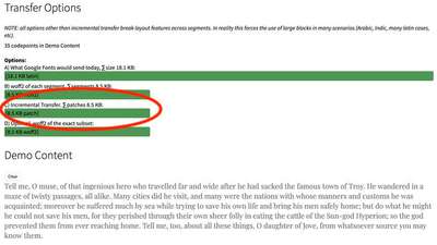
Once I hit the ‘Add Text’ button, you’ll see the resulting comparison of font data delivered, and the demo text rendered below. In the bar graphs, the top line represents the currently served complete font file. The line we’re most interested in is the subsetted ‘patch file’ on the 3rd line. In this case it’s showing that the full file is 18.1kb, and the subsetted patch is only 8.5kb. That’s less than half the full file, and overall savings on larger font files could be even more dramatic.
Now we can add more text and see what the incremental transfer would be.

I’ve cleared the text area and pasted in another paragraph of text, and once again clicked the ‘Add Text’ button.

Now it gets interesting

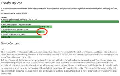
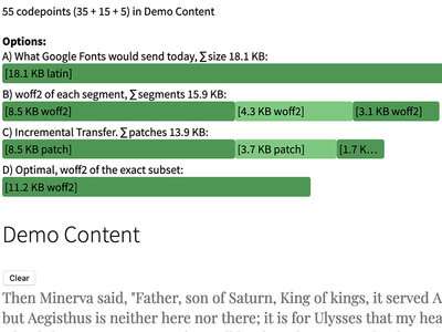
This is, as the kids say, where it gets lit. Adding another paragraph of text only resulted in an additional patch of 1kb! I’ve tried various experiments, and even adding three more lengthy paragraphs only resulted in 3.7kb getting downloaded, and then another 1.7kb. While still clearly very early days, the promise of where we’re headed is substantial. I’m hoping that we’ll see an updated demo relatively soon that will include a variable font to test as well.
At the moment the only examples I have to show are for Western language fonts. Where this will really shine is with languages like Chinese, Japanese, Arabic, Vietnamese, and other more complicated languages with much larger sets of glyphs. Think of being able to subset a 20MB font down to even a few hundred KB or less, especially with subsequent page loads. It will be the difference between using web fonts and better typography or not.
Couple that capability with variable fonts, and the combination could be simply transformative for the design possibilities on sites using those languages. After years of promise shackled to performance constraints, this will be nothing short of revolutionary.
As soon as we figure it out.
Stay tuned! There’s huge support from a bunch of organizations with loads of super-talented engineers and designers focused on this challenge. I’m confident that amazing things will come of it before too long. As soon as there has been enough defined to create a forum for discussion on the W3C Github account, I’ll be sure to let you know. The web is for all of us, by all of us. Your input will be much needed, and most welcome!