Details, devils, and getting from here to there
I wrote about the basics of typesetting a paragraph on the web a few weeks ago, and focused on the three core elements of font-size, line-height, and line length. Following that issue, we dug into units of measure and typographic scale (the relationship between different elements in a typographic system, like headings and body copy). Today, I’d like to explore a few more fiddly details you might want to think about on your next project. As has been said before (by me and I’m sure by many others far more learned), the difference between simply good and truly great typography is the details.
In our continuing odyssey towards a really well-set paragraph I’d like to look at a few different decisions and tweaks you might want to make. The first is about hyphenation and justification. To understand the latter, let’s talk a bit about formatting. In English (and many other languages), text is read from left-to-right. So most often you’ll have text aligned to the left (meaning each line of text in a block aligns to the same left edge) and either ‘ragged’ on the right (breaking from one line to the next wherever the words end, leaving a ‘ragged’ edge on the right side of the block of text) or the block is ‘justified’, with spacing applied between words to achieve an even edge on both sides of the block of text. This technique is often used in publications to ensure nice clean columns of text.
Trouble is, this can require a fair amount of finessing to do well, and even then can still look awkward. And let’s face it: there is nothing about justified text that is meant to improve the reading experience. It is solely for the purpose of aesthetics. I may be a minority in my opinion about it, but I think that designer vanity has been winning out over user comfort and better reading comprehension for many, many years. I realize that it’s a much more minimal disruption in a wider block of text (like a book), but it’s still there, and still about aesthetics over experience.
A river runs through it
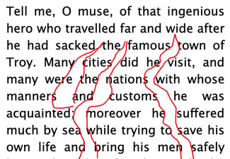
When the word spacing is applied to justify text, one can often see a series of gaps that form pathways through the text. These are referred to as ‘rivers’—and they are often more pronounced the narrower the column of text due to widely uneven word lengths. For this reason, justification is often paired with hyphenation (or H&J for short). Almost as much ink and blood has been spilled over proper H&J as has been about typographic scales. In most cases, I generally side with the ‘H but not J’ crowd when it comes to the web. Basically, web browsers simply can’t be as nuanced about their ‘J’ decisions, and it was only in the past couple of years that we had a universal enough ‘H’ solution—so our options were limited and results, well, varied.
Personally, I’m perfectly happy with a ‘right rag’ solution, with a judiciously applied smattering of hyphenation at narrower column widths. I think that gives the smoothest reading experience as it leaves the word spacing alone, and hyphenation helps even that out further on the smallest screens and columns. Thankfully we now have a pretty reliable hyphenation option in CSS. The attribute has been supported for quite a while, but it was only relatively recently that all the shipping browsers actually included a hyphenation dictionary to support it. It’s important to note that to get the best results, be sure to set the ‘lang’ attribute in your root HTML element so the browser can apply the most appropriate hyphenation rules for the language of your site (see the note on the W3C spec page for more details).
.hyphens {
  -webkit-hyphens: auto;
  hyphens: auto;
}
So now with one line of CSS (well, two so we can support Safari with a vendor prefix), we can enable a pretty decent hyphenation solution. Because it is a little less than perfect (and not something you can fine-tune very much), I generally set hyphenation for small-screen-first, and then turn it off once the viewport gets larger. Generally once text blocks are wider (say 60+ characters or so) I’ll go with natural line wrapping without any word breaks.
Ink and madness
When the web was created, what made it actually useful was the link. A document in isolation wasn’t anything new; it was the ability to interconnect them that sparked the imagination of the world. A link is a truly Powerful Thing. But somewhere along the way, we lost sight of the purpose in pursuit of the style. The standard link style was pretty clunky, and it became the order of the day to remove the standard ‘text-decoration: underline’ and replace it with a bottom border of some kind, sometimes a background color, but most often (and most problematic) with nothing but a subtle color difference from the text around it. This was an accessibility nightmare, and is still making the web far harder to use for millions of people today.
I could spend a chapter or two on the subject, but let’s focus on the core purpose of a link and the standard for them as defined by the Web Content Accessibility Guidelines in the latest version. A link exists to connect one piece of content to another. In order for that to be useful, the user has to be able to perceive the link is there. So the WCAG guidelines specify (for level AA conformance) that there should be at least 2 ways to perceive that something is a link. For text, that usually means a distinguishable color and something else, like the default ‘text-decoration: underline’ or some other underlining/highlighting mechanism like a border or background element.
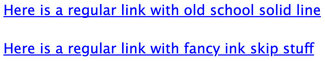
As you can see in the first screenshot, the ‘original’ and slightly improved default link implementation in Chrome is a bit heavy-handed. The underline is a bit heavy and crude. Note that in the bottom one the underline skips the descenders in the lower case letters, a nicety that Safari pioneered a few years ago and is now part of the CSS specification. The top link is a simulation of what links looked like since the beginning of the graphical web, largely unchanged until very recently.
Progress of sorts
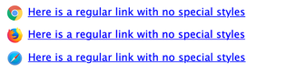
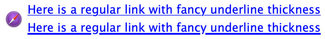
There’s some nifty stuff evolving. The W3C CSS Working Group has defined a new attribute of ‘text-decoration-thickness’ that can accept a value to define the thickness of the underline, so it will be simple to even out the display of links and make them a bit more refined. Skipping the descenders and thinning out the line looks really nice. There’s another one I really like too: ‘text-underline-offset’, which when set in an EM value will always scale nicely with the time (as does the thickness when set the same way). You can see the first implementation in the Safari Technology Preview edition now, shown in the screenshot here as well.
.thin-line {
  text-decoration-skip-ink: auto;
  text-decoration-thickness: 0.05em;
  text-underline-offset: .1em;
}

.thin-line:hover {
  text-decoration-thickness: 0.15em;
}
Currently it’s still implementing the older syntax (‘text-decoration-skip: ink’ rather than the newer accepted variation of ‘text-decoration-skip-ink: auto’ that has evolved), but you can add both as you’ll see in the CodePen example and it covers turning it on or off in the mix of supporting browsers. Firefox unfortunately has not implemented any of it, but there is at least an active ticket. (Maybe if a few of you commented there in support we could nudge it along!) If all the browser vendors implemented these, we wouldn’t have to resort to such convoluted (albeit brilliant and beautiful) link style hacks that that which Marcin Wichary worked out for Medium a few years ago. (And which I’ve copied and used on many occasions, including on my own site)