Conjuring up a better numbered list
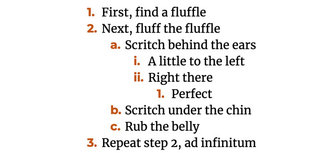
One thing I’ve ended up doing on several projects lately—including my own site—is to style ordered (and unordered) lists with a slightly different approach than in the past. It’s always been frustrating that by default you can’t style the numbers or bullets all that much. You can specify a few different list styles, but you can’t change color or font. I decided to dig in to that and found a couple of helpful posts about it and started to come up with an approach that I thought would work.

Typographically, the goal was to come up with a way to style the typeface, background, color, and spacing of the numbers or bullets. It had to work both aesthetically and functionally, meaning that accessibility via screen readers and other assistive technologies was an absolute must. The ability to style numbers and bullets would mean you can use a combination of typefaces or weights, use color to accentuate or decrease the visual weight of the list elements, or even add backgrounds to numbers for a much greater visual impact.
What came together to make this possible was a combination of CSS capabilities like counters and generated content. With a bit of testing it has proved to be pretty resilient, and seems to work just as well as the normal list styles from an accessibility standpoint. Thanks to some inspiration and exploration by the likes of Cassie Evans and Eric Meyer, it feels like a perfect use of CSS techniques layered together to solve the challenge.
Counting backwards (and by letter)
CSS counters have been around for quite some time, but somehow have never come up in my work until recently. But the ability to create counters and iterate on them through repeating elements like counters or sets of grid block items can be extremely useful. Let’s take a look at how they work.

The first thing you have to do is define the counter on the containing elements (in this case, the ‘ol’ element that contains the ordered list items.
ol {
  list-style: none;
  /* name the counter */
  counter-reset: list-counter;
}
Then you set the increment on the list item style, and the rest takes care of itself. You can also nest them and the counter will increment properly at each level. This is particularly useful on nested lists like outlines.
ol li {
  font-family: Merriweather, serif;
  /* say which counter you want to increment */
  counter-increment: list-counter;
}
For nested lists, you can alter the counter style too:
ol li li::before {
  /* increment the counter at this level, but with alphabetic characters */
  content: counter(list-counter, lower-alpha) ". ";
}
ol li li li::before {
  /* increment the counter at this level, but with Roman numerals */
  content: counter(list-counter, lower-roman) ". ";
}
Numbers, but fancier
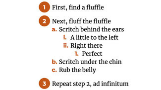
Sometimes plain ’ol numbers just won’t do the trick. We want a circle with the number in it. It requires a bit more spacing and finessing, but also not too difficult to accomplish.

There's a bit more styling to do, but the concepts are all the same. Building on what we’ve already done, we add this to style the background of the top level list element and give it a bit more space and finesse.
ol.fancier > li {
  margin-bottom: 1em;
}

ol.fancier > li::before {
  background-color: #c05522;
  border-radius: 50%;
  content: counter(list-counter);
  color: #ffffff;
  min-width: 1.75em;
  min-height: 1.5em;
  margin-left: -1.5em;
  margin-right: 0.35em;
  margin-top: -0.3em;
  padding: 0.3em 0.1em 0.1em;
  text-align: center;
}
Numbered boxes
This technique also works equally well with other repeating elements, like ‘article’ elements in grid. This can be a nice visual element when designing ’reasons to do something’ where the numbering is more visual element and less list-signifier. I use that technique on my home page to illustrate reasons why someone might hire me.

Bonus better bullets
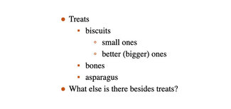
The same kind of approach can be taken with bullet lists, so while we don’t need the counters we can still style unordered lists with alternate characters, colors, and styles. Since we’re using generated content to specify the bullet character, it’s equally possible to specify an image or icon.

The code for this style is much simpler, and we follow that with alternate bullet characters for nested lists too.
ul {
  list-style: none;
  /* name the counter */
  counter-reset: list-counter;
}
ul li {
  /* say which counter you want to increment */
  counter-increment: list-counter;
}
ul li::before {
  color: #c05522;
  display: block;
  float: left;
  margin-left: -1em;
  /* set the character for this level */
  content: "●";
}

ul li li::before {
  /* set the character for this level */
  content: "▪";
}

ul li li li::before {
  /* set the character for this level */
  content: "◦";
}
Accessibility concerns
While there have been some issues with removing the semantics of lists when using ‘list-style: none;’ to remove default styling and replace it with our new elements, it appears that at least with VoiceOver on the Mac (tested with the Catalina version of the OS), this is behaving as expected, and announcing/enumerating lists properly.
Resources
- Examples on CodePen
- MDN Using CSS Counters
- Chris Coyier wrote about styling numbered lists last year too
- Scott O’hara’s observations on some accessibility issues when styling lists