ATypI Tokyo: In-Variably interesting
There’s no way to adequately sum up what a magical week this has been. A combination of a completely new place and cultural experience, reuniting with a community of friends I only see once or twice a year, and dozens of talks full of fascinating details, delivered with passion and care. It is a truly wonderful experience, and has been so each of the past 4 years I’ve participated.
It’s a bit different than the web conferences I’m more frequently attending: the talks are mostly only 20 minutes (I might have gone a little over), and are presented back-to-back in blocks of 4 or 5 talks, punctuated by coffee breaks. The days were long too: the first talks started at 9am, and some days didn’t finish until almost 7pm. When one conference is trying to represent ideas, research, and innovations of a global type community, there’s a lot to cover. I may write more, but since there were some very significant developments in the world of variable fonts and the web, I thought I’d start with those.
Day 0: W3C Web Fonts Working Group
The day before the conference started we had our first in-person meeting since formally starting up work on Progressive Font Enrichment. I’m happy to say that a lot of progress has been made in testing ideas, developing research and testing frameworks, and validating the different technological and research directions we’re going to pursue. While it’s still going to be 6 months at least before we start to see some of the results, we came away with clear goals, tasks, and deliverables. Group members Rod Sheeter and Garret Rieger from the Google Fonts team gave an update during the main part of the conference, and I’ll send out a link once the video is available.
Day 1: Workshop
My workshop on using variable fonts was a really full house, with nearly 30 attendees. A mix of type designers, graphic and UI designers, and even a few folks from the sales side of some type organizations were all eager to learn about what can be done on the web with variable fonts. Since there was only one or two web developer and engineers in the room, we did have to adopt more of a show-and-explain approach.
During the course of the day I built up an example page, explaining the code and purpose as we went along. With a healthy does of time dedicated to questions and conversations, it ultimately didn’t seem to matter that people weren’t doing a lot of coding along. I was really pleased to have folks from several foundries (including Monotype), and a new friend from the Google Fonts team in attendance as well.

Day 2: Give me 148 million reasons
Perhaps one of the most significant revelations of the entire conference (to me anyway) was one that has gone virtually unnoticed thus far: Designer Irin Kim and engineer Nathan Williams revealed that Google Fonts has been serving a variable version of Oswald to users who can see them, on sites using enough different weights to warrant it, for months now.
To the tune of around 148 million times a day
The site owners likely never even knew: they simply called for Oswald, set up their CSS, and went on their way. Wherever appropriate, Google Fonts started serving the variable version of the font, and nobody noticed. I think that’s absolutely perfect, and showcases something I suspected would be true: in the right circumstances, variable fonts can be a win even just being a better version of what came before with regard to performance.
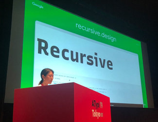
Then Irin dropped another surprise: she introduced a new variable font they’ve been working on with type designer Stephen Nixon called Recursive. It’s a beautiful design that can flip between mono-spaced and regular, slightly curvy to a bit more straight-laced. It has a number of different axes, and really makes for a beautiful design, with a wide range of voice. They’re working on a new specimen site (it will be their first for a variable font!), and you can also download the font on Github.
Finally, Nathan left us with something else that’s pretty major: Google Fonts has launched a new version of their web font API that supports variable fonts! I’ll be digging into that this week in preparation for my workshop and talk at Web Unleashed in Toronto starting on Thursday, so more details on that soon.
Avoiding the fallback Faux
Type designer Irene Vlachou and Axis-Praxis creator Laurence Penney gave a talk on their new undertaking: Faux Foundry. Conceived as a way to handle missing Greek glyphs in web fonts (a surprisingly common problem across the web), this service helps sites serve better results and avoid having characters show up on fallback fonts when the main one has an incomplete character set. The solution they’ve created examines the main font and creates a small variable font and corresponding CSS to supply a font that goes right in the stack between the primary font and the fallbacks. It contains all of the glyphs that are missing to support Greek text, and the variation axes are already set to match the main font remarkably closely.

While developed specifically for Greek, it’s immediately clear that this clever, innovative approach could solve for a tremendous number of problems like this one even at the OS level. Be curious to see what happens with this one.
Grammato and the future of writing
The smart fellas from Underware are up to their tricks again, this time with a new evolution of variable fonts and the teaching and representation of writing. I won’t be able to do it justice, so you’ll have to check out their site, and I’ll post a link to the video when it’s available. Totally worth it!
A call to the type industry: what the web wants
After seeing the response from the web community this year to variable fonts, I felt I needed to convey that enthusiasm to the type designers and foundries at ATypI. But in order for variable fonts to be more easily adopted, we need type designers to use weight and width axis values that work easily with CSS. It’s not a requirement, but will make adoption much simpler and provide better compatibility in scenarios where the fonts might not load or be supported. This is a critical aspect of how the web is meant to work.
We also could benefit greatly from fonts with an optical size axis. While certainly not as simple as adding width or weight, the design flexibility and enhanced legibility across size ranges will greatly increase the opportunity to create typographic systems that just use a single typeface. Grade is another axis worth exploring more, as it can hep address accessibility needs and is tremendously helpful when designing interface animations.

It’s about showing up
Beyond just font features, we need participation. The variable font format was introduced by four of the largest companies driving the web: Adobe, Apple, Google, and Microsoft (with substantial efforts from others, but those were the 4 on stage). In the past three years however, visible signs of support have been uneven at best. Browser support came along very quickly, but then things seemed to stall. Adobe introduced variable font in Photoshop and Illustrator, but it’s generally at ‘rough beta’ level of reliability. There have been some bright spots recently with Monotype’s recent font releases, and a huge step forward with the developments from Google.
We need more
It shouldn’t be left to three or four individuals to promote variable fonts and encourage their adoption. We need more educational documentation, accurately written, and put where users will see it (meaning on the major sites like Google Font’s site, in the Monotype Mosaic and Fonts.com interfaces, etc). And we need partnership. As John Maeda pointed out in his opening night keynote, just because you build it doesn’t mean anyone will come. Likewise, just making a variable font and putting it up for sale on your site does nothing—and understandably nobody is buying them.
But that’s because nothing is being done to market them. We need to work together to leverage your knowledge of the fonts (and which clients are using them), and our knowledge of the web. Let’s pitch together and get a few clients excited. It’s not just me either: there are a number of web folk who would be thrilled to help.
Together we can get clients excited, and help their team with the implementation, ensuring that they are working with the best format (it should always be WOFF2 for the web), that the font is properly subset and optimized for their needs, and that they are integrated into the HTML and CSS in the best possible manner. Once there are a few more sites to point to and case studies to showcase, momentum will pick up even more. I’m encouraged by the reactions I’ve seen, and grateful for those who have approached me already since I gave the talk. I have no doubt that there are great things to come.