Design is communication
And if you can’t explain it, you’re not done designing it yet

A while back I wrote an article about one of my most influential experiences studying Graphic Design: the requirement of one of my instructors that we show up for any ‘first crit’ with no fewer than 30 thumbnails. But there was another experience, with another instructor, that perhaps had an even greater impact on me and on the way I guide and teach other designers.
While Heemong Kim’s requirement centered on the start of any project, Nancy Bockbrader’s signature element came at the finish: every project, no matter how big or small, had to include a paper explaining the ‘why’ behind the design decisions made in the course of the assignment. It could be as short as a paragraph or two, but if you couldn’t explain in clear language the reasoning for your typeface selection, color palette or any other visual language, you just weren’t done.
I’m not sure, but I may have been one of the only students who actually liked that part.
This forced clarity. It meant that even if you made up the explanation to fit the project, you still had to sell it. You had to be comfortable with the vocabulary of design, and how to use it convincingly and with rigor.

It probably helped that I went to school a few years later than most, but I was ready to think, and do so out loud. I found by focusing on the explanation, it made the work stronger. Because when you have to say it out loud (even metaphorically), a weak idea has no place to hide. It becomes very apparent, very quickly, that the reasoning for a typeface choice, or the cultural relevance of a color palette, or the subtle symbolism embedded in a logo might just have been more for your benefit than the imaginary client’s.
I’ve used this technique in classes I’ve taught, and even with design teams I’ve managed. Not for the client per se, but for our own internal review. This is even more important. When conducting an internal design review it’s critical the designer be able explain why this solution is the best one.
Without explanation all we can do is evaluate execution, not effectiveness
There’s an important byproduct of this process: if every designer has to explain their work clearly and convincingly on a regular basis, they’re far more likely to do so with clients. This is critical, because in all but the rarest of cases, our clients aren’t designers. They don’t know what we know, or speak the same language we speak. We must be our own translators, and educate the client along the way. If we can’t bring them along to the view we have created, why should they believe us when we say it’s the right one?
I’ve brought this practice into the teams I’ve run over the years, and make it part of the daily routine. When we talk about work, we talk about why it’s effective. When a designer works on a project, they present it to the client. If two designers are working, they each present their own. Not only does this provide opportunity to practice this kind of communication, it also gives them the credit they deserve for the work they have done. The solution comes from the team, so the team should have time in front of the client to shine.
Besides, as Mike Monteiro put it so well in Design is a Job: if you’re not the one selling it, you didn’t finish designing.
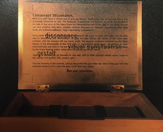
[ True story: the matchbox set pictured was a project for a class with Nancy, and was included in Graphis Magazine’s Student Design Annual 1997 ]
Originally published on Medium—if you like it, please recommend it there to help others find it as well!