Zen and the art of knowing what to hold (and what to let slip—or be slippery)
I’ve been working for a long time to teach graphic designers how much they can do typographically on the web. An overwhelming amount of the time, the reaction is something like ‘if we can’t control all of these things, why bother with any of it.’ When working with UX designers and front-end developers, the tendency is to focus on what will work in all conditions for all content—but the knowledge of typographic techniques, where they would be appropriate, and how to implement them are often absent. The answer—and the best web typography—lies somewhere in the middle.
Last week I showed how with a few lines of CSS we could turn a relatively common layout pattern into something a bit more interesting and visually engaging. Far from being superfluous, these kinds of efforts have for over a century contributed to publications’ success, differentiation, and popularity. While it’s certainly a tall ask to customize every single post, it’s clear many of these techniques could be built in as options in our publishing systems or simply customized for specific stories. This week I’ve taken the layout a bit further and pulled in both design and code techniques that really transform the experience.
Let it go
We’ve already created a typographic system that eschews specific point or pixel sizes in favor of relative hierarchies. But we have to move further into our acceptance that unlike in print, the letters don’t stay where we put them down. Every time the content changes, the screen size changes, the orientation changes—our design changes with it. So our design systems have to flex. Our intent to either increase or decrease that friction between the content, design, and the reader has to be elastic.
In this week’s iteration, we’re going really big and bold with the headline, and allowing the words to break where they will. It’s only three words, so the reader might be a little challenged, but not unduly so. We’ve incorporated styles for the first line in once case, and first letter in another, knowing that they may not be perfect in every browser, but close enough to fit.
Add it up
We’ve added some depth and texture with a photo and gradient overlay behind the title. We’ve also picked up on some of the tones from the photos for accents rather than sticking with a standard palette color. And knowing that the text was not overly long we’ve gone with a multicolumn design that will shift automatically from one column on mobile to two or more as the screen size allows.
We’ve also added some details that might only show in some circumstances—but that’s OK. The baseline experience is still solid. Safari and Chrome will try to avoid single lines of content at the top or bottom of a column. The relationship between the title, lede, and body will be slightly different on every device. And that’s just fine—it’s the sum of all these little touches in each user’s experience that adds up to something greater than what came before, and what is found on almost every other site.
Design is the details!
What’s the difference
Well, almost nothing in the HTML. Pretty much all we did was add a ‘section’ wrapper around the main text (excluding the ‘lede’ paragraph), rearranged the images, and added a blockquote. We needed the section wrapper to add a multicolumn class, and I wanted to include the quote to showcase how images and blocks of text can be used in those kinds of layouts.
As for CSS, it’s not much more than last week. The two alternate layouts from last week added 70 and 100 lines of CSS respectively. This one adds about 150. I point this out to highlight that while custom coding everything may not be practical, adding and/or customizing 150 lines of CSS is much more attainable on a more frequent basis. Taking time to design and code some of these elements to make it a bit more unique will go a long way towards increasing engagement with your content.
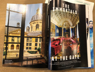
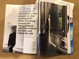
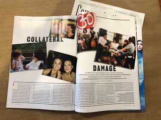
Prior art (direction)
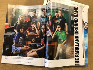
Lest you think this is entirely without precedent, have a look at the article title pages from Vanity Fair show above. Every article has a different approach. Each with different image treatments, overlays, directionality, alignment. Then each flows into one of the layout options I wrote about last week. Far from being a fad, this is what publication design is all about. Each article cover page is designed (or art directed if you will) to get you to stop flipping through the pages and read that particular piece. It reflects the piece itself.
In our push to make publishing possible, to systematize our design, and to optimized for every possible device—we’ve left the idea of design for a specific piece of content completely off the table. Don’t get me wrong: those things are all critical. But they should be treated as table stakes, not the final result.
Good design honors the content. Great design celebrates it.
I bring this up to reinforce the notion that the best design and typography might be challenging. It might force a slower pace or deeper concentration. Because sometimes that’s what’s required to get the most out of the piece. And we shoudn’t shy away from that.
Agents, changed
Let’s take a look at a some of the specific elements that received special attention.
Title
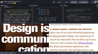
I wanted to push this a bit, so decided to go with scale. Modifying the low and high end size, width, and line-height variables gives us a big bold, compressed headline (I also added slightly tighter letter-spacing, which often helps with larger sizes of text feel more connected). I further amplified the effect by setting the title in a width-constrained block and reversed the contrast, so it was white text on a black background. Added a line of CSS to allow the words to break wherever they needed to in order to fill the space with letterforms more completely. With only a three word title, it won’t be too hard to figure out even if the words themselves break in unpredictable ways. A tiny bit of negative margin on the right allows the white letters to bleed into the whitespace next to the title block. This pushes the ‘breaking out of its own space into yours’ kind of effect I was looking for.
header {
  background-color: #000;
  background-image:
    linear-gradient(
      rgba(49, 19, 11, 0.65),
      rgba(29, 9, 1, 0.75)
    ),
    url("[super long image URL]");
  background-size: cover;
  word-break: break-word;
}
@media screen and (min-width: 55em) {
  header {
    float: left;
    margin-left: 0;
    margin-right: 1vw;
    max-width: 50vw;
    text-align: right;
  }
}
And here’s the code for the heading itself:
h1 {
  --h1-size-min: 7;
  --h1-size-max: 11;
  --h1-lh-min: 0.8;
  --h1-lh-max: 0.9;
  --h1-wdth: 60;
  --h1-wdth-max: 60;
  --h1-wght: 900;
  --h1-wght-max: 900;
  color: #fff;
  min-height: 3em;
  letter-spacing: -0.05em;
  margin: 0 -0.01em 0 0;
}
@media screen and (min-width: 55em) {
  h1 {
    margin-bottom: 0;
  }
}
Finally, I repurposed one of the photos as a background, coupled with a colored gradient overlay to mute the tones and ensure there was enough contrast for the type. This taken together gave it a much more polished look without loading an additional asset.
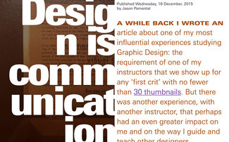
Lede paragraph
The styling the first paragraph (sometimes referred to as the lede) a bit differently has been an effective design technique seen for many years. It’s a way to draw the reader in and ease them into the rest of the piece. In this instance I combined the larger, more open typesetting with a differentiated first line as well. I set that in small-caps (an OpenType feature) and set it bolder and wider using the width and weight axes of the variable font. This did uncover an odd bug only seen in Safari which I’ll have to chase down, but otherwise it’s all pretty self-regulating. Because we’re using CSS custom properties to control the scaling, the code required is pretty minimal.
The final touch was to sample the photograph and pick an accent color for the text in that lede paragraph itself. I’ve generally stayed true to color palettes in the past, but in this case making the choice based on the surrounding content will really help it shine. Having this one element vary won't take away from the cohesiveness of the overall design system one bit.
.lede {
  --p-size-min: 1.5;
  --p-size-max: 2;
  color: #953800;
  max-width: none;
  padding-right: 2vw;
}
.lede:first-line {
  font-stretch: 130%;
  font-variant-caps: all-small-caps;
  font-weight: 650;
}
Multicolumn text
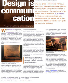
For the main part of the article I tried something a little different. Since it’s not that long, I used CSS multicolumn to dynamically split the layout from one column to two or more depending upon viewport width. Thanks to a detailed look at CSS Fragmentation by Rachel Andrew a little while back, I’ve added a couple lines of CSS that help address true typographic widows and orphans in multicolumn layouts: you can see in the images below how it’s rendering on a larger screen in Firefox and then in Safari and Chrome.
Now, it’s not every article where this can work. I knew I could get away with it in this case because it’s fairly short. But you also don’t have to set the whole piece the same way. You might break it up in sections, going from single column to multicolumn, with images and without. This gives a natural rhythm and pace to the reading experience you don’t otherwise get with a single layout all the way through. All of these are techniques you can use to pace the reader through the content.
.multicolumn {
  column-width: 25em;
  column-gap: 1.5em;
  widows: 2;
  orphans: 2;
}
figure {
  break-inside: avoid;
}
blockquote {
  break-inside: avoid;
}
I’ve added another attribute to the blockquote and figure elements from Rachel’s piece: ‘break-inside: avoid’—which in most cases will prevent that element being split across columns (lines of the quote, or image and caption appearing separately). I also slipped in an initial cap, and utilized the accent color there and on the blockquote to further unify the piece.
Checking the tally
While none of these changes alone are particularly earth-shattering, they add up to a much more distinct experience, and one that will be far mre memorable. And each of these customizations could easily be implemented as a blend of options built into the design system (such as layout options, image backgrounds, multicolumn capabilities) coupled with specifics to that piece of content (like typesetting variables and accent colors). That way it might only require one or two classes and a couple dozen lines of CSS to achieve a really distinct outcome that still ‘belongs’ to the rest of the site and system.
It’s time we recognize that the difference between 'good enough' and truly great design will be in the ‘and’, not the ‘every’. It’s what we add to the content with design that really counts.
Resources
- Example on CodePen
- CSS Fragmentation by Rachel Andrew on Smashing Magazine