Text & image, interplay & animation
Following on from last week’s issue (and inspired a bit by receiving the latest Type Directors Club annual in the post), I spent some more time looking at vintage posters. The spark came about when I went looking through the last couple emails from DJR’s Font of the Month Club. I discovered that January’s edition contained a bonus: a new, more complete version of Gimlet in variable format, complete with axes for width, weight, italic, and optical size!

I’ve loved Gimlet since I first saw an early version just after variable fonts were introduced, and have used it for various demos over the years. I love its quirky 60’s vibe, and have always thought it reminded me of period poster and advertising design.
So that’s where we went.
Searching for what’s seldom seen
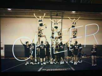
One of the most common and visually arresting techniques in graphic design is creating the illusion of interplay between text and image. The shifting of typographic forms before and behind photographic elements creates dynamic tension, sparking interest and examination. These techniques have been in use for hundreds of years in illustration, magazine and poster design, and can even be seen in the title screen of the latest streaming sensation, Cheer.
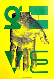
Have a look at this poster from Schmid/Widmaier (via the TDC annual). Notice how the abstracted letterforms drift in front of and behind the hand.
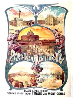
Or this stunning travel promotion by Cussetti. Note the way the flowers curl around the ‘P’ in Paris. Subtle, but lovely.
So wherefore art thou on the web?
The simple answer is that we don’t see this kind of interplay between text and image because it used to be hard to do. We’re conditioned on the web to keep things simple: images in boxes, text on top. Usually on a semi-transparent block. Always optimizing for a system-driven, content-managed, ever-changing world of new posts published every day with no time for design or development intervention.
While it would be impractical to think every page, promotion, or post could be designed and custom-coded, I’ve written about a middle ground before—and this is another good example. The core text content doesn’t need much if anything modified, but spending a little bit of time customizing a clip-path mask for the text overlaying the image can create some really dynamic effects without requiring very much code.
Catching the travel bug
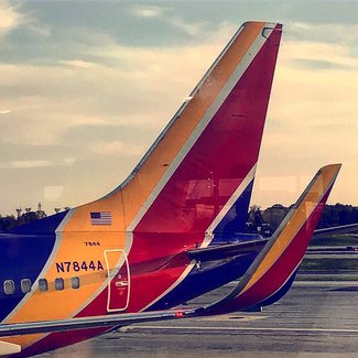
Taking cues from the poster examples, I dug though my photo archive and found one I posted to Instagram a few years ago on my way back from Baltimore. It’s got a really graphic quality to it that seemed like it would fit. I decided on a horizontal crop that focused on the tail. Setting the image as a background sized to 100% kept it filling the container, and let me set up the basic layout.
.poster {
  background-image: url(https://s3-us-west-2.amazonaws.com/s.cdpn.io/57225/79D7C2EE-7F10-4AEB-9434-8988EFC7BD52.jpeg);
  background-repeat: no-repeat;
  background-size: 100%;
  ...
}

.poster-mask {
  ...
  height: 100%;
  width: 100%;
  z-index: 1;
}

h1 {
  color: rgba(0,0,67,.7);
  font-family: "Gimlet";
  font-size: 15vw;
  font-stretch: 75%;
  font-weight: 900;
  font-variation-settings: 'ital' 1;
  line-height: 1.1;
  padding: 5vw 2vw 0 2vw;
  width: 75vw;
}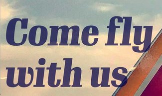
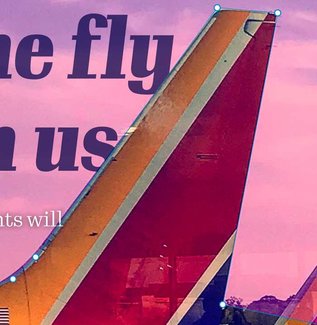
Now what I want to do is allow the text to fall behind the tail of the plane without resorting to adding separate image files with different transparency to sandwich the text (though that’s a pretty interesting technique as well). Enter CSS attribute ‘clip-path’ (and it’s vendor-prefixed cousin to ensure compatibility with Safari). I found a good article on CSS Tricks about it, and after a little fiddling with the Shapes editor in the Firefox Dev Tools (thanks Jen, Miriam, & the Dev Tools team!) I had pretty good masking layer created.
Everything is done in percentages and the text is set including viewport units so we can be sure it will all scale nicely. You can always tweak the size values in other ways to fit your layout needs. But with a little bit of Grid for layout layering, this holds up pretty well.
.poster-mask {
  ...
  -webkit-clip-path: polygon(0% 0%, 100% 0%, 100% 100%, 69.34% 90.23%, 79.17% 10.09%, 68.35% 8.66%, 35.89% 77.18%, 31.83% 83.22%, 0% 100%);
  clip-path: polygon(0% 0%, 100% 0%, 100% 100%, 69.34% 90.23%, 79.17% 10.09%, 68.35% 8.66%, 35.89% 77.18%, 31.83% 83.22%, 0% 100%);
  z-index: 1;
}
Since we are on the web in this example, I’ve added a bit of animation as the whole thing loads. I think that's one of the emerging areas of typgraphy on the web that should be explored more. Animating type along axes during load or when content comes into view is a wonderful way to draw the readers eye. You don’t want to go overboard—and you should respect preferences for reduced motion—but it’s easy to do and animates beautifully.
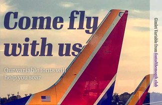
While certainly not something you might do every day, you could imagine this working really well on a landing page or home page teaser (or some other promo usage). Indeed, given how much time publications put into their cover and article intros in print, it seems an obvious place to put some effort to create this kind of effect on their sites.
This experiment certainly has its limitations, but it does scale pretty well. I hope you’ll find this inspiring enough to try out osme of these techniques on your own projects. Be sure to share when you do!