Thirty thumbnails

  .width.super-floof {
    font-stretch: 140%;
  }
  .width.petite-puffle {
    font-stretch: 50%;
  }
  .weight.chonky-boi {
    font-weight: 900;
  }
  .weight.skinny-minnie {
    font-weight: 500;
  }
  .x-height.bubba-bear {
    font-variation-settings: 'YTLC' 600;
  }
  .x-height.lil-bit {
    font-variation-settings: 'YTLC' 450;
  }

  .slant.trouble {
    font-style: oblique 10deg;
  }
Wandering around Turner Reservoir, sniffing all the sniffs, chasing all the squirrels, and muddying up some paws.
 .opsz-corrected {
   font-optical-sizing: auto;
   - or -
   font-variation-settings: 'opsz' 72;
 }
Typography is inseparable from the type that it sets; there is no such thing as ‘neutral’ in this regard—typography will make the text that it sets easier to read or more difficult. Draw more attention to the text, or let the typesetting fade into the background and let the text take center stage. But the influence is always there.
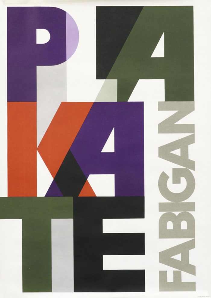
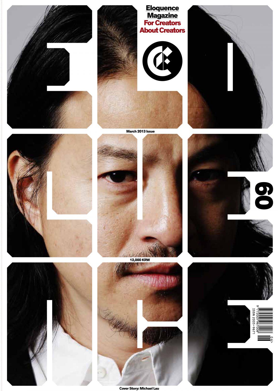
It stands to reason then this truth can used to advantage. Indeed the notion of ‘display typography’ centers around just that: it is meant to draw attention. So while text typesetting for body copy may be meant to reduce the friction between text and reader, display typography is often designed to increase it. Intentionally slowing the reader down; requiring focus and a bit of concentration that can in turn make the message more memorable. This also allows design principles of color, shape, and layout be used more expressively—at least when designing the headline.
Heemong Kim, our instructor for Graphic Design 1 (and 4 & 5) at Rhode Island College had a rule for starting any project: 30 thumbnails. If you showed up for the first class after getting a new assignment without 30 little sketches, he wouldn’t talk to you.
That frustrated a lot of students in the class. But that created its own sort of solution. The school is a small state school that attracts a lot of local commuter students, many of whom end up taking Graphic Design out of a kind of process of elimination as a way to make art and make a living. I’m sure this is true at many schools, but this was my experience. That meant that in a class of 15, there might have been five to seven who were really there because they loved graphic design and wanted to make that their vocation.
slides:
https://noti.st/jpamental/C9jqPU